Add the widget

Add the widget to the canvas
To access and use a widget:
In Elementor Editor, click +.
All available widgets are displayed.Click or drag the widget to the canvas. For more information, see Add elements to a page.
What is the Zigzag widget?
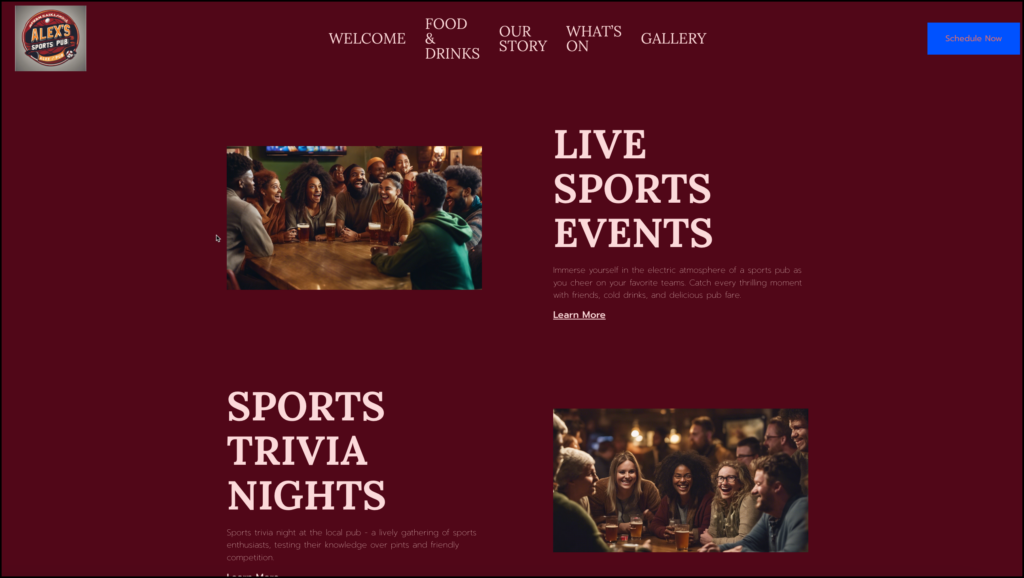
One of the most common, and effective, website layouts is the zigzag design. The most common zigzag design is to have a graphic element on one side and text elements on the other. Then, in the row below, have a graphic side and a text side but with the positions reversed.
The zigzag widget allows you to quickly create this layout using just one element.
Common use case
Alex is creating a website for their sports pub. On the Home page they insert a Zigzag section below the Hero section to talk about pub’s various activities.
Additional use cases
- Building an About Us page with photos of staff members on one side and their contact info on the other.
- Creating a listing of rentals with an image of the property on one side, and description of the property on the other.
Adding a Zigzag widget: Step-by-step
In the example below, we’ll create a zigzag section for the home page of a sports pub.
For this page, we will create a zigzag with two sections:
- The top part talking about the pub’s live sports events.
- The bottom part talking about the pub’s sports trivia night.
Add a Zigzag widget
To add a Zigzag widget:
- Add the Zigzag widget to the canvas. For details, see Add elements to a page.
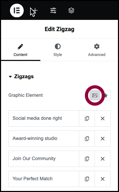
- In the panel, make sure the Graphic Element symbol is set to image. A Zigzag widget can use either images or icons for the graphic element.
In the panel, each row of the Zigzag widget contains the information you see on the canvas.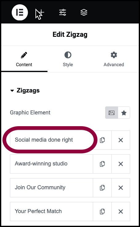
- In the panel click the first row.
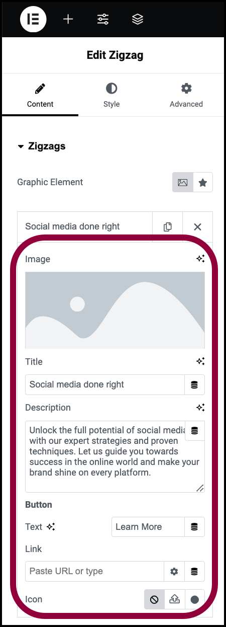
The row information appears.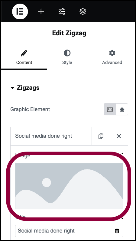
- Click the Image field.
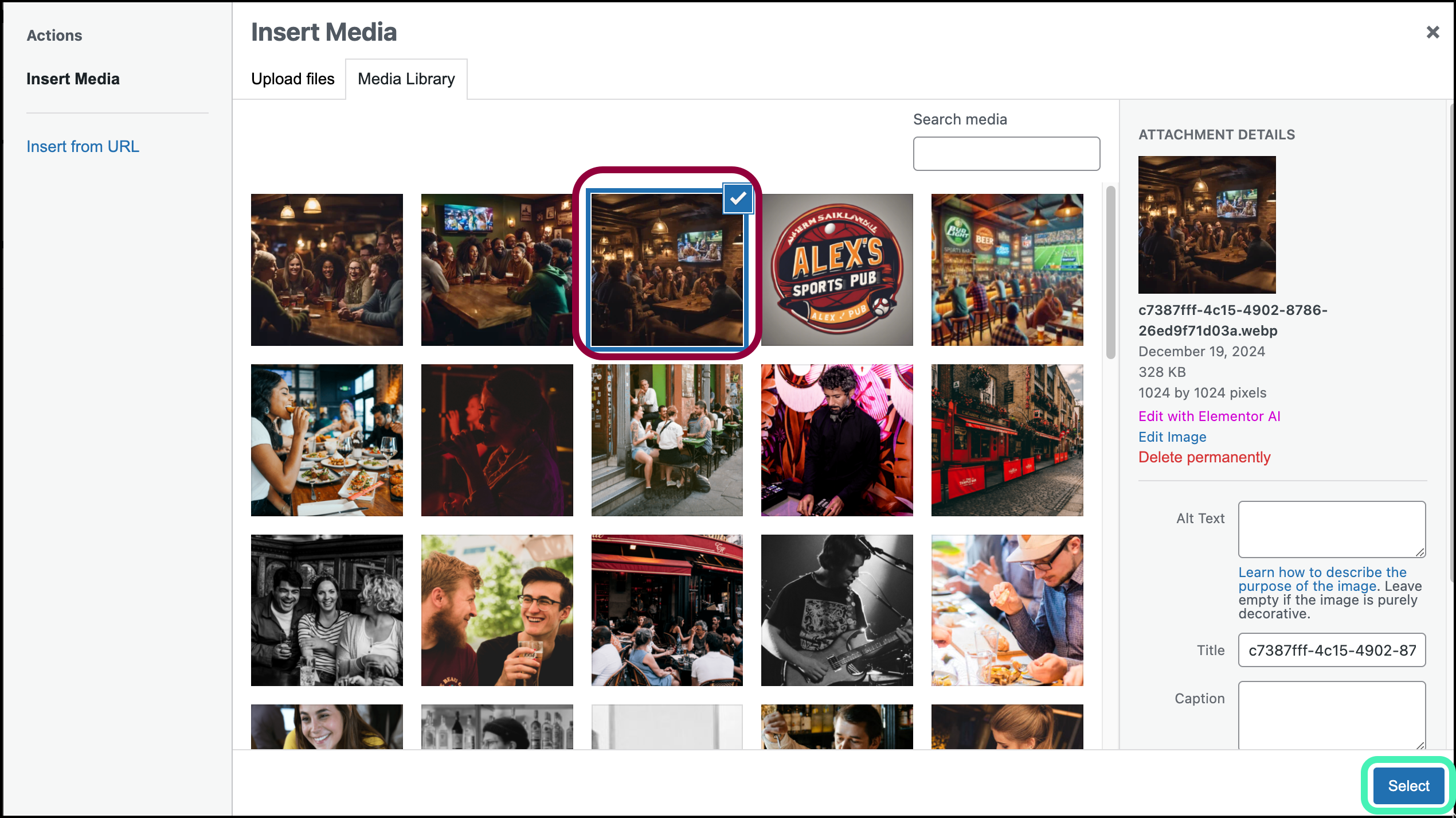
- Navigate to the image of people watching a screen at a sports bar and select it.
- The text element has three parts:
- A title
- Text
- A button or link
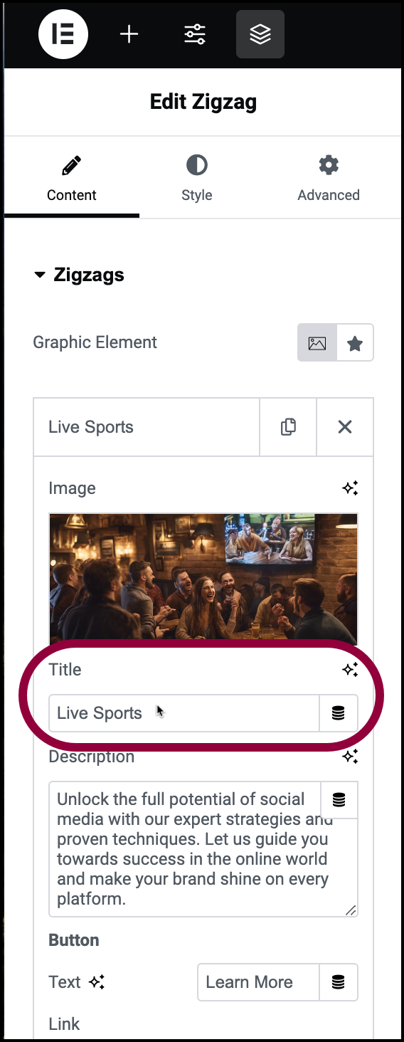
- In the Title text box, enter Live Sports.
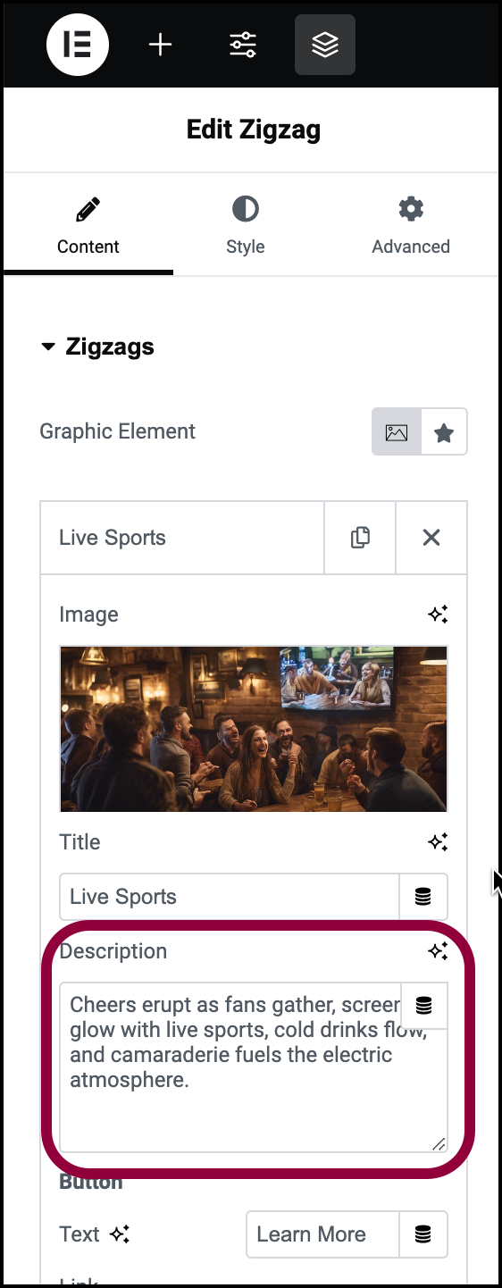
- In the Description text box, enter Cheers erupt as fans gather, screens glow with live sports, cold drinks flow, and camaraderie fuels the electric atmosphere.
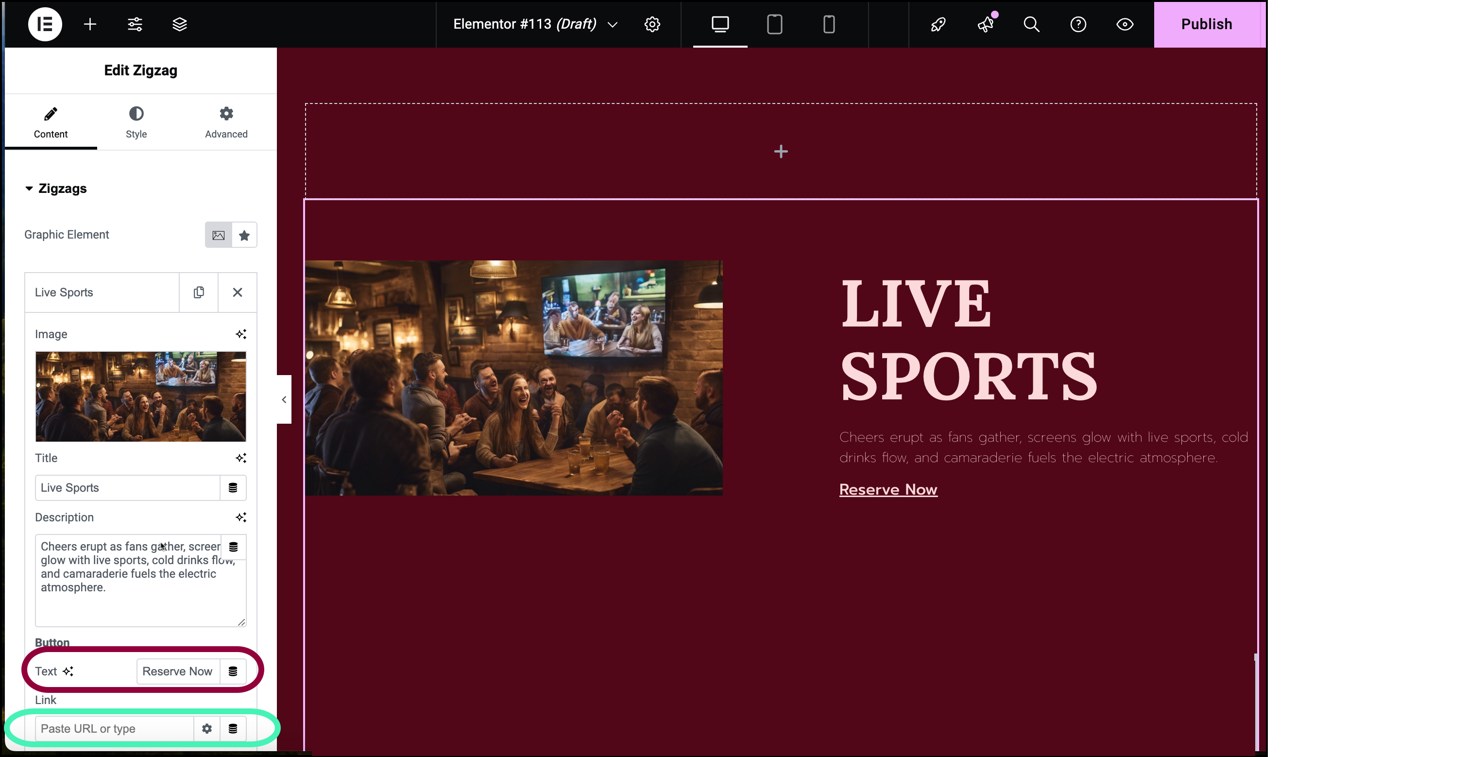
- In the button text box enter Reserve Now.
If this was a real page, you would enter the URL of the page where visitors could reserve a table. - Click the next row.
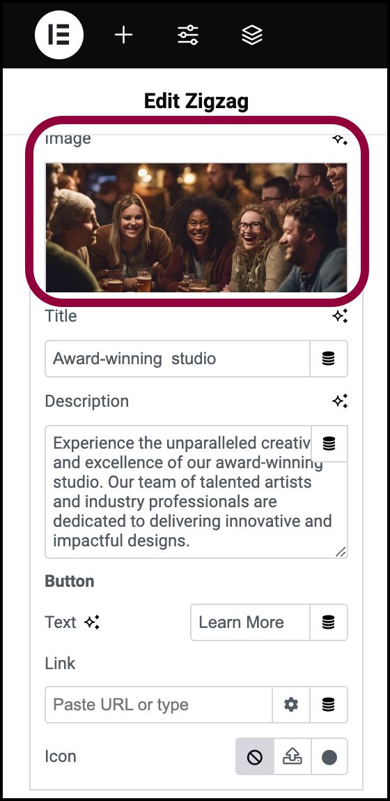
- Click the Image field.
- Navigate to the image of people participating in a trivia night and select it.
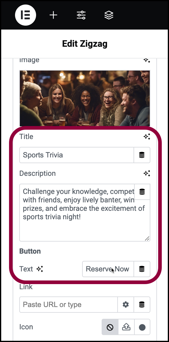
- In the Title text box, enter Sports Trivia.
- In the Description text box, enter Challenge your knowledge, compete with friends, enjoy lively banter, win prizes, and embrace the excitement of sports trivia night!
- In the button text box enter Reserve Now.
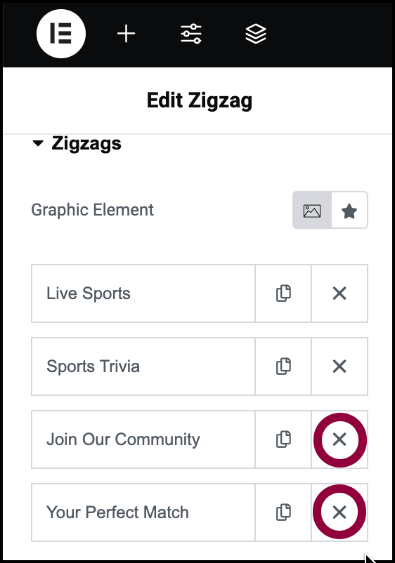
Since we’re only using two rows for this example, we’ll delete the next two rows by clicking the X icon on each row.
If we wanted to add a row, we could: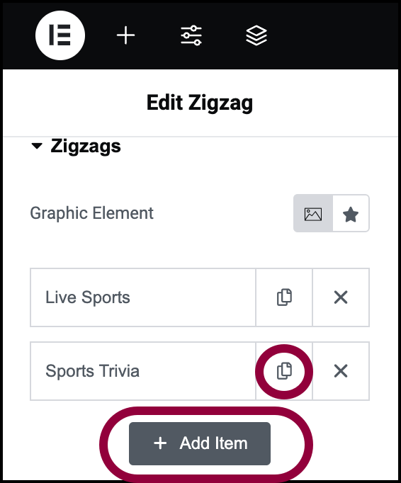
- Click the copy icon of an existing row.
- Click the Add Item button.
- Buttons can appear as either links or buttons. Our buttons currently appear as links so let’s change that.
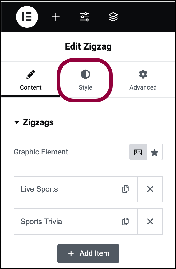
- Click the Style tab.
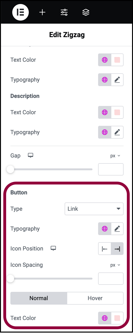
- Scroll down to the Button section.
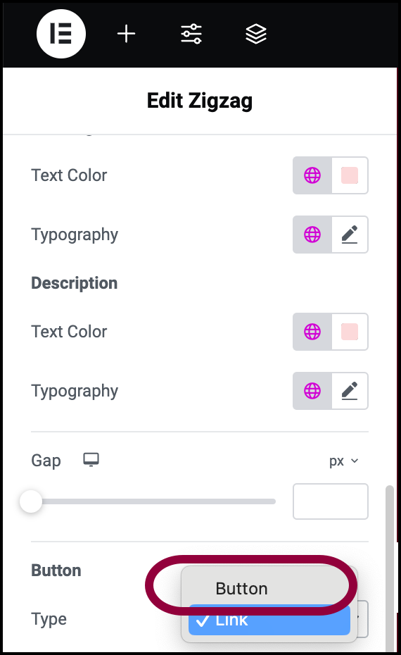
- Use the Type dropdown menu to select Button.
Finally, we’ll have the button change when users hover over it.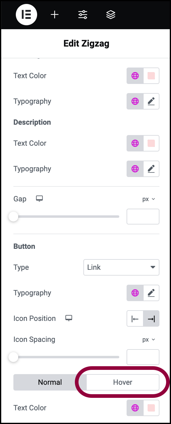
- In the Button section, click Hover.
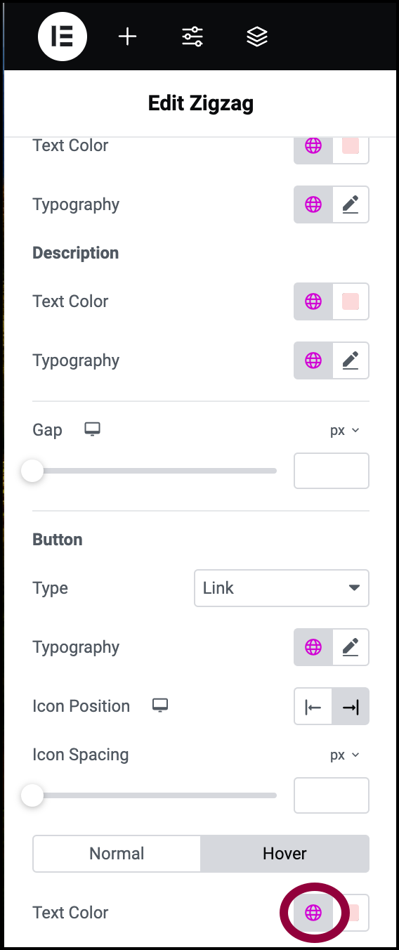
- In the Text Color section, click the global color icon.
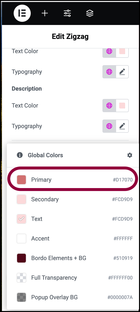
- Select Primary.
- Hover over the button to see how it changes.
You created a ZigZag section.
Settings for the Zigzag widget
You can customize your widgets using content, style, and other advanced parameters, offering you great flexibility in tailoring them to your needs. Click the tabs below to see all the settings available for this widget.
Content tab
Add, delete, and edit menu items and controls.
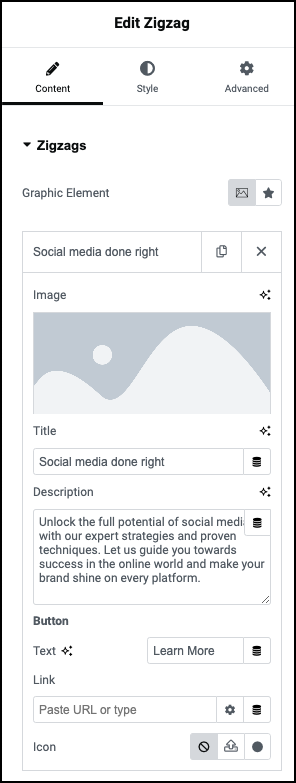
Graphic Element
Use the symbols to determine if the graphic element is:
- An image:

- An icon:

Add and delete rows
Each row contains two icons:
– Duplicate this row item. Using copy helps maintain consistency in your menu.
![]() – Delete this menu item.
– Delete this menu item.
Image
One side of each zigzag row contains an image or icon.
To select an image or icon, click on the Image/Icon field and navigate to the desired Image/Icon. For details, see Adding images and icons.
To delete an image/icon, hover over the image/icon field and click the delete icon .
Title
Enter a title in the text box. In general, titles should be short, no longer than ten words.
Description
Enter a description in the text box. The description appears under the title.
Button
Zigzags can contain buttons or links at the bottom.
You can switch between a button and link in the Style tab.
Each button/link includes:
- Text: In a button the words appear on the button, for links, it is the link text.
- Link: The URL that opens when the button/link is clicked.
- Icon: You can select no icon
 , upload your own icon
  , or click the icon to choose from the icon library.
Style tab
Here you determine how the image, text and button look and feel.
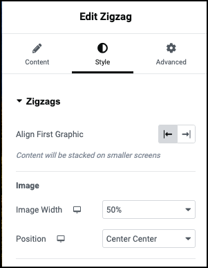
Align first graphic
Switch between placing the graphic element on the left or right.
Image
Image Width: Use the dropdown menu to change the size of the graphic element. Changing the size of the graphic element will also change the size of the text next to it. and Position dropdown meuControl the size and position of the graphic element.
Position: Select what part of the image is visible. For more information, see Positioning background images.
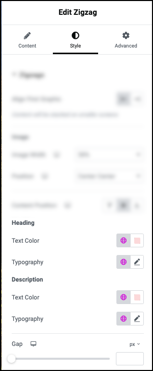
Heading
Control the font color, type and size.
- Text Color: For details, see Choose a color or Use global fonts and colors.
- Typography: Set the font type and size. For details, see Typography.
Description
Control the font color, type and size.
- Text Color: For details, see Choose a color or Use global fonts and colors.
- Typography: Set the font type and size. For details, see Typography.
Gap
Use the slider to increase and decrease the size of the space between the graphic element and text.
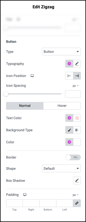
Type
Use the dropdown to switch between Button and Link.
Typography
Control the font type and size of the text on your button or in your link. For details, see Typography.
Icon Position
Determine if the button/link icon appears on the right or left of the button/link.
Icon Spacing
Use the slider to increase and decrease the amount of room between the button/link and the icon.
Normal/Hover
Click Normal to set how the button/link Text Color, Background Type and Color appear by default.
Click Hover to set how the button/link Text Color, Background Type and Color appear by when visitors mouse over them.
- Text Color: Set the font color of button/link text. For details, see Choose a color or Use global fonts and colors.
- Background Type (for button only): For details, see Create a Background.
- Color (for button background only):
Border (for button only)
Add a border to the button. For more details, see Border type.
Shape (for button only)
When using a button, use the dropdown menu to select:
- Round: Buttons appear with smooth corners.
- Rounded: Buttons appear with evenly curved edges.
- Sharp: Rectangular buttons.
Box shadow (for button only)
Click the pencil icon to add shadow to the toggle. Learn more about shadows.
Padding (for button only)
Control the spacing between the button borders and the text. For details, see Padding and margins.
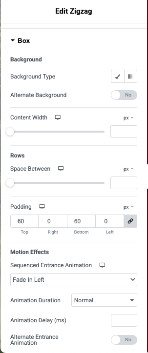
Background
Add a background to the Zigzag widget. For details, see Create a Background.
Alternate Background: If you toggle to Yes, you can create a second background that is used for every other row. This way you can create a distinct difference between the different rows.
Rows
Space Between: Use the slider to control how much room is added between the rows of the zigzag widget.
Padding: Increase and decrease the space between the widget’s elements and widget border. For details, see Padding and margins.
Motion effects
Motion effects: Allows you to animate the elements of your ZigZag widget. You can select from the following special effects:
- Fade In: The elements are not visible until the visitor scrolls down and they slowly appear.
- Fade In Left: The elements are not visible until the visitor scrolls down and they fade in from the left.
- Fade In Right: The elements are not visible until the visitor scrolls down and they fade in from the right.
- Fade In Up: The elements are not visible until the visitor scrolls down and they slide in from the bottom of the screen.
- Bounce In: The elements are not visible until the visitor scrolls down and they bounce into view.
- Bounce In Left: The elements are not visible until the visitor scrolls down and they bounce in from the left.
- Bounce In Right: The elements are not visible until the visitor scrolls down and they bounce in from the right.
- Bounce In Up: The elements are not visible until the visitor scrolls down and they bounce in from the bottom of the screen.
- Slide In Left: The elements are not visible until the visitor scrolls down and they slide in from the left.
- Slide In Right: The elements are not visible until the visitor scrolls down and they slide in from the right.
- Slide In Up: The elements are not visible until the visitor scrolls down and they slide in from the bottom of the screen.
If you select an animation you can also choose:
- Animation Duration: Use the dropdown menu to determine how long the animation effect takes to finish. Choices are:
- Slow
- Normal
- Fast
- Animation Delay: You have the option of delaying the animation so it doesn’t occur immediately as the user scrolls down. The time is measured in milliseconds.
- Alternate Entrance Animation: If you have more than one element in the ZigZag widget, toggle this to Yes if you want to set different animation effects for every other element.
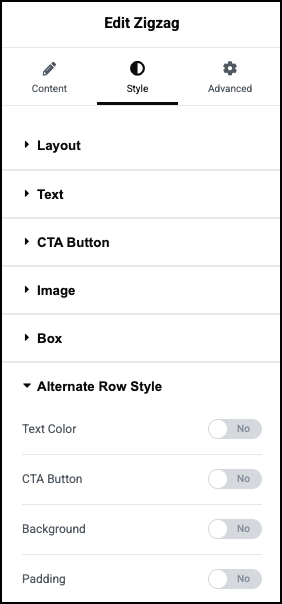
Alternate Row Style
Changing the style of every other row on your zigzag can add flair to your page. Using the Alternate Row settings allows you to change:
- Text Color: Toggle to Yes if you want to use a different text color for every other row.
- CTA Button: Toggle to Yes if you want to use a different style for the CTA in every other row.
- Background: Toggle to Yes if you want to change the background of every other row.
- Padding: Toggle to Yes to change the amount of horizontal padding on every other row.
Advanced tab
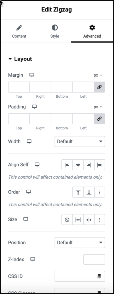
Control the placement of your widget, insert links, add custom code and more.
Advanced
Learn more about the Advanced tab settings.

