Help Center / Editor V4 / Elements / YouTube element

YouTube element

Last Update: July 1, 2025

The YouTube element is part of the V4 editor.

Learn more about activating V4 features here.

Add the widget

To access and use a widget:

  1. In Elementor Editor, click +.
    All available elements are displayed.

  2. Click or drag the element to the canvas. For more information, see Add elements to a page.

What is the YouTube element?

The YouTube element lets you quickly embed YouTube videos into your web page.

See all the options available with the YouTube widget.  

Common use case

Alex is designing a home page for their web design business and wants to embed YouTube content to draw potential customers’ attention.

Youtube element video

See a video demonstrating the widget in action. 

Adding a YouTube element: Step-by-step

In the example below, we’ll embed a YouTube video using the YouTube element.

Add a YouTube element 

To add a YouTube element:

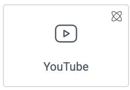
  1. Drag the element to page.

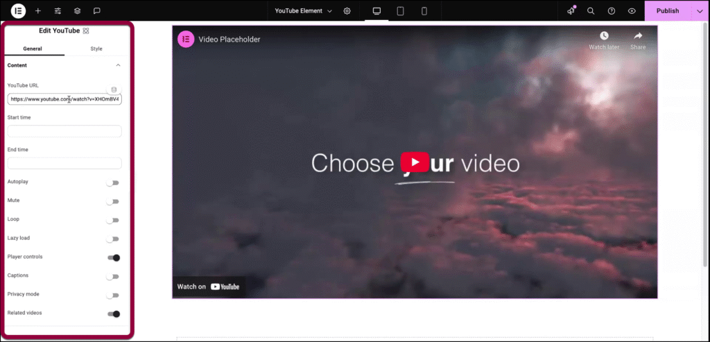
    The element options appear in the left panel. 
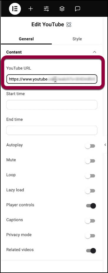
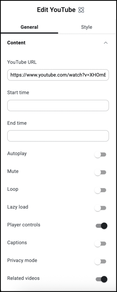
  2. In the YouTube URL field, enter the link to the YouYube video you want to embed.
  3. (Optional) Enter a Start and/or a Stop time to only show a portion of the video.
    Tip
    The times entered should be in seconds.

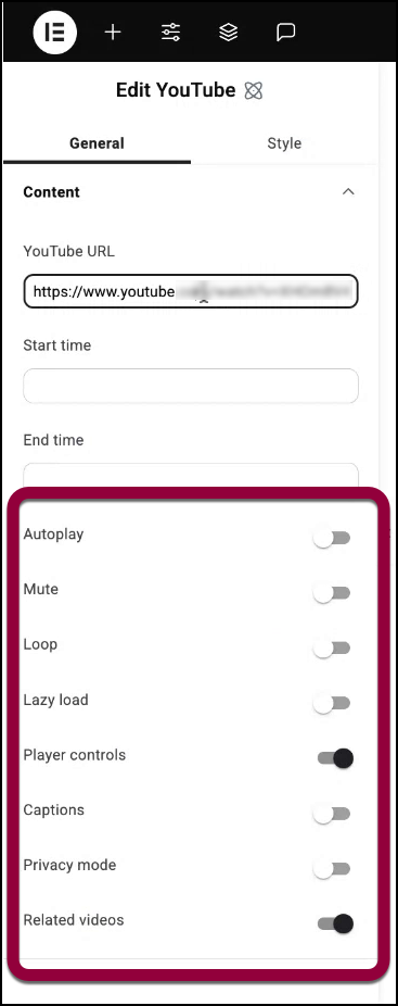
  4. Enter any additional options for the video. These options are explained below.
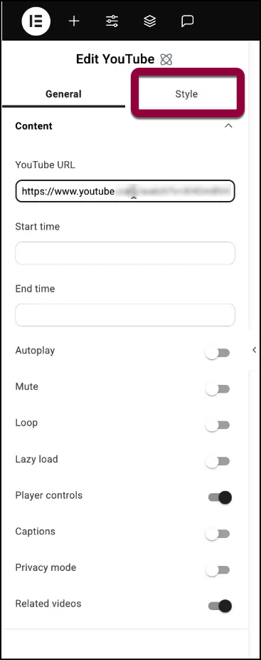
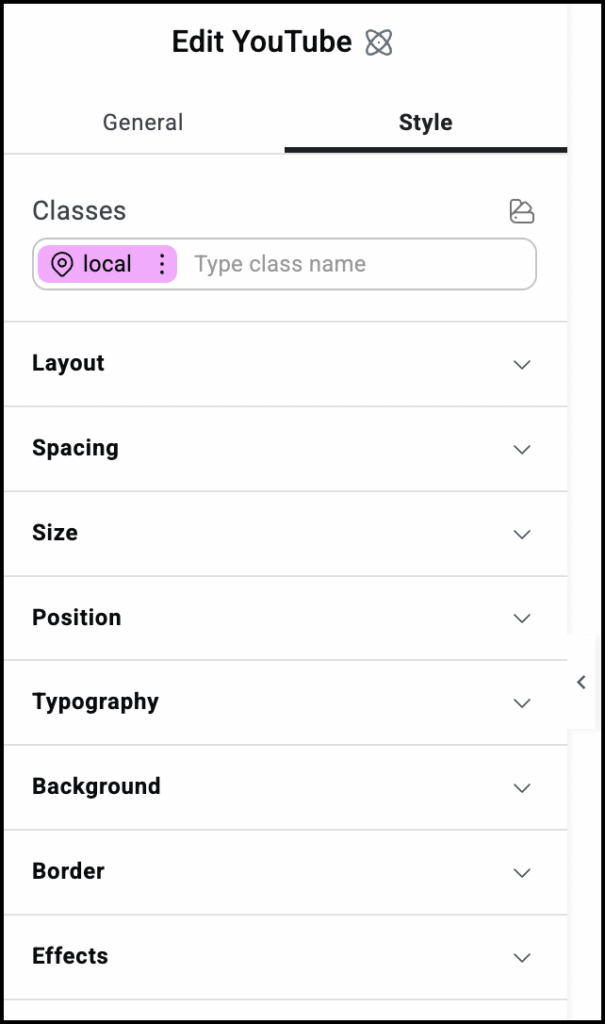
  5. Click the Style tab to adjust the look and feel of the element, for example adding a background.
 

Settings for the YouTube element

You can customize your elements using the General and Style tabs. Click the tabs below to see all the settings available for this widget.

General tab

Add, delete, and edit menu items and controls. 

Specify a time for the video to start (in seconds). Allows you to only show a portion of the video to visitors.

Specify a time for the video to stop (in seconds). Allows you to only show a portion of the video to visitors.

Decide if the video should start playing automatically when someone visits the page.

If enabled, you can choose:

  • Play On Mobile: You can also enable the autoplay for mobile devices.

Toggle on if you want the video to start without sound.

Toggle on to continuously play the video.

Toggle Lazyload on to load the extra video stuff only once someone hits the play button. This feature helps in improving page speed. Learn more about Lazy Loading.

Show or hide buttons like Play, Pause, and Volume.

Toggle to Yes if you want the YouTube captions to show in your video.

If you toggle on, YouTube won’t store information about visitors on your website unless they play the video.

Pick what YouTube should suggest after your video ends. Choose from the Current Video Channel or Any Video.

Allows you to choose when the dropdown menu will activate, when you select it (Click), or when you mouse over it (Hover).

You can choose to have your dropdown slowly appear. If you do, Animation Duration determines the amount of time it will take for the dropdown to fully appear.

Style tab

Determine the look and feel of menu items and controls.

Control how the content of your menu is displayed.

Use the slider to controls the amount of room between the items in your menu.

Use the slider to control how far the distance between the menu and content area.

Determine how the text on the menu tabs will appear. Learn more about typography.

Determine the color of the text on the menu tabs. To choose a color, either use the color picker or a global color.

Set shadow effects for the text on the menu tabs. Learn more about shadows.

Set a background for the menu tabs. Learn more about backgrounds.

Add a border around the menu items. If you add a border, you’ll have the option of setting a border type and the border’s width.  Learn more about border types.

Place a horizontal divider between menu items. After you add a divider, define the divider settings :

  • Style (Solid, Double, Dotted, Dashed)
  • Width 
  • Height
  • Color 

Round the corners of the border if you added one. 

Add padding around the menu item borders if you added them. Learn how to create space with padding and margins.

This section is only relevant if you chose to place an icon next to your menu item.  

Determine if the icon next to the menu item will be located to its right, left, top or bottom. 

Use the slider to increase and decrease the size of the icon next to the menu item. 

Use the slider to increase and decrease the amount of room between the icon and the tab name. 

How the icon will appear by default.

How the icon will appear when visitors hover over it.

How the icon will appear when the item is selected. 

Determine the color of the icon. To choose a color, either use the color picker or a global color.

Best practice is to replace the menu with a toggle if visitors are using a mobile device. The section controls the look of this toggle.

Use the slider to set the size of the menu toggle. 

How the toggle will appear by default.

How the toggle will appear when moused over. 

How the toggle will appear when  selected.

Set the color of the toggle For more details, see Choose a color or Use global fonts and colors. 

Add a background to the toggle. For more details, see Create a Background. 

Use the dropdown menu to add a border to the toggle. Learn more about border types.

Click the pencil icon to add shadow to the toggle. Learn more about shadows.

Round the corners of the borders around the toggle, if you added a border.  

To adjust the radius with the counter control, use the four counters to adjust each individual corner. Learn more about measurement methods. 

Use the slider to control the amount of space between the menu toggle and menu content.

Determine how the content in the menu tab will appear.

Add a background to the menu tab’s content. Learn more about backgrounds.

Add a border to the menu tab’s content. Learn more about border types.

Round the corners of the borders around the menu item content, if you added a border.  

To adjust the radius with the counter control, use the four counters to adjust each individual corner. Learn more about measurement methods. 

To adjust the radius, use the four counters to adjust each individual corner. Learn more about these measurement methods. 

Click the pencil icon to add a shadow to the menu tab’s content. Learn more about shadows.

Add space around the menu item content. Learn how to create space with padding and margins.

Best practice is for menus to appear as dropdowns on mobile. This section determines the look of these dropdown menus.

How the dropdown menu will appear by default.

How the dropdown menu will appear when selected. 

Select a text color for the dropdown menu text For more details, see Choose a color or Use global fonts and colors.

Add a background to your dropdown menu. For more details, see Create a Background.

Click the pencil icon to add a box shadow to the dropdown menu. Learn more about shadows.

The dropdown box surrounds the menu tab’s content. Use this section to style the dropdown box. 

Add a border to the dropdown box. Learn more about border types.

Round the corners of the border surrounding the dropdown box if you added them.  

To adjust the radius, use the four counters to adjust each individual corner. Learn more about these measurement methods. 

Click the pencil icon to add a shadow to the dropdown box. Learn more about shadows.

Advanced tab

Control the placement of your widget, insert links, add custom code and more.

Learn more about the Advanced tab settings.

On this page

Share this article

Hosted with