Add the Hero widget

Add the widget to the canvas
To access and use a widget:
In Elementor Editor, click +.
All available widgets are displayed.Click or drag the widget to the canvas. For more information, see Add elements to a page.
What is the Hero widget?
A Hero section is usually found at the top of webpage. In general, it features:
- Title, usually the site name.
- Tagline letting visitors know what to expect from the site.
- A striking image or video to draw visitors’ attention
- Call to action (CTA), giving visitors the chance to engage.
The Hero widget lets you easily and quickly add all, or some, of these to your page.
Common use case
Alex is creating a page for their new sports pub. The top of the page will feature:
- The name of the pub: Alex’s Sports Pub.
- The tagline: Cheers, Beers and Roaring Crowds.
- An image of the pub.
- A button letting you reserve a table.
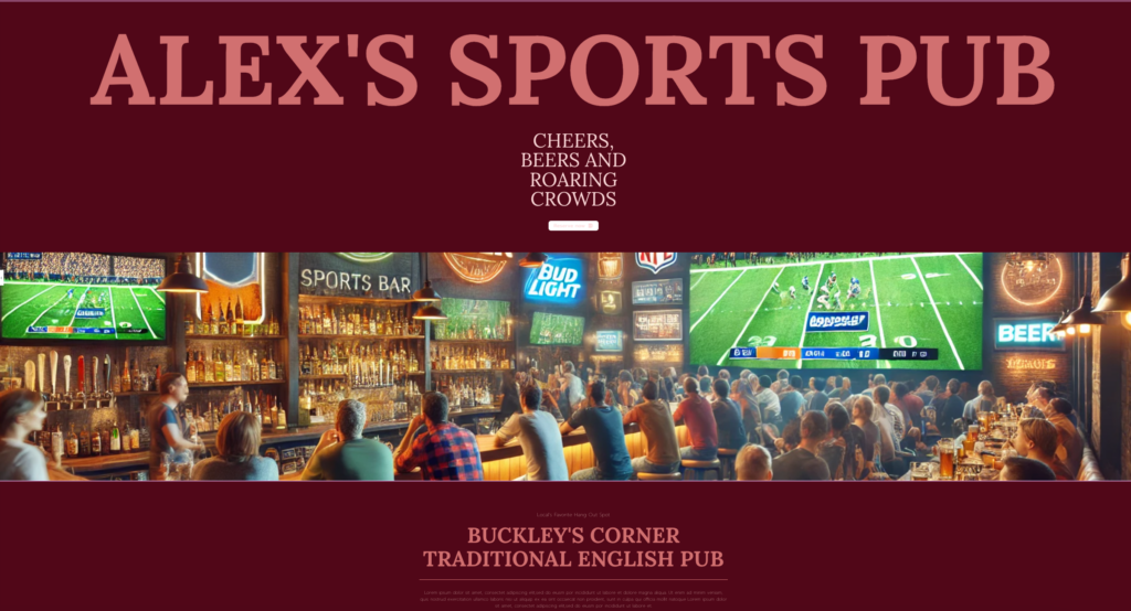
For a step-by-step walkthrough creating a Hero widget, see Edit your home page.
Settings for the Hero widget
You can customize your widgets using content, style, and other advanced parameters, offering you great flexibility in tailoring them to your needs. Click the tabs below to see all the settings available for this widget.
Content tab
This is where you’ll add the text for the title and tagline, the image and the information for the CTA button.
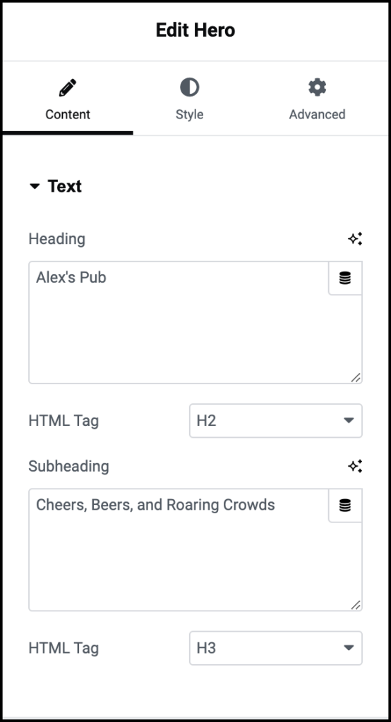
Heading
The Heading is usually the name of the site or business it represents.
HTML Tag
The HTML tag help search engines and accessibility tools identify the most important parts of a page.
The Heading is usually the most important part of the page so, by default it is marked as H2. This way, if someone searches for “Alex’s Pub” they’re more likely to land on this page.
However, you can use the dropdown to tag the Heading and Subheading differently if you choose.
Subheading
The subheading gives a little more detail about what users can expect from the site or business. In a Hero section space is at a premium so it should be as short as possible, no more than ten words.
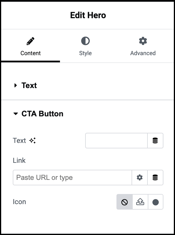
Text
Add text such as Reserve Now or Contact Us to your CTA button.
Link
Choose to:
- Insert a URL in the text box to take users to a page when they click the button.
- Click the dynamic tag icon to insert a dynamic tag. For more details, see Dynamic tags.
Icon
You can add catchy/informative little symbol to the CTA button.
For example, you can add a mail icon to a Contact Us CTA.
- Click the upload symbol to upload your own .svg format icon. You may need to confirm permission to upload .svg files.
- Click the icon symbol to open the library giving you access to hundreds of image options.

Menu Toggle
Control how the icon representing the dropdown will appear, if you select a dropdown layout.
Alignment
Set the icon representing the dropdown to the right, left or center.
Normal
How the icon will appear by default.
Hover
How the icon will appear when a visitor mouses over it.
Active
How the icon will appear when a visitor clicks on it.
Icon
Select the icon that will represent the menu. Learn more about icons.
Style tab
This is where you’ll change the look and feel of text, image of buttons. For example, here is where you’ll change the font size of the Heading.

Content Position
You can align the Hero section to the:
 Center of the container.
 Start of the container.
 End of the container
Center alignment is the most common choice.
Heading
Set the following options for the Heading:
- Text Color: For details, see Choose a color or Use global fonts and colors.
- Typography: Set the font and size of the text. For details, see Typography.
- Text Width: Set how much space, from right to left, the text will take up.
Subheading
Set the following options for the Subheading:
- Text Color: For details, see Choose a color or Use global fonts and colors.
- Typography: Set the font and size of the text. For details, see Typography.
- Text Width: Set how much space, from right to left, the text will take up.
CTA Button
- Set the following options for the CTA:
- Type: The CTA can be displayed as either a button or a simple text link. Use the dropdown to switch between them.
- Typography: Set the font and text size of the button or link. For details, see Typography.
- Icon position: Use the positions to determine if the icon will be to the right or left of the text.
- Icon Spacing: Use the slider to set the distance between the icon and the text.
The options below can change depending on where the cursor is:
- Normal: How the CTA appears by default.
- Hover: How the CTA appears when visitors mouse over it.
Dynamic options for the CTA:
- Text Color: Change the color of the CTA text. For details, see Choose a color or Use global fonts and colors.
- Background type (button only) : Switch between a classic background or a gradient background. For details, see Create a Background.
- Color (button only): Change the background color of the CTA. You must choose a global color.
Other options for the CTA:
- Border: Adding a border can help your CTA stand out. Toggle to Yes to add a border. If you add a border you can also choose a border width and color.
- Shape: Use the dropdown to determine the roundness of the CTA button. Choose between:
- Default
- Sharp: Rectangular button.
- Round: Buttons appear with smooth corners.
- Rounded: Buttons appear with evenly curved edges.
- Box Shadow: Add depth to your CTA by adding shadow. For details, see What is Shadow?
- Padding: For details, see Padding and margins.
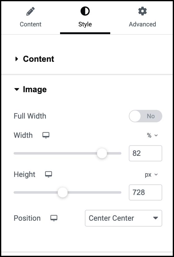
Width
Determine how far the image will stretch across the screen.
Toggle Full Width to Yes if you want the image spread across the entire screen. If not, use the slider to set a height and width. Then use the dropdown menu to position the image.
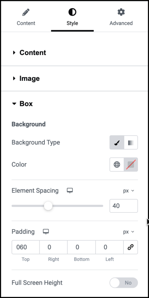
Background
This is where you can style the background for the entire section. For details, see Background.
Element Spacing
The Heading, CTA and Image are all elements in the Hero widget. Use the slider too set a distance between each of these elements.
Padding
Use the counters to control the distance the elements of the Hero Section and widget’s boundaries. For details, see Padding and margins.
Advanced tab
Control the placement of your widget, insert links, add custom code and more.
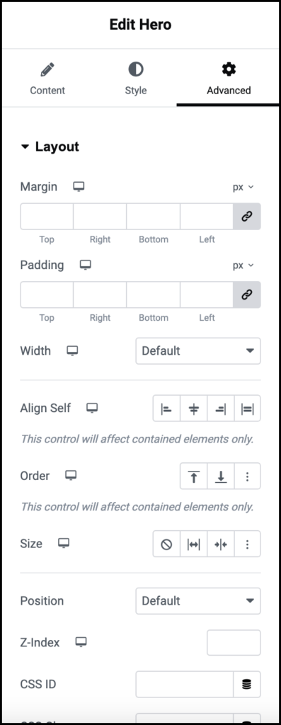
Advanced
Learn more about the Advanced tab settings.

