Add the widget

Add the widget to the canvas
- In Elementor Editor, click +.
All available widgets are displayed. - Click or drag the widget to the canvas. For more information, see Add elements to a page.
What is the Featured Image widget?
The Featured Image widget is a Theme Element specifically designed for use within Single Post Templates in Elementor. It enables you to dynamically display the featured image of the current post. This means that when a visitor views a specific post on your website, the featured image associated with that post will be automatically displayed in the location where you’ve placed the Featured Image widget within your single post template.
Common use case
Ken is building a website for his small pottery business. They want to showcase the latest creations on the website’s blog section, with each post featuring a prominent image of the showcased pottery piece. To design this, Ken adds a featured image widget within Elementor’s Single Post Template and sets the template to be used on all posts.
When visitors navigate to a specific blog post, they are greeted with a beautifully displayed featured image of the showcased pottery piece at the top of the post. This not only grabs the visitors’ attention but also provides them with a visual preview of the content they are about to explore.
Using the Featured Image widget, Ken ensures that each blog post on his website is visually appealing and has the same featured image style. This enhances the overall user experience and helps to attract potential customers to his small pottery business.

Additional use cases
- Display mouth-watering images of signature dishes in each blog post to entice visitors to explore the restaurant’s culinary offerings.
- Feature stunning landscape photographs as the featured image for each travel destination post, captivating readers and encouraging them to embark on their own adventures.
- Showcase high-quality images of the latest fashion trends as featured images in blog posts, inspiring readers and driving engagement with the content.
- Highlight beautiful property photos as featured images for each listing, providing potential buyers with a visual preview of the available properties.
Add a Featured Image widget: Step-by-step
- Add the Featured Image widget to the canvas. For details, see Add elements to a page.ImportantThis widget is a REQUIRED element on the Single Post Template. If this widget is not added to the Single Post Template, the Elementor editor will not load. For more information, see Create a single post template.
- In the Content tab, under the Image section, the Choose Image field dynamically displays the featured image of the current post.
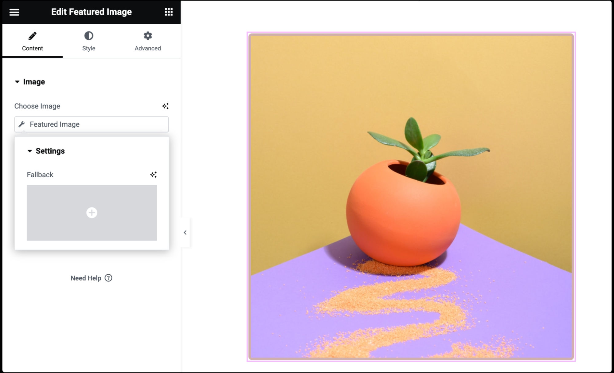
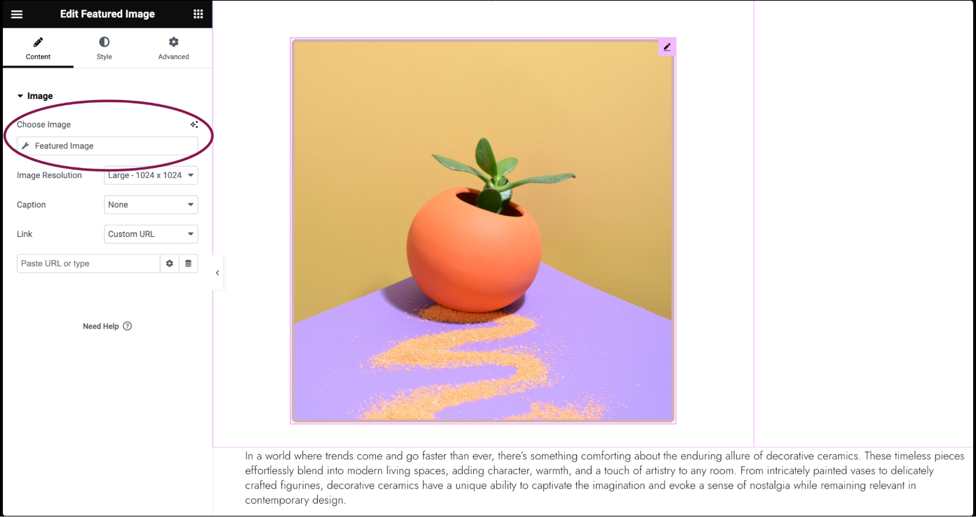 NoteIf you click “Featured Image,” a window will pop up to allow you to choose a Fallback Image in the event that a Featured Image does not exist.
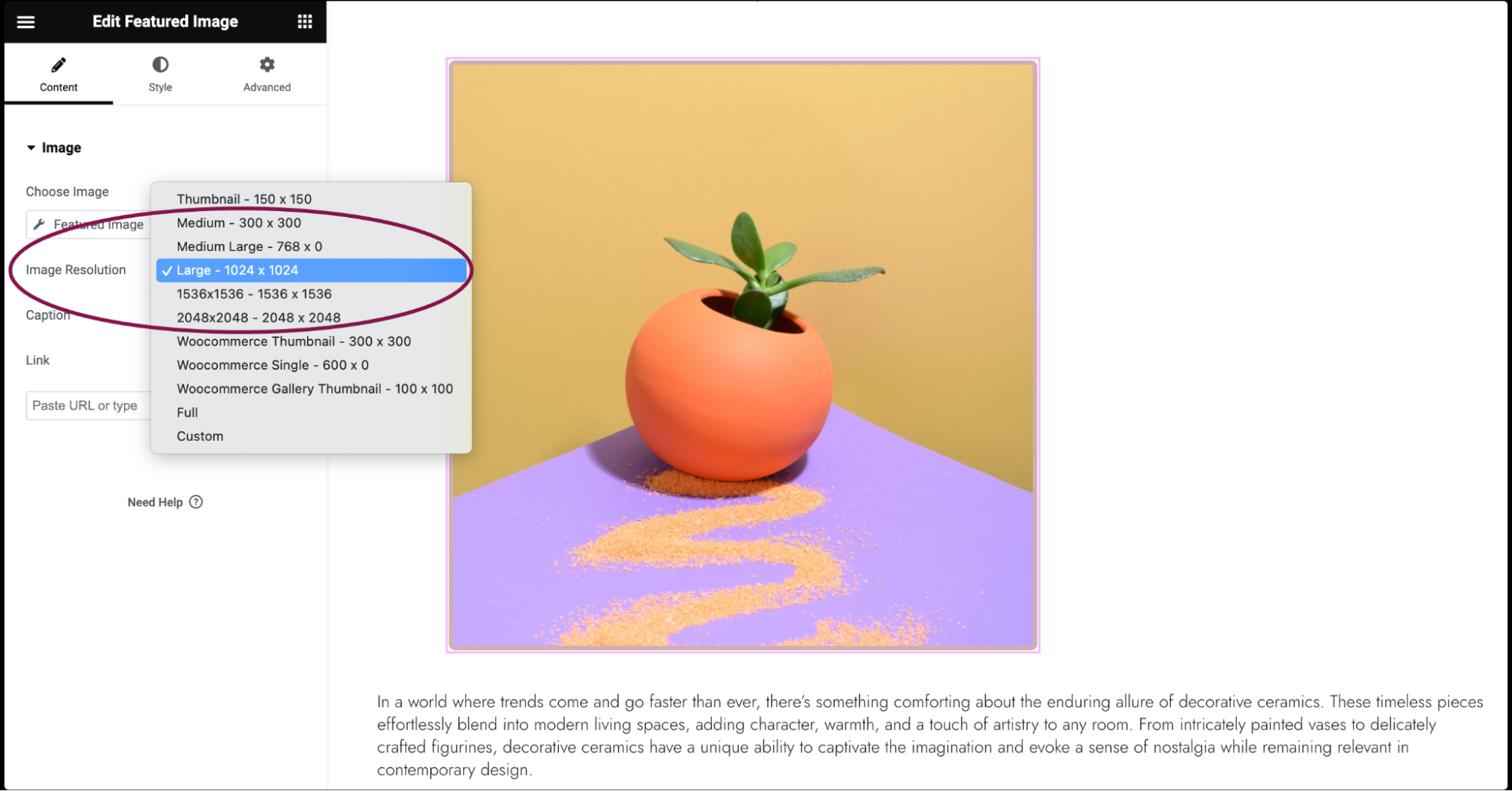
- In the Image Resolution field, select the size of the image, from thumbnail to full, or enter a custom size.
- In the Caption field, choose the text to be included as a caption under every featured image. The options are None, Attachment Caption, or Custom Caption.
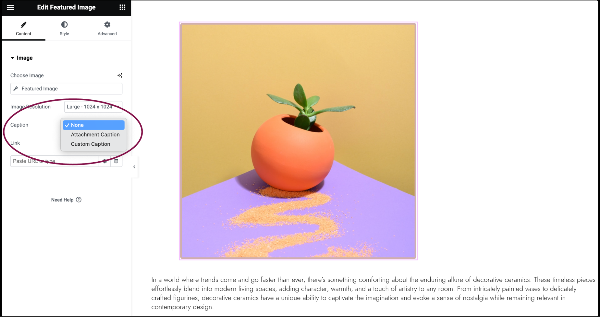 NoteIf you add a custom caption, the same caption text will be displayed under each featured image. This is not dynamic.
 - Use the Link To field to link the image to None, Media File, or Custom URL.
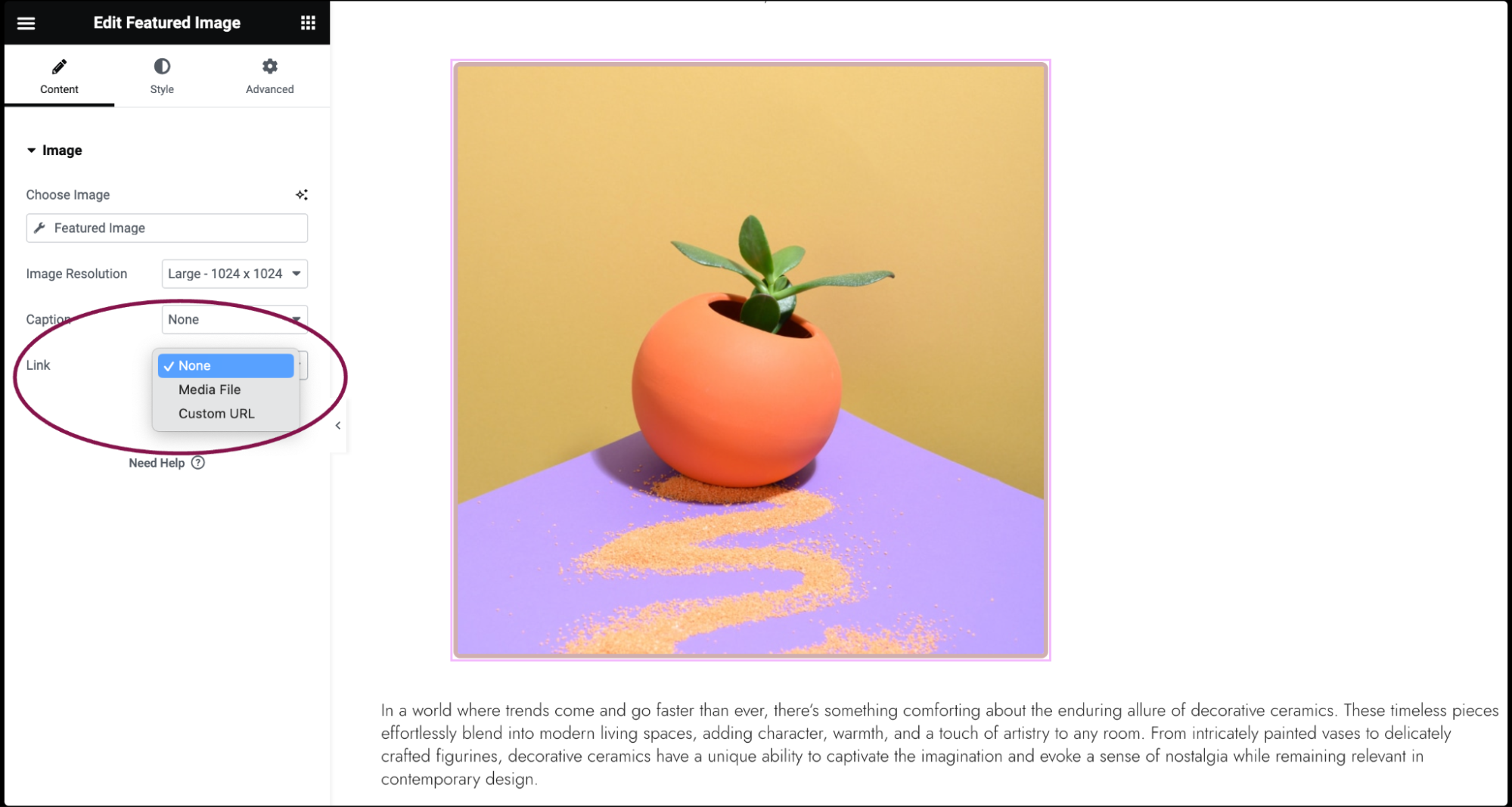
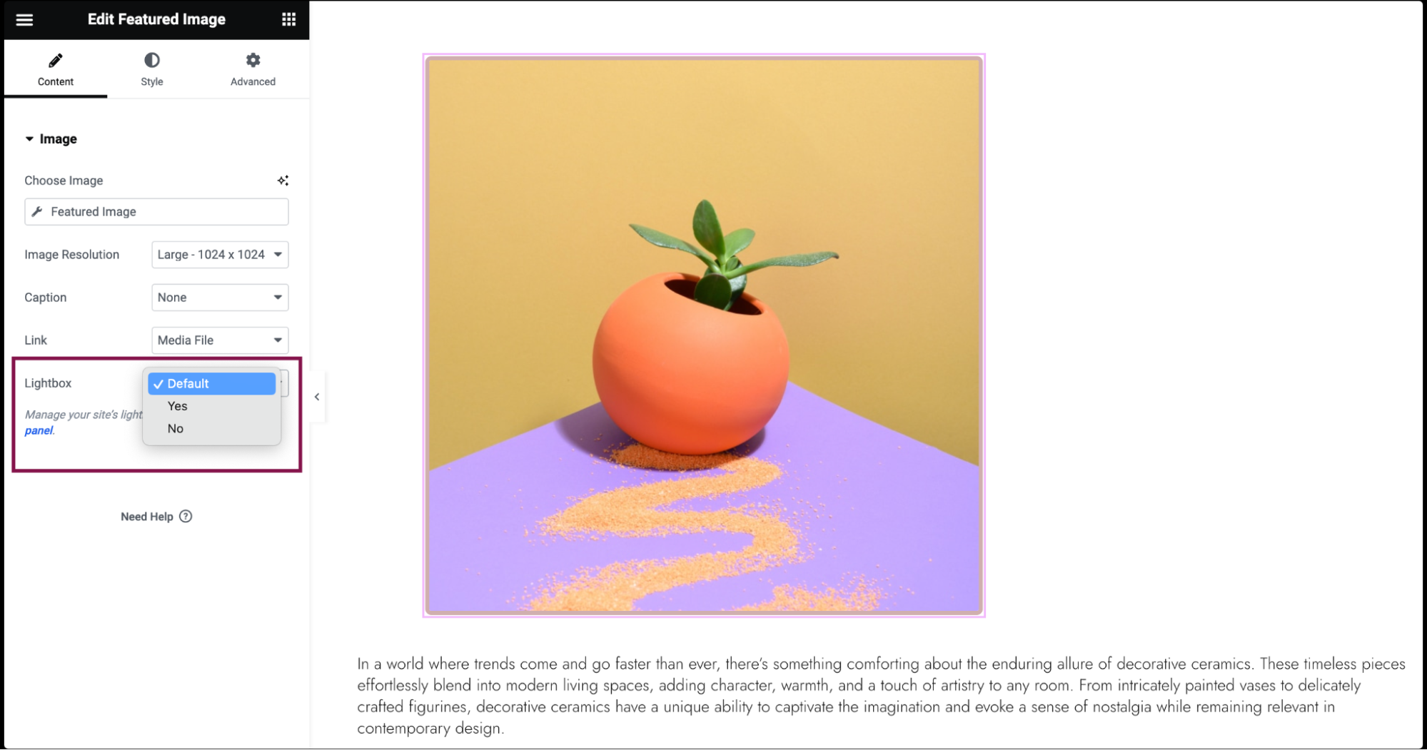
- If you choose Media Files, you get an option to open images in a Lightbox. You can choose whether to show images in a lightbox. Selecting Yes or No will override the default lightbox setting.
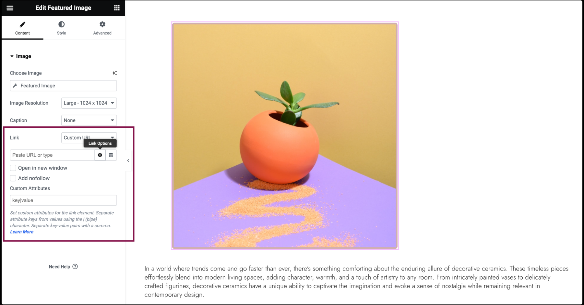
- If you add a Custom URL. Click the ⚙️ to set the link to either open in a new window or to add rel=nofollow to the link, and use the Custom Attributes option to assign custom attributes to the link element. Use the | (pipe) for key-value separation and commas to separate pairs.
- If you choose Media Files, you get an option to open images in a Lightbox. You can choose whether to show images in a lightbox. Selecting Yes or No will override the default lightbox setting.
Settings for the Featured Image widget
You can customize the Featured Image widget using style and other advanced parameters, offering you great flexibility in tailoring them to your needs. Click the tabs below to see all the settings available for this widget.
Content tab
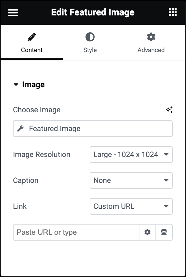
Choose Image
Dynamically displays the featured image of the current post.
Image Resolution
Select the size of the image, from thumbnail to full, or enter a custom size.
Caption
Enter text to be included as a caption under every Featured Image. If you add a custom caption, the same caption will be displayed under each. This is not dynamic.
Link
Choose to link the image to None, Media File, or Custom URL.
- If you choose Media Files, you get an option to open images in a Lightbox. You can choose whether to show images in a lightbox. Selecting Yes or No will override the default lightbox setting.
- If you’re adding a Custom URL. Click the ⚙️ to set the link to either open in a new window or to add rel=nofollow to the link, and use the Custom Attributes option to assign custom attributes to the link element. Use the | (pipe) for key-value separation and commas to separate pairs.
Style tab
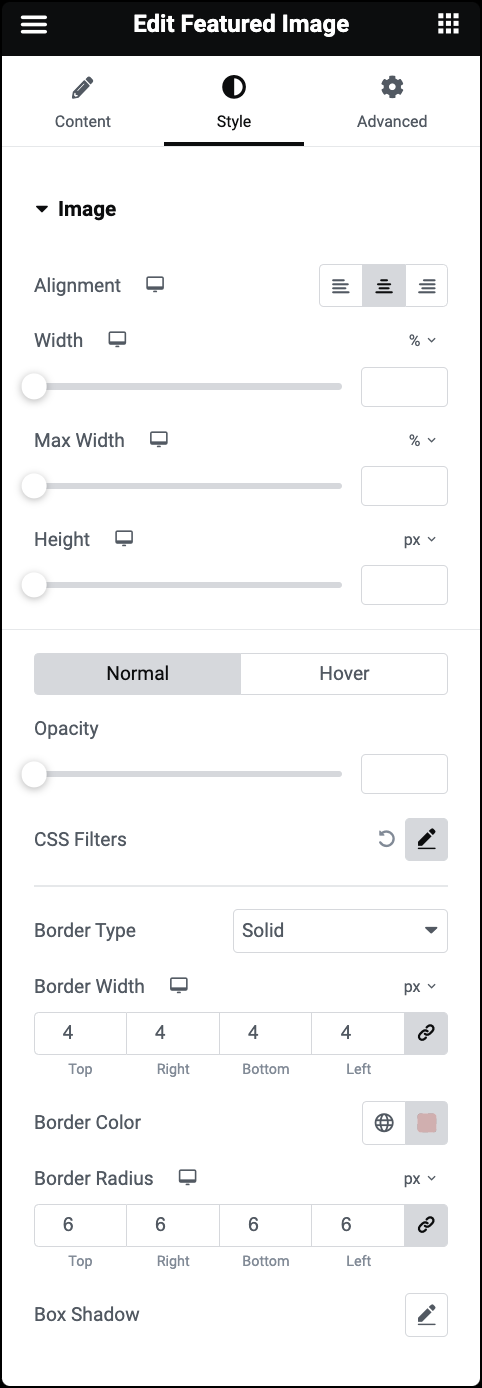
Alignment
Set the image’s alignment to the left, center, or right.
Width
Use the slider to set the width of the image.
Max Width
Use the slider to set the maximum width of the image as a percentage of its container.
Height
Use the slider to adjust the height of the image.
Normal
Determine how the image appears by default.
- Opacity: Adjust the image transparency.
- CSS Filters: Apply filters such as Blur, Brightness, Contrast, and Saturation.
Hover
Determine how the image appears when moused over.
- Transition Duration: Determine the duration of the hover animation.
- Hover Animation: Click the dropdown to choose hover effects that activate when someone hovers over the image.
Border Type
Select a border style from None, Solid, Double, Dotted, Dashed, or Groove. For more details, see Border type.
Border Width
Specify the thickness or width of the border around the featured image.
Border Radius
To create rounded corners around the image, increase the border radius. For more details, see Border radius tools.
Box Shadow
Click the 🖋️ icon to add a shadow to the image. Learn more about shadows.
Advanced tab
The Advanced tab provides options to control widget position, adjust spacing, add custom code, and more.
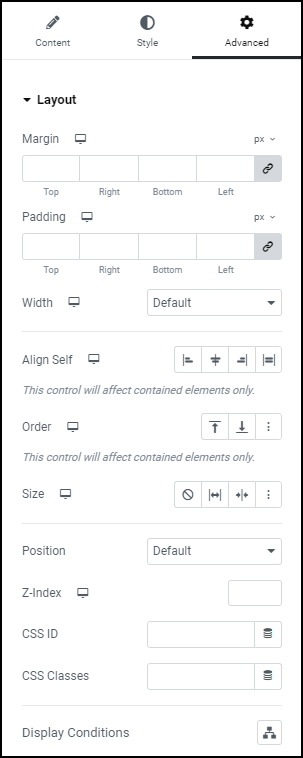
Advanced
Learn more about the Advanced tab settings.

