When you style the elements on your page, you can create three substyles for the element. These substyles are known as states or pseudo-classes. These states are:
- Hover: How the element appears when visitors mouse over it.
- Focus: How the element appears when visitors focus on it, usually by clicking on it or tabbing to it.
- Active: How the element appears when element is selected.
Add a state to an element
To add a state:
- Open the Elementor Editor.
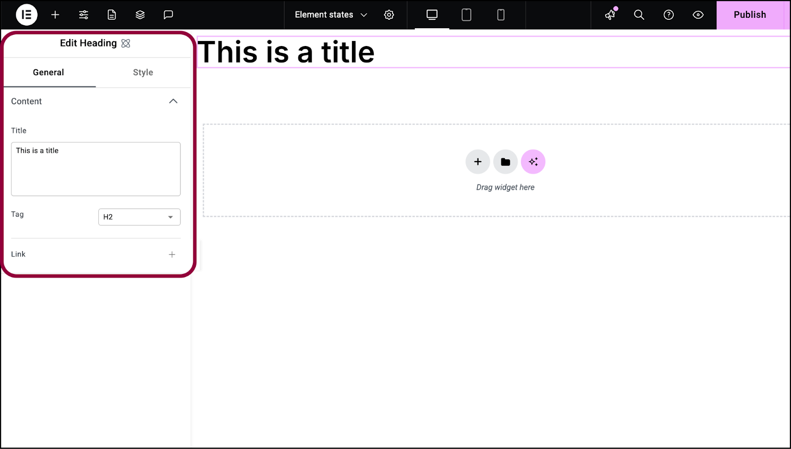
- Select an element.
The options appear in the panel.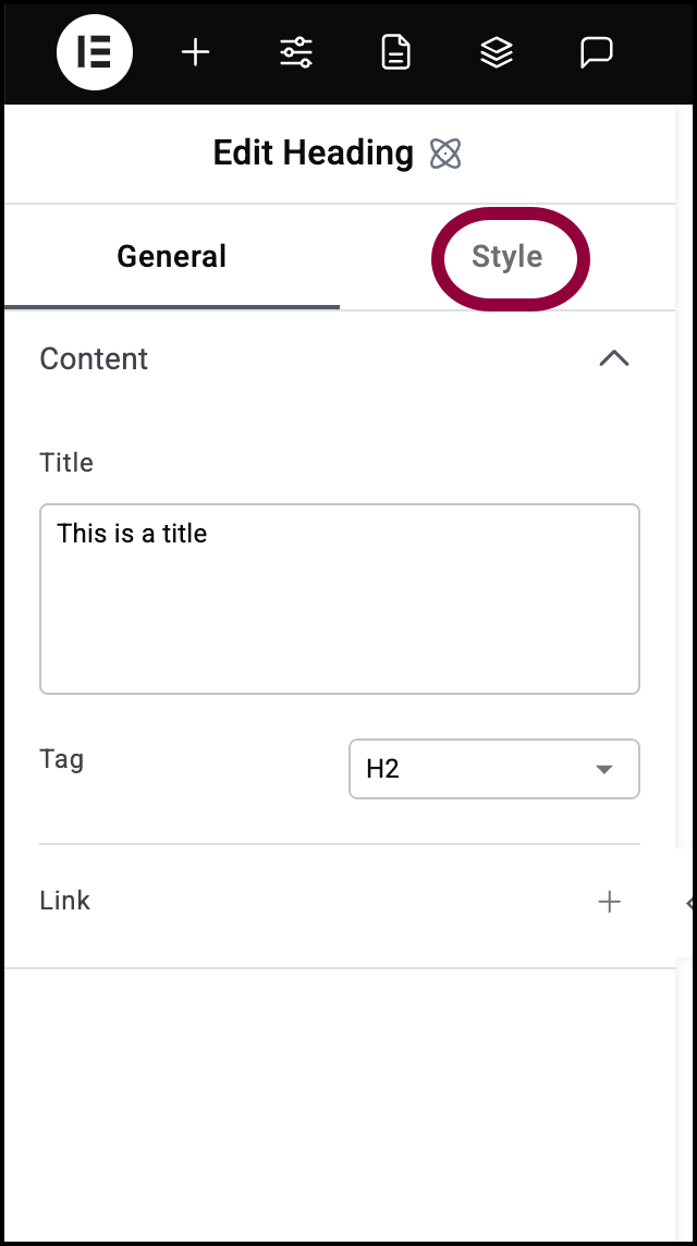
- In the panel, click the Style tab.
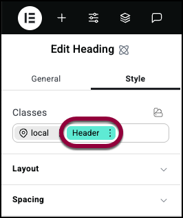
- In the Classes field, locate the class you want to edit.
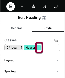
- Click the ellipses.
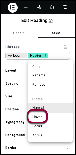
- Select the state you want to edit.
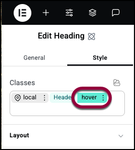
Notice the state appears in the CSS classes field and is colored green. This indicates that you are editing the element in this state. If you edit a local class, the class will be pink instead of green. - Use the Style options to set how the element will appear in the selected state.
For details about the different Style options, see the individual articles on style options: