What is a Floating Bar?
Floating Bars are templates, not widgets or other elements. Floating bars are added from WP Admin, not from the Elementor Editor. For details see below, Creating a Floating Bar: Step-by-Step.
Common use case
Jan owns a clothing store. Forecasts are predicting a couple weeks of rain so they want to draw attention to their umbrella selection. To make sure everyone knows they sell umbrellas, they add a Floating Bar to their website so its visible on all pages.
Example

Additional use cases
- Sales: Run sales from your website by offering coupon codes from a Floating Bar.
- Navigation: Want to draw visitors to a new or special section of your site? Use a Floating Bar as a quick navigation tool.
- Action Trigger: Use the CTA button on the Floating Bar to encourage your users to sign up for newsletter of take other actions.
Adding a Floating Bar: Step-by-step
In the example below, we’ll create a Floating Bar that will allow users to open a chat with a customer representative. This Floating Bar uses an Elementor Floating Bar template.
Create the template
Floating bars are based on templates, therefore you must create a template before adding a Floating Bar.
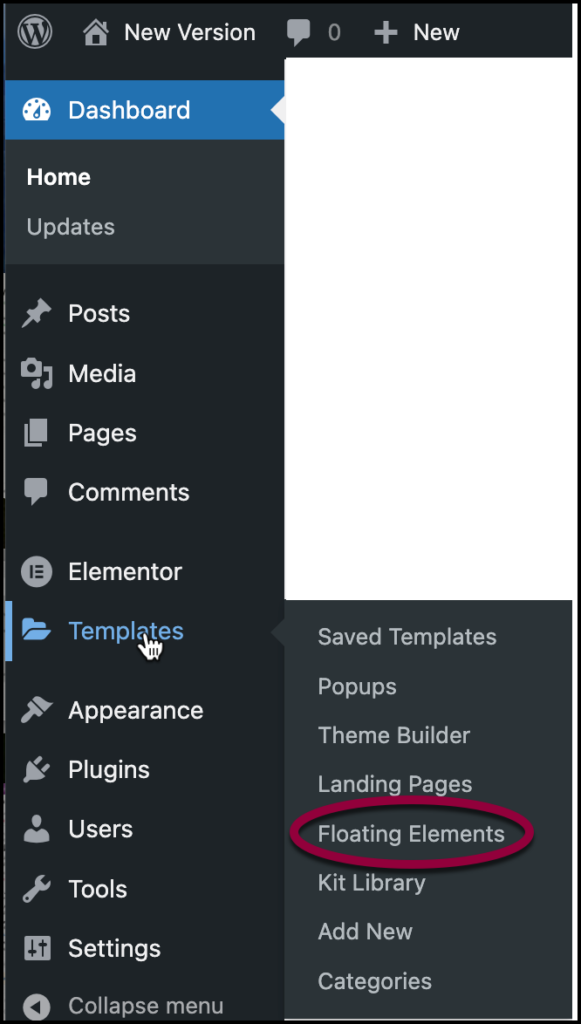
- From WP Admin, navigate to Templates>Floating Elements.
The create floating element pane opens up on the right.NoteAfter you create your first floating element, you can create more elements by going to WP Admin and clicking Templates>Add New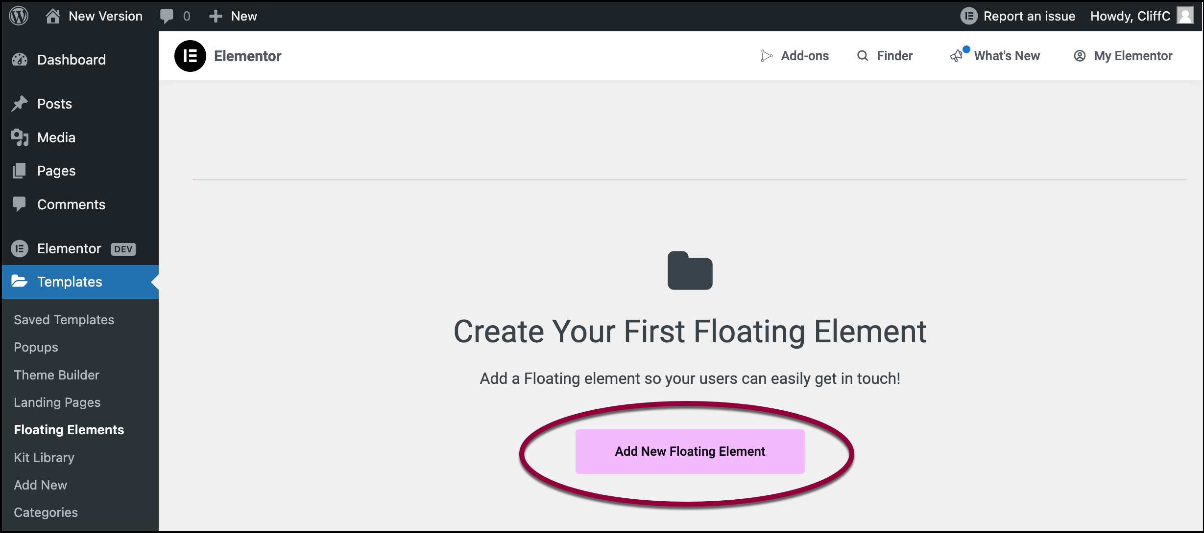
- Click Add New Floating Element.
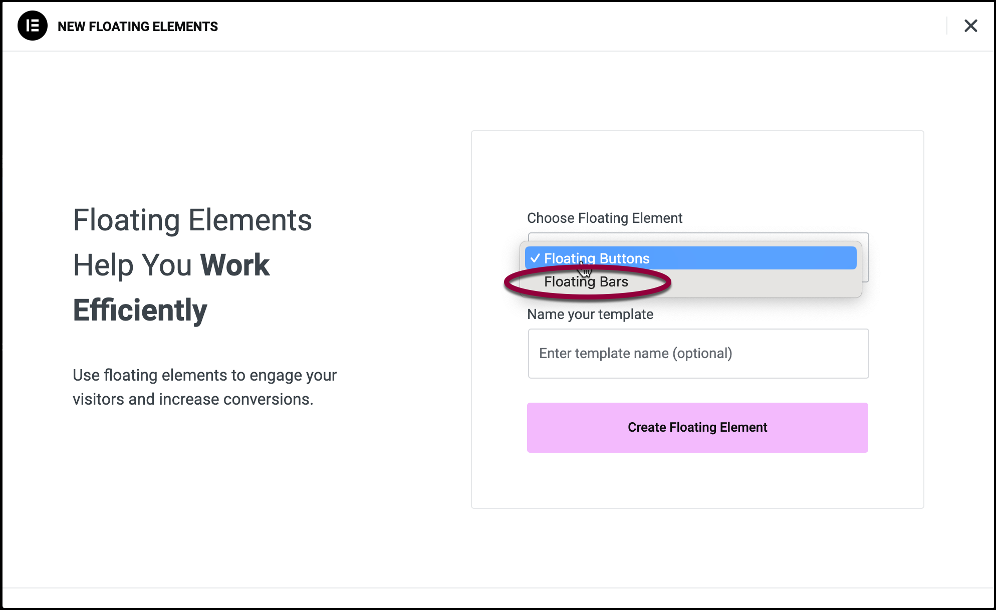
- Select Floating Bars from the dropdown menu.
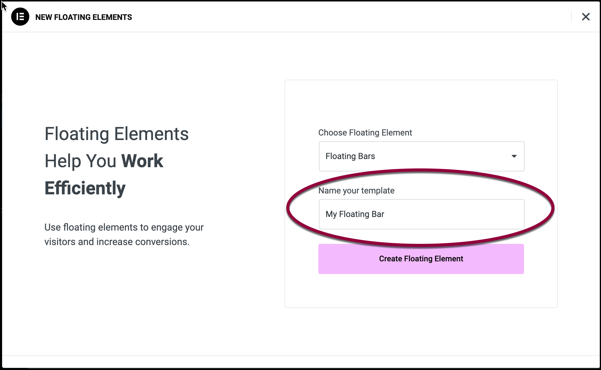
- (Optional) Name your Floating Bar in the name field.
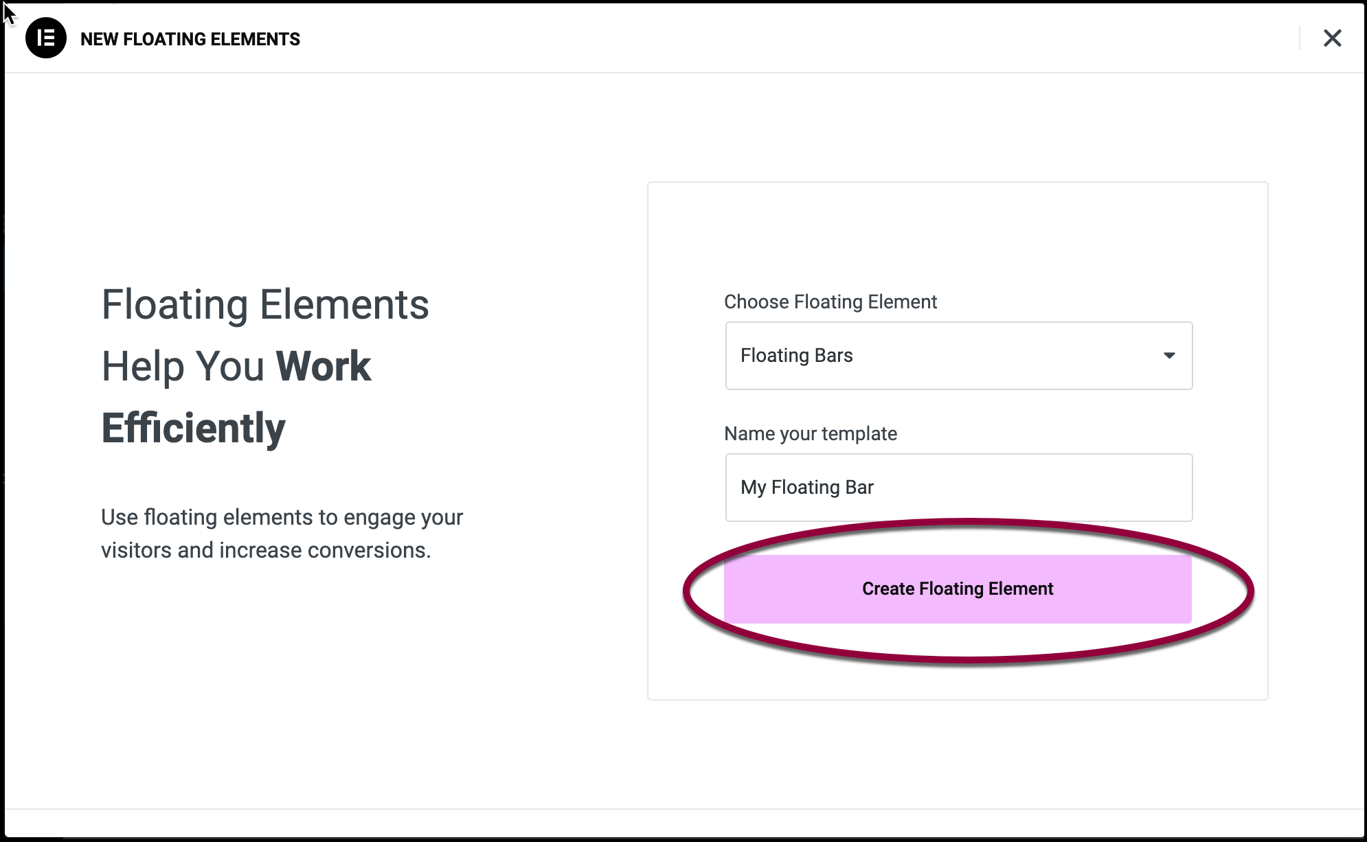
- Click Create Floating Element.
The Template Library opens to the Floating Bars section. You must select one of these templates in order to create a Floating Bar.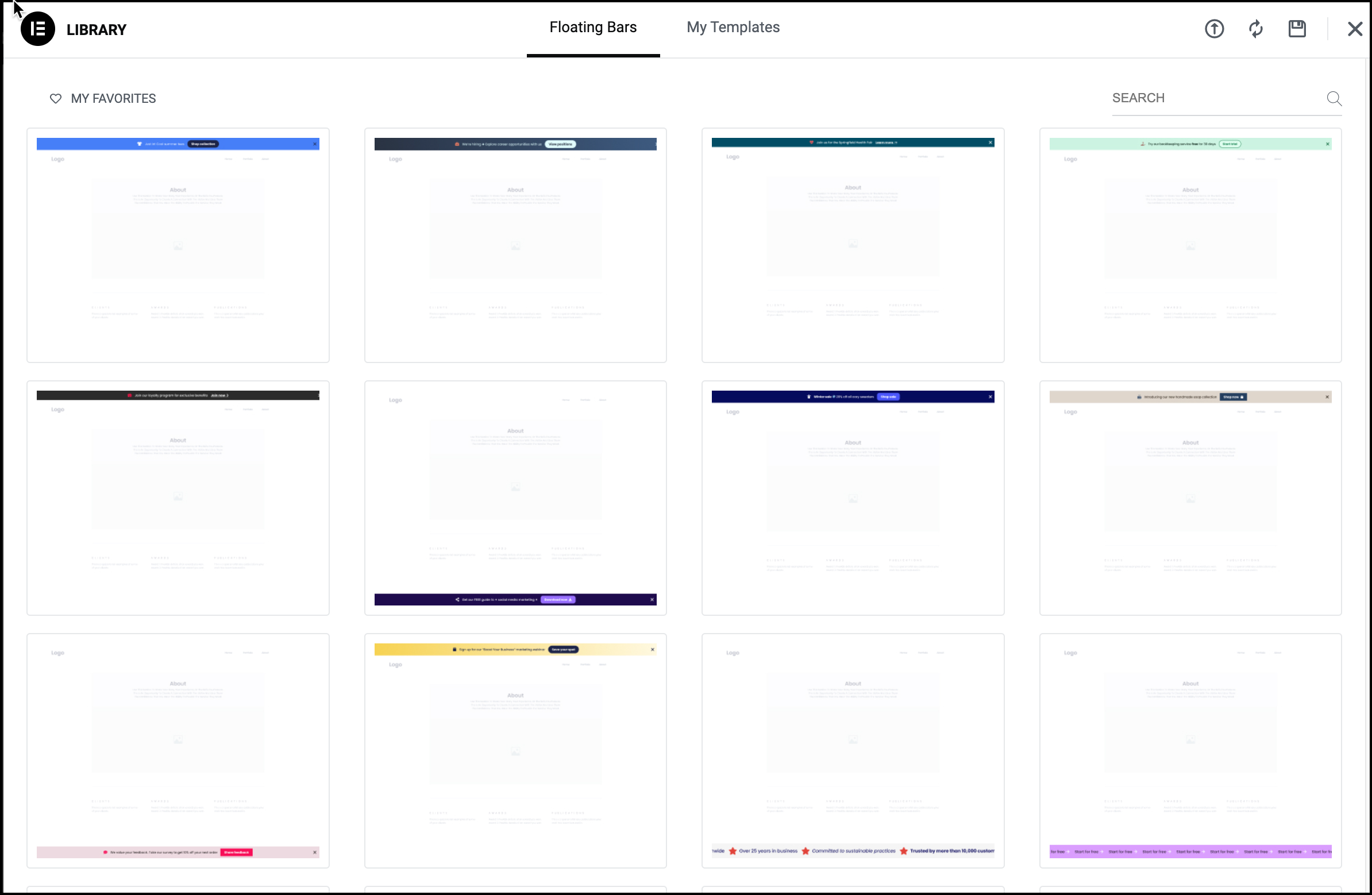 NoteTemplates marked Pro are only available to Elementor Pro users.
 - Select a Floating Bar template by hovering over it and clicking Insert.
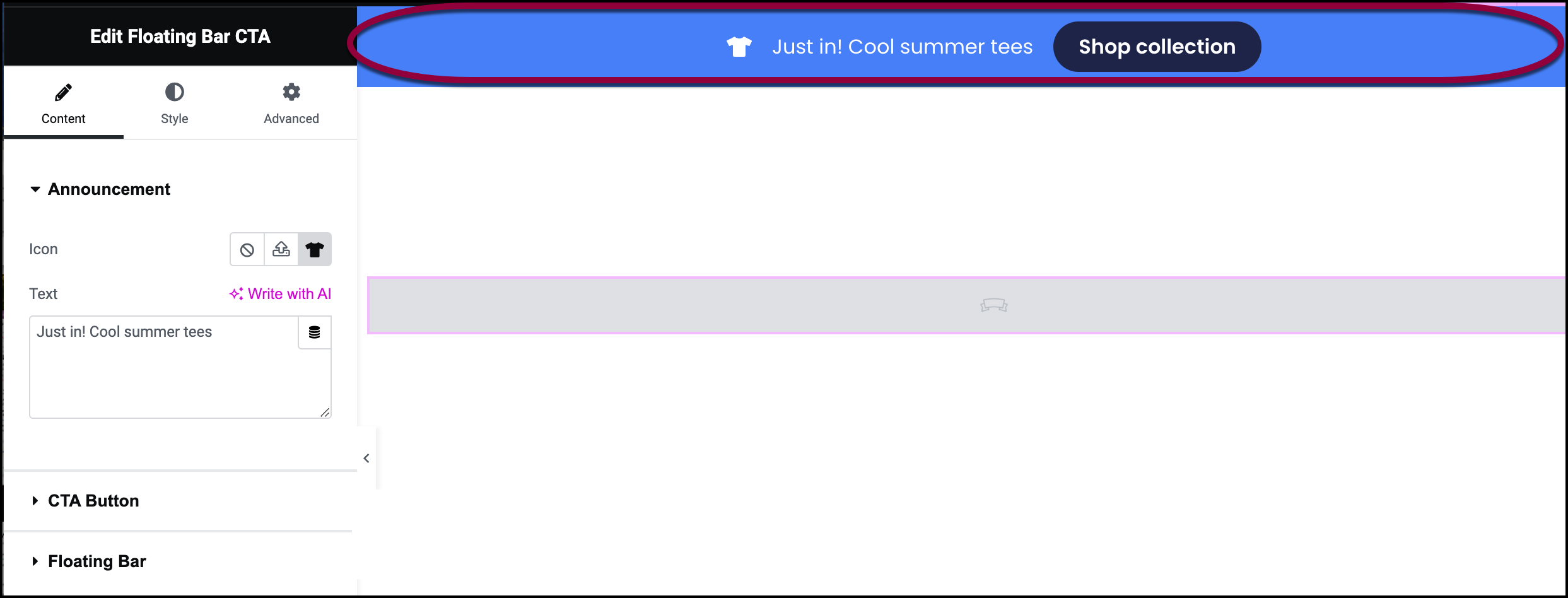
The template appears in the canvas of the Elementor Editor.
Editing the Floating Bar
The Panel offers a number of options, depending on which template you choose. In this example, we’ll change the message displayed in the bar, the icon, the CTA and the placement of the bar.
- In the panel, locate the Icon field.
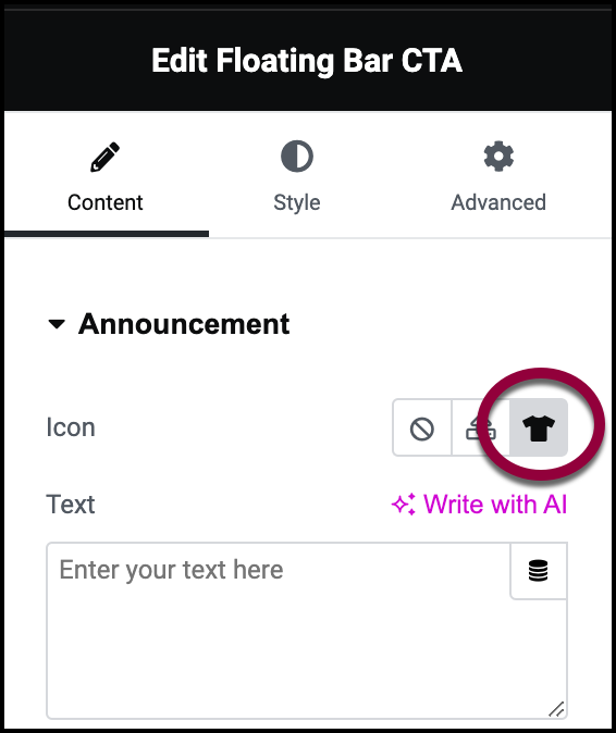
- Click the icon on the right.
The icon library appears.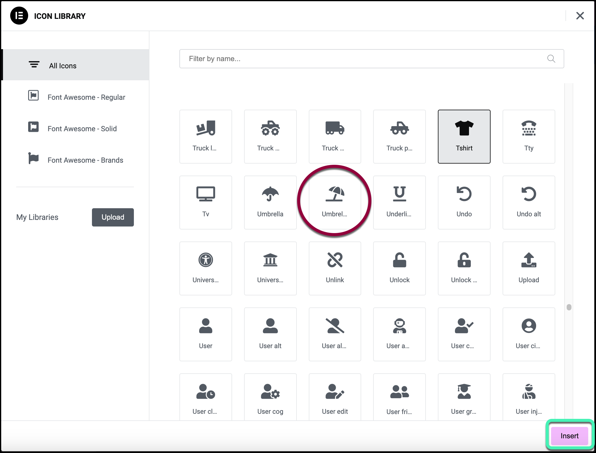
- Select the umbrella icon from the library and click Insert.

- In the Announcement field, enter Stormy Weather? Check out our umbrellas.
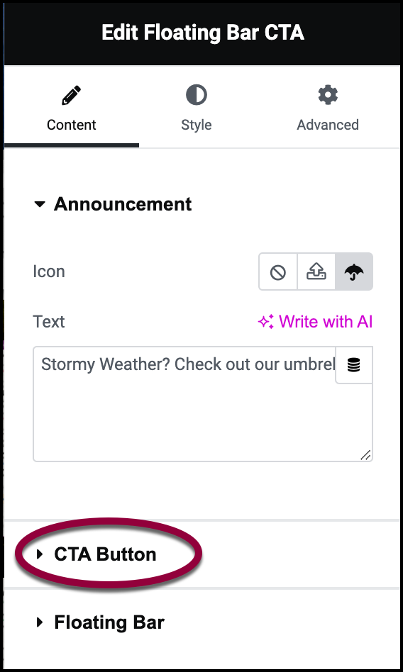
- Open the CTA Button field.
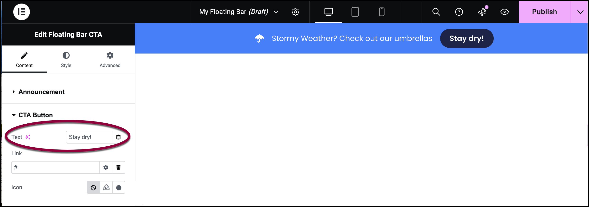
- Change the Text field to Stay dry!
In a real online store, this is where you would put a link to the relevant page.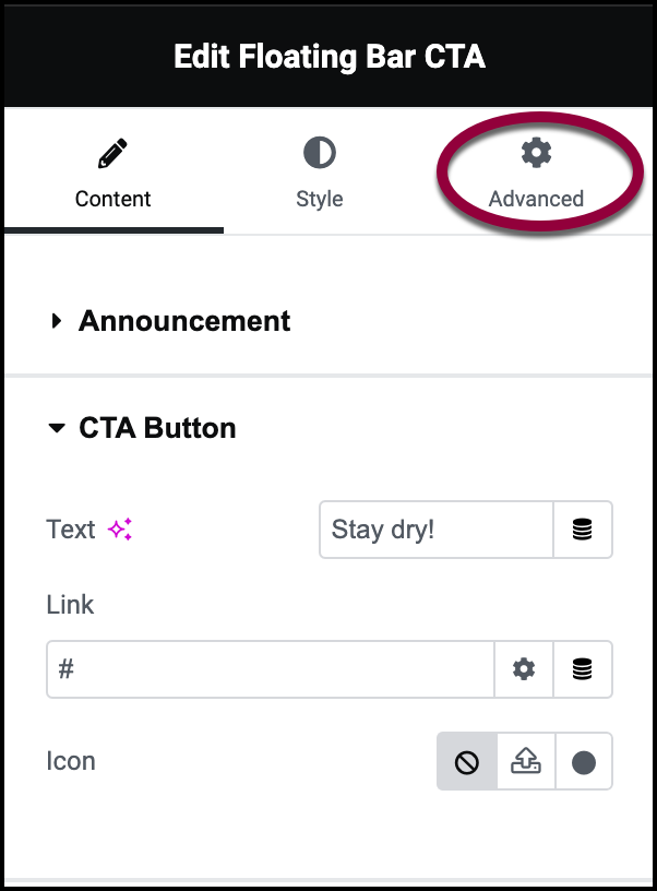
- Open the Advanced tab.
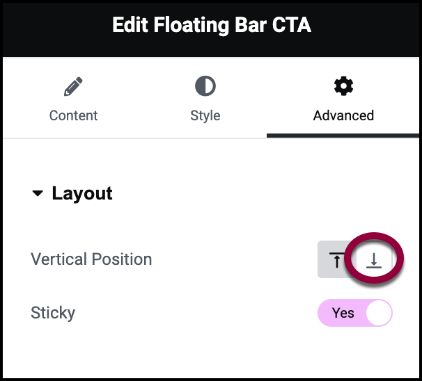
- Click the bottom icon.
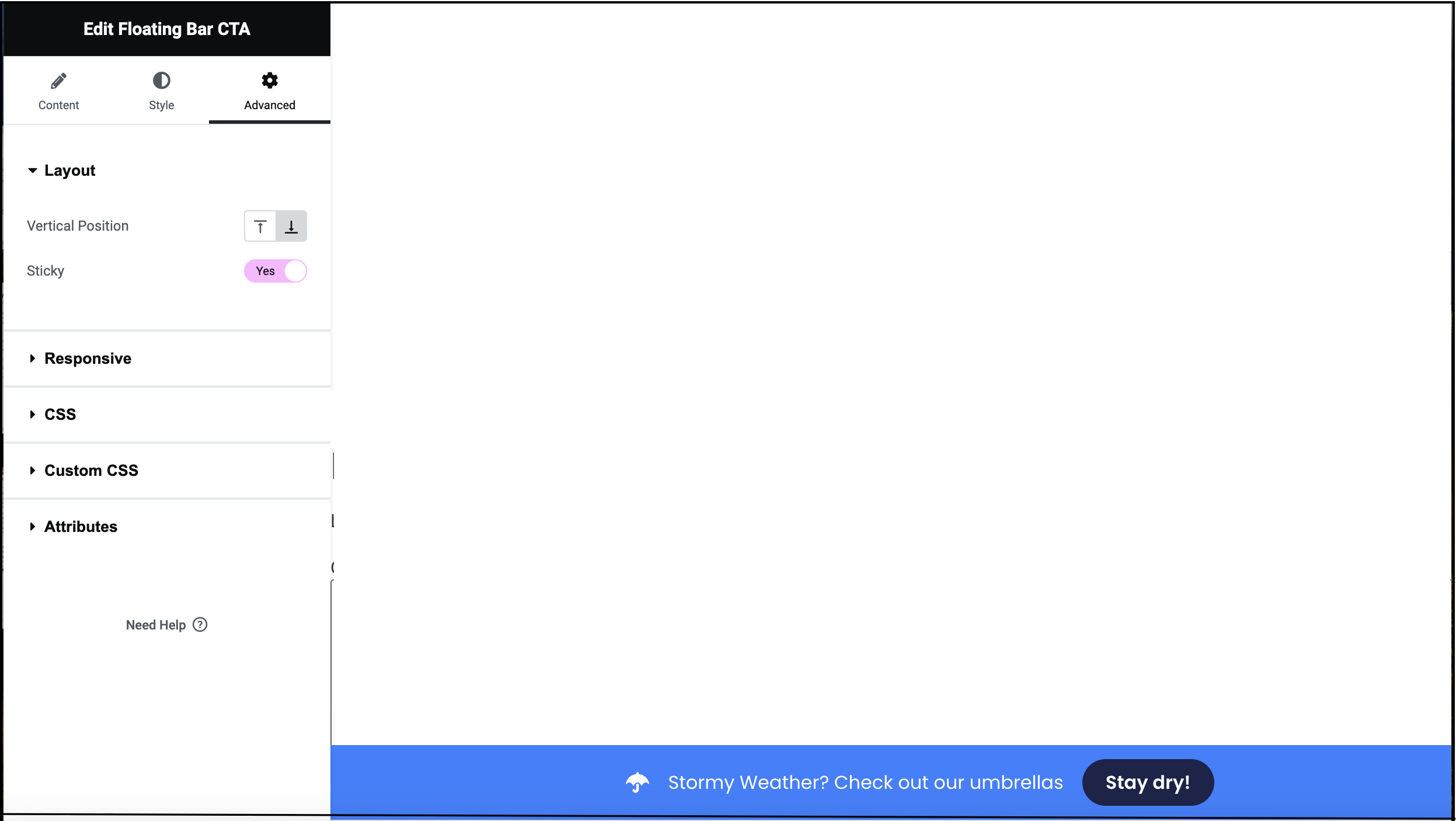
The Floating Bar now appears at the bottom of your screen.
- In the upper-right corner, click Publish.
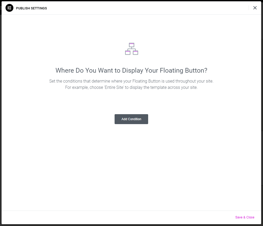
- Click Add Condition.
- (For Elementor Pro users only) Set conditions for the floating bar to appear. This way you can control where in your site it appears. For more details, see Set display conditions for global templates.
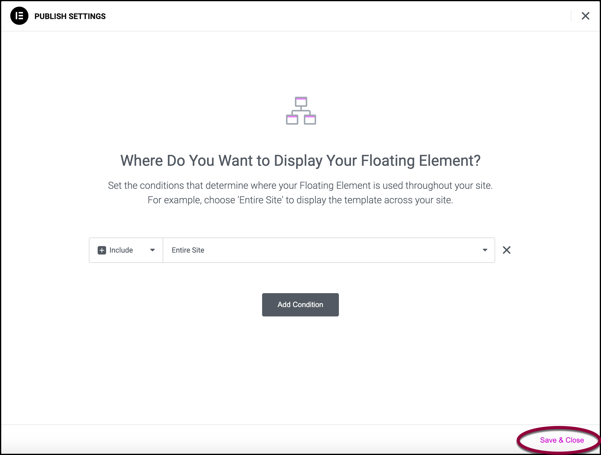
- Click Save & Close.
The floating bar will now appear on the designated pages.
Floating Bar Options
Below are the most common options you’ll find in Floating Bar templates. There are a wide range of Floating Bar templates so some may have different options or layout.
The Content tab
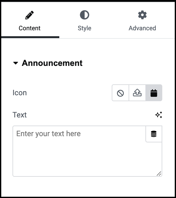
Icon
Insert an icon into the top bar. For details, see Adding images and icons.
Text
Add a short text to insert in the top bar. In general you do not want the text to be longer than one line.
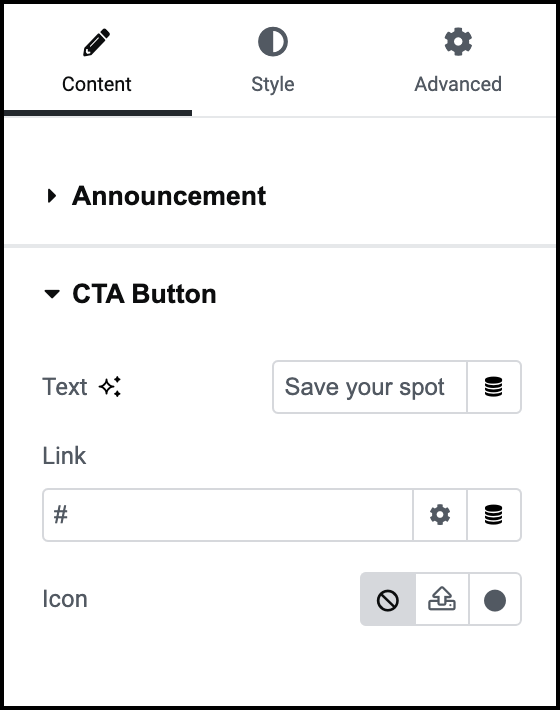
Text
A few words that will appear on the CTA button. This text is usually only two or three words.
Link
The CTA button usually contains a link. This can be a popup, a website page or any other action that can be triggered by a link.
Icon
The CTA button can contain an icon. For details, see Adding images and icons.
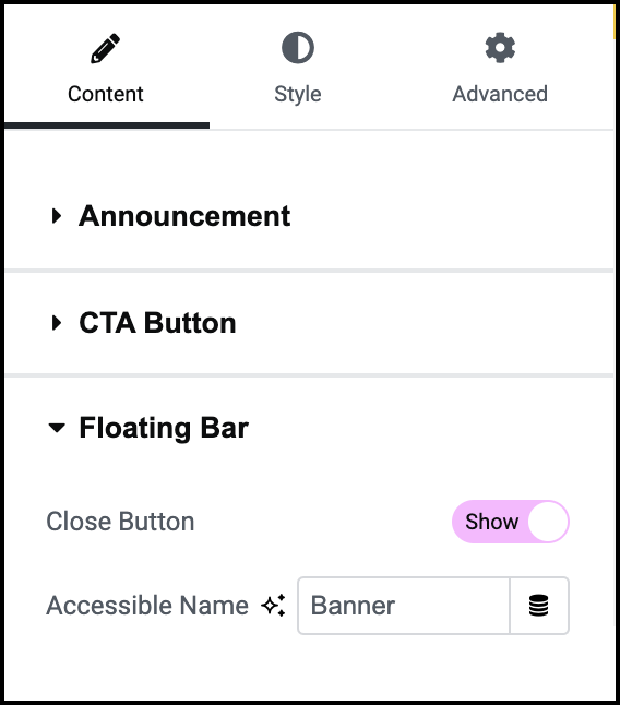
Close Button
Toggle to Hide if you do not want visitors to be able to close the Floating Bar.
Accessible name
Give the Floating Bar a name that will be used by readers for those visitors with accessibility issues.
The Style tab
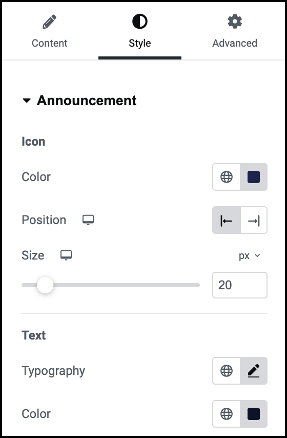
Icon
If you decide to use an icon, determine its properties:
- Color: Choose a color for the icon. For details, see Pick a color.
- Position: Place the icon to the right or left of the announcement text.
- Size: Set the size of the icon.
Text
Set the look and feel of the announcement text.
Typography: Determine the size and font of the announcement text. For details, see Typography.
Color: Determine the color of the announcement text. For details, see Pick a color.
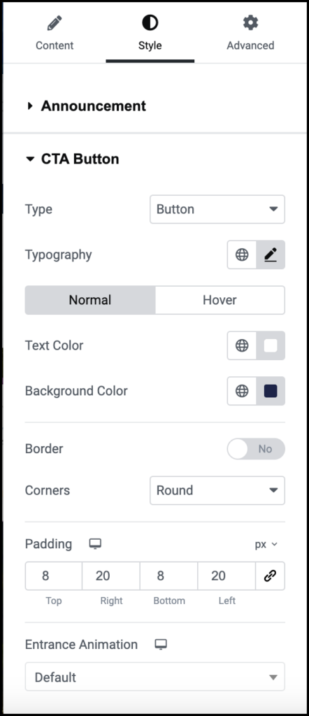
Type
The Floating Bar has two types of Calls-to-Action. Use the dropdown to select between:
- Button
- Link
Typography
Determine the text size and font. For details, see Typography.
Normal/Hover
Control the text and background color depending on mouse location.
- Normal: Determine how the CTA appears by default.
- Hover: Determine how the CTA button appears when moused over.
Text Color
Select a text color. For details, see Choose a color or Use global fonts and colors.
Background Color
Select the CTA’s background color. For details, see Choose a color or Use global fonts and colors.
Border
Toggle to Yes to add a border to the CTA button. If you add a border, you will need to select a border color and width.
Corners
Use the dropdown menu to select:
- Round: Buttons appear with a smooth corner.
Rounded: Buttons appear with evenly curved edges.
Sharp: Rectangular buttons.
Padding
Learn how to create space with padding and margins.
Entrance Animation
By default, the CTA button appears in the Floating Bar. You have the option of animating the button, and having it appear in a variety to ways. If you choose to animate the button, use the dropdown to choose an animations style.
If you animate the button, do, the Animation Duration appears. Use the slider to determine the amount of time the animation will last.

Close Button
Be default, Top Bars have a button visitors can use to hide the Top Bar. You can determine the look and position of the Close button:
- Horizontal position: Determine whether the Close button will appear on the right or left of the Floating Bar.
- Color: Determine the color of the Close button. For details, see Choose a color or Use global fonts and colors.
- Size: Use the slider to determine the size of the Close button.
Align Elements
The announcement text, icon and CTA button, are the elements of the Floating Bar. Use the icons to align these elements to the:
- Left
- Center
- Right
- Stretch: have the elements spread across the Floating Bar.
Element Spacing
Determine how much space there is between the announcement text, icon and CTA button.
Padding
Add padding to the announcement text, icon and CTA. For details, see Padding and margins.
Background
Add a background to the Floating Bar. For details, see Create a Background.
Background Overlay
Add a background to the Floating Bar that has some transparency to it.
The Advanced tab
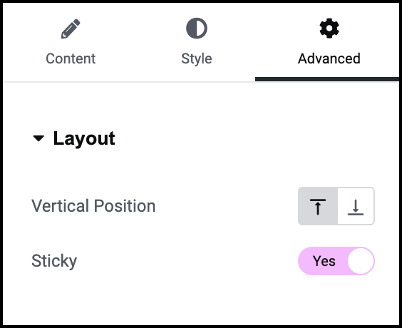
Vertical Position
Use the icons to place the Floating Bar at the top or bottom of the screen.
Sticky
Toggle to No if you want the Floating Bar to disappear as visitors scroll down the page.
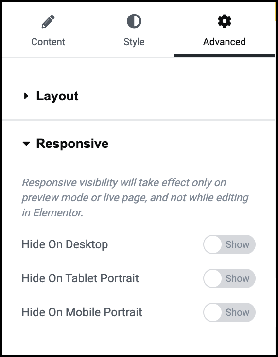
Open On
Allows you to choose when the dropdown menu will activate, when you select it (Click), or when you mouse over it (Hover).
Animation
You can choose to have your dropdown slowly appear. If you do, Animation Duration determines the amount of time it will take for the dropdown to fully appear.
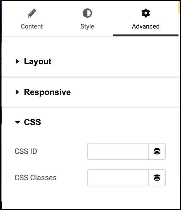
CSS ID
Give the Floating Bar a CSS ID so it can be identified. For details, see CSS ID.
CSS Classes
Give your floating Bar a CSS Class. For details, see CSS Classes in Elementor.
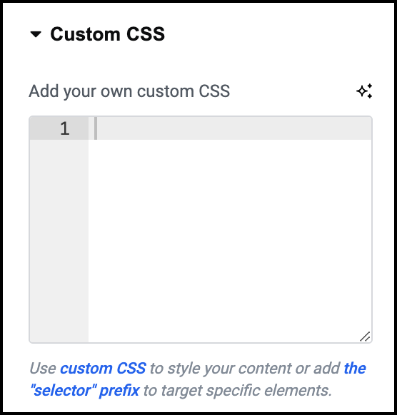
Custom CSS
Add custom CSS to the Floating Bar. For details, see Add Custom CSS.
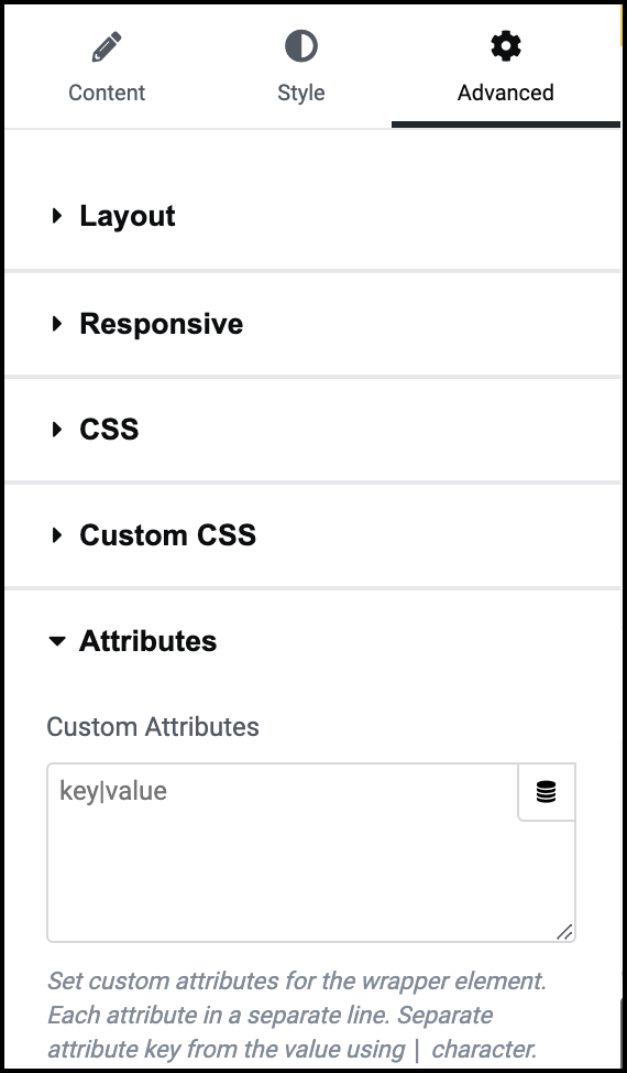
Attributes
Add Attributes to the Floating Bar. For details, see Custom attributes.

