Who can use this feature:
This article is for Editor v4 users. If you’re using Editor v3, check out the relevant article here: Advanced tab
The Size control sets the height and width of an element. 
There are three types of size settings:
- Unmodified: The height and width of the element under normal circumstances. This setting lets the content decide the element size.
- Min: The smallest width an element can shrink to, even if the content inside it or the surrounding layout suggests it should be smaller. Helps balance design with responsiveness.
- Max: The largest width an element can grow to, even if the screen or content allows it to be larger. Helps balance design with responsiveness.
- Overflow: If the element’s contents are too large for the element, you can set the overflow to:
- Visible: The contents are visible even though they are outside the element’s boundaries.
- Hidden: Contents outside the element’s boundaries are hidden.
- Auto: Contents outside the element’s boundaries can be seen by scrolling.
Change an element’s size
In the example below, we’ll create an image that will be responsive and stay within design constraints.
To set the height and width of the element:
- Open the Elementor Editor.
- Add a Div Block to the canvas.
- Drag an Image element into the Div Block.
The options for the Image element should appear in the panel.
- Add an image to the widget. For details, see Adding images and icons.
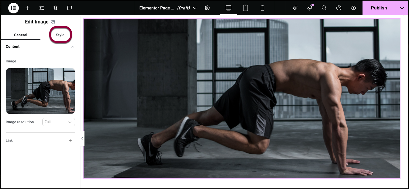
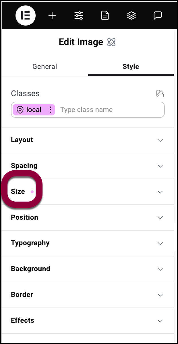
- Click the Style tab.
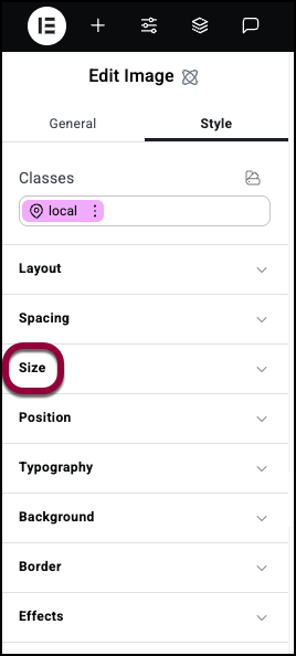
- Open the Size field.
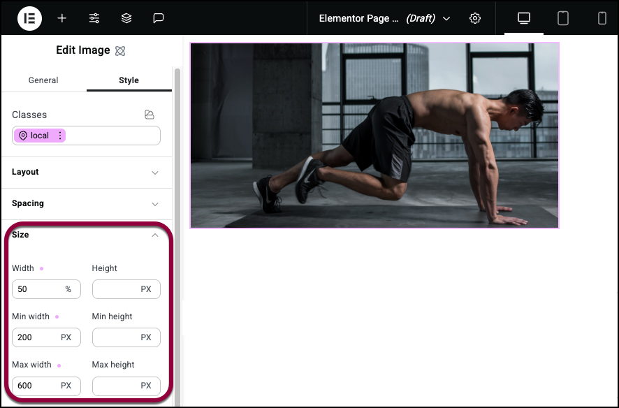
- Set the default width to 50% so the element size will adjust based on its parent container.
- Set minimum width to 200px to prevent the image from becoming too small.
- Set maximum width to 600px to ensure it does not stretch out of proportion.
- Leave the default heights.
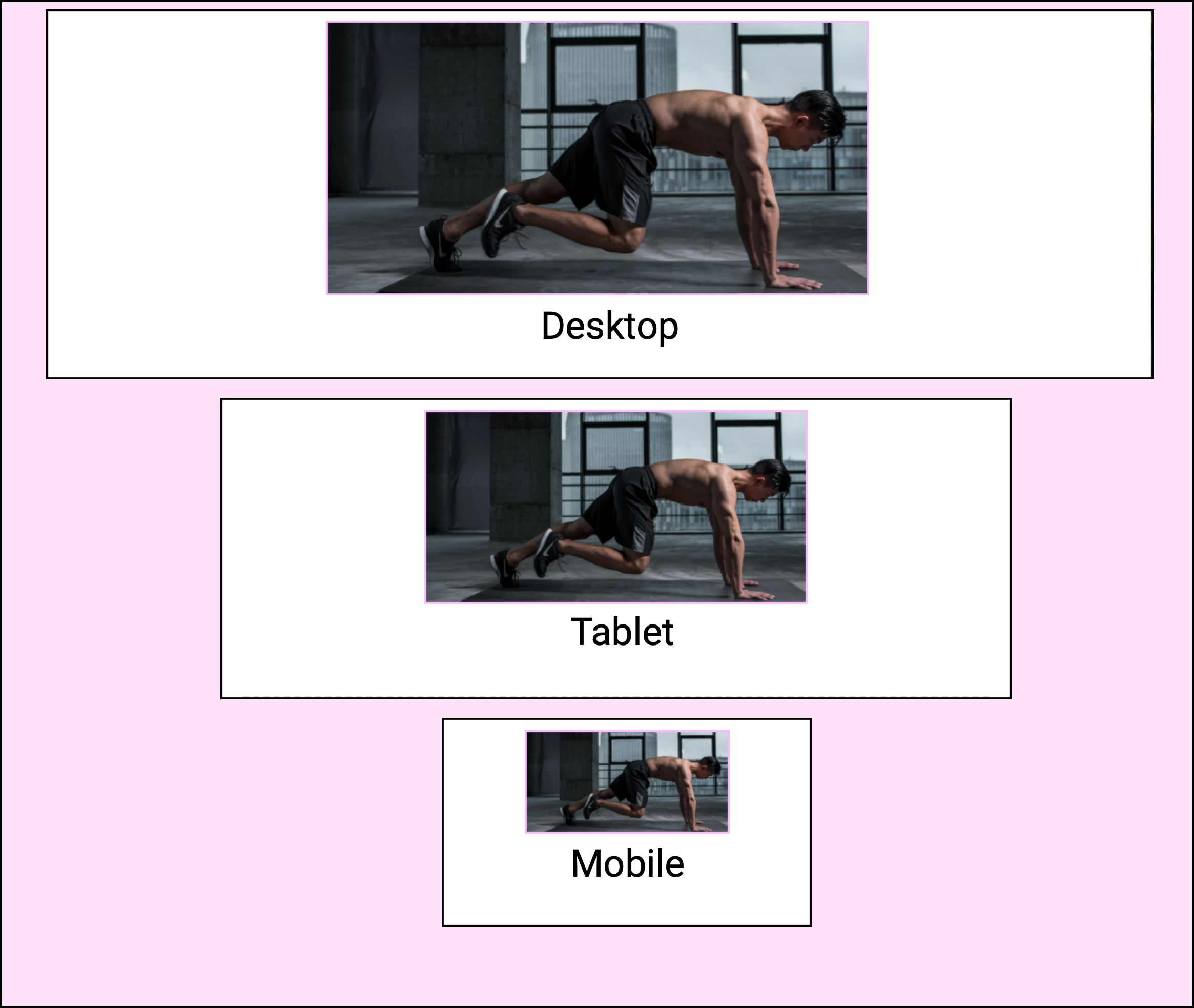
This creates an image that looks good on a variety of screen sizes.
Maintain image proportions with Object fit
The Size tab has a special control, mostly used for images, designed to maintain the proportions of the element’s content called Object fit.
To use Object fit:
- Add an image to the canvas using the Image element.
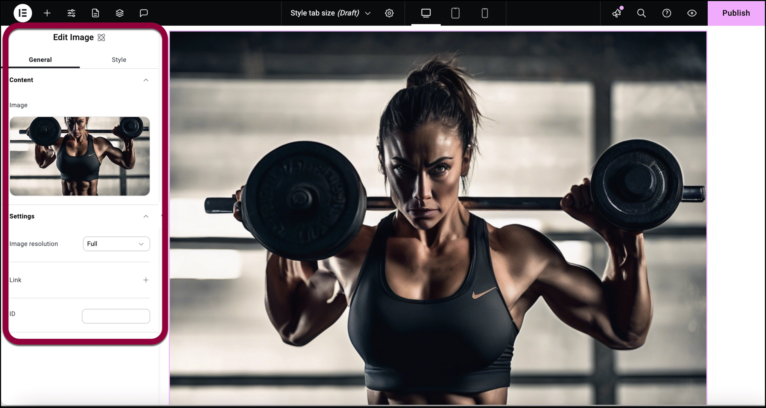
The controls appear in the the left panel.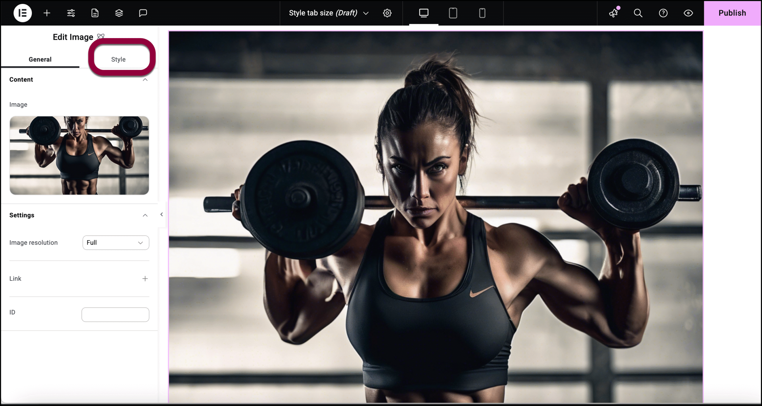
- Click the Style tab.
- Open the Size field and change the image size.
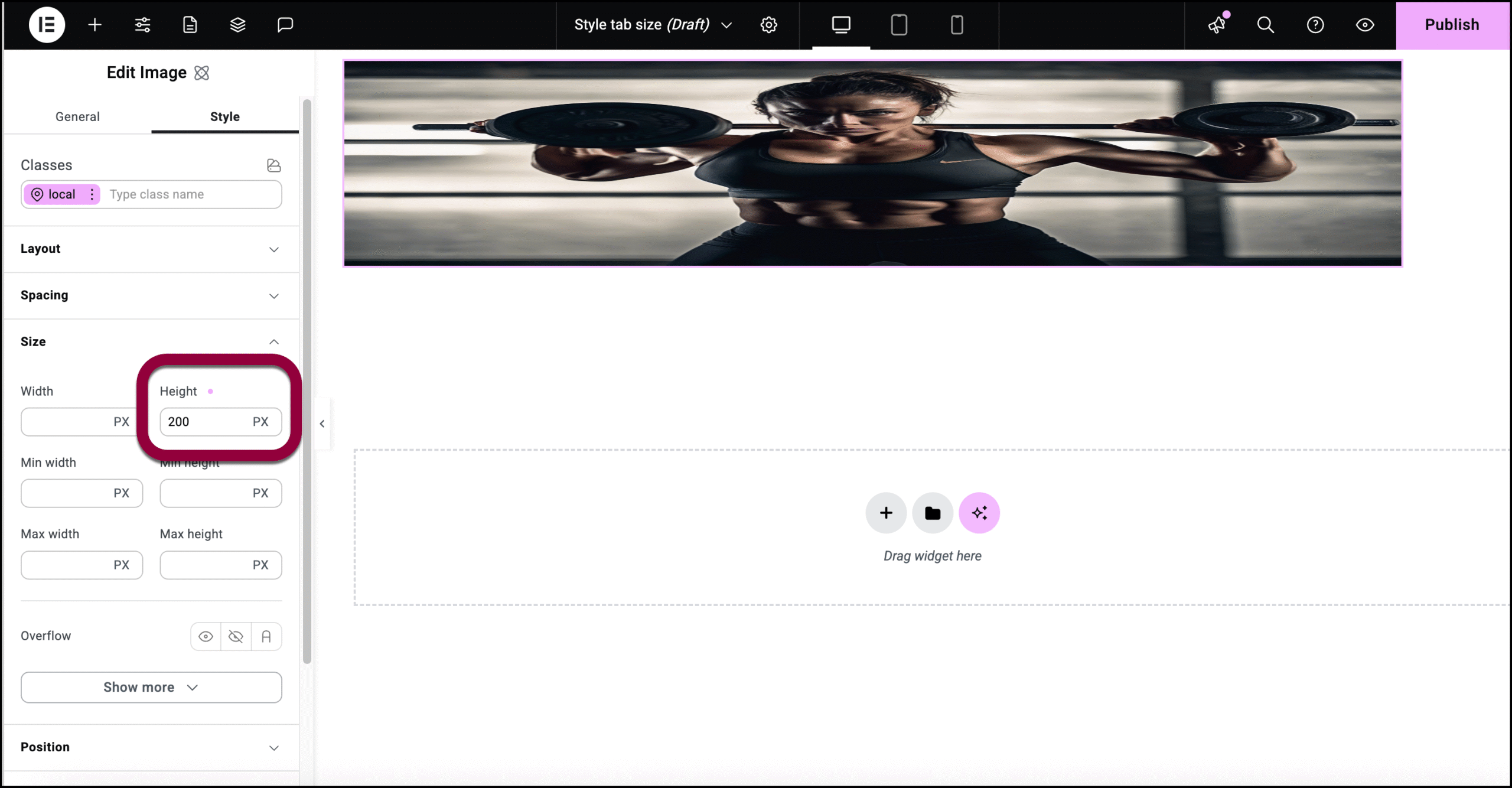
In this example, we changed image height which distorted the image.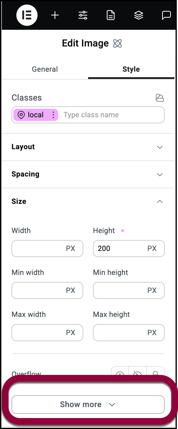
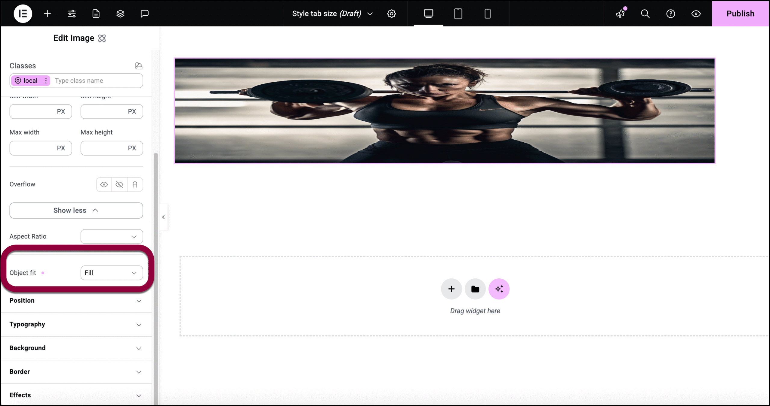
- In the panel, click Show more.
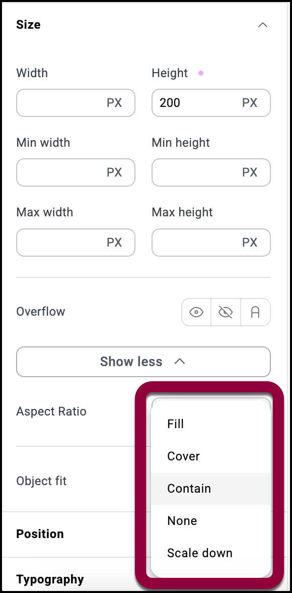
- Use the Object fit dropdown to choose one of the options:
- Fill:
The image fills the area as you set it. - Cover:
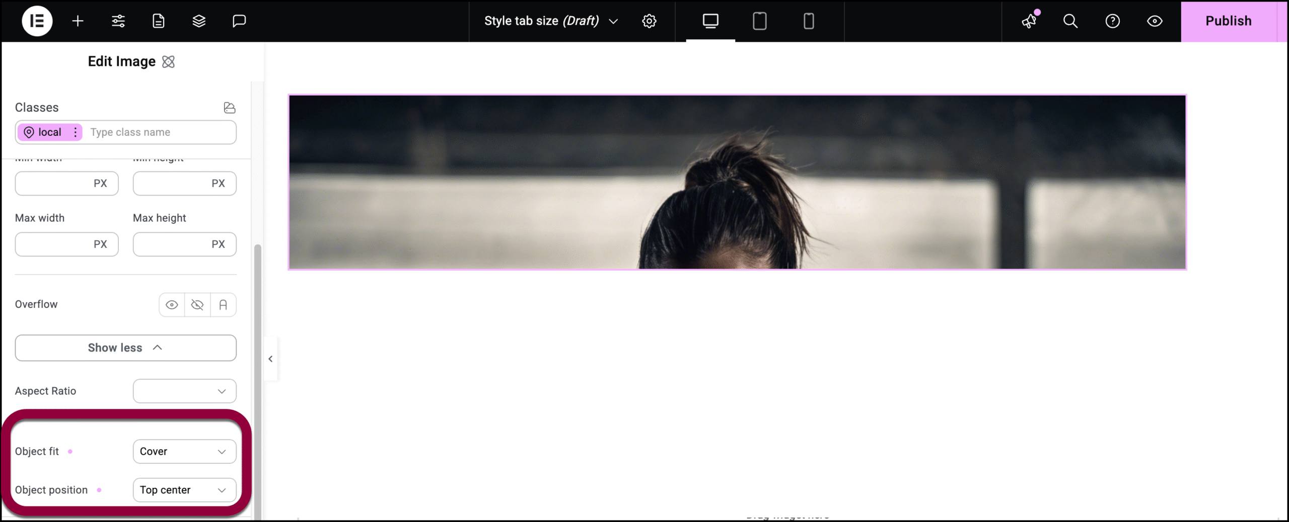
The image maintains its original part but only part of it is visible. If you select Cover, the Object position menu appears and you can use it to determine what part of the image is visible. - Contain:
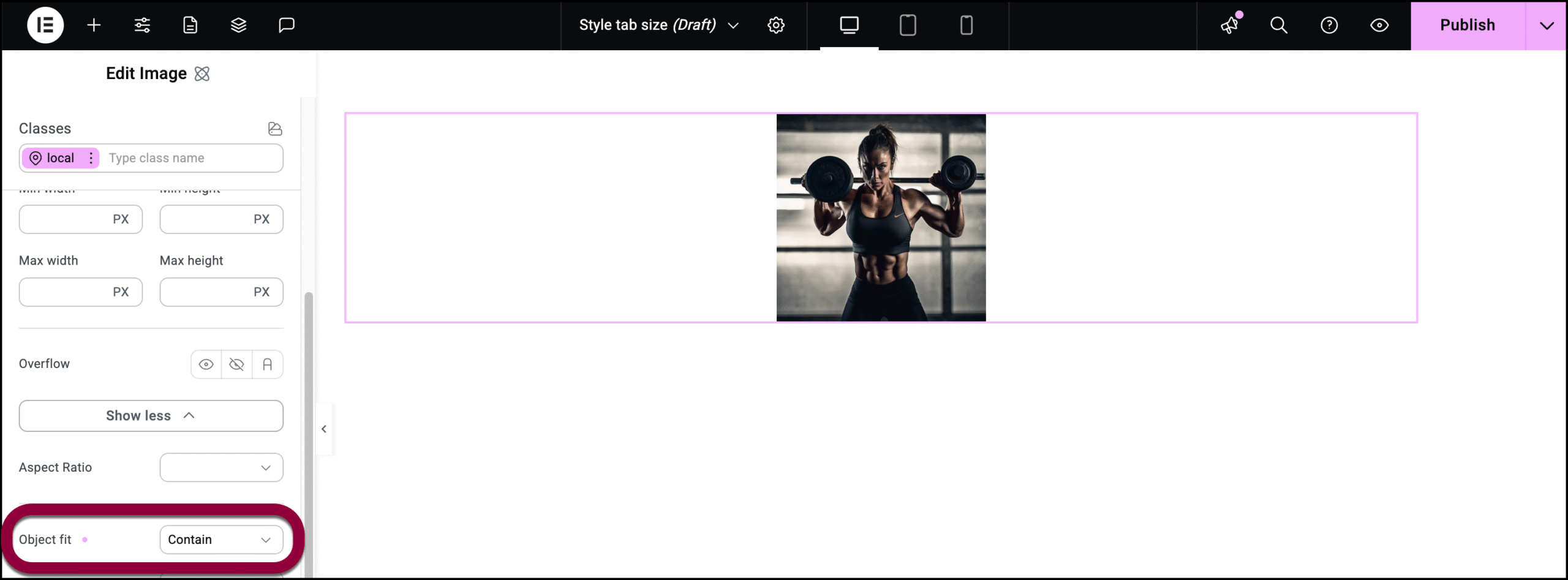
Adjusts your image so that it fits in the element while retaining its proportions. If you select Contain, the Object position menu appears and you can use it to determine the position of the image within the element. - None:
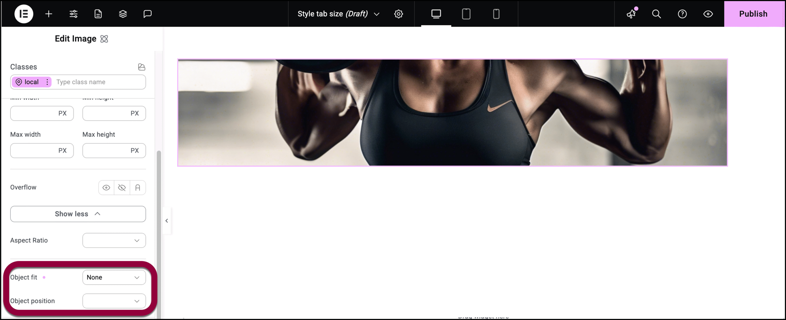
Uses the images default settings. If parts of the image are not visible, use the Object position settings to determine what part he image will be visible. - Scale down:
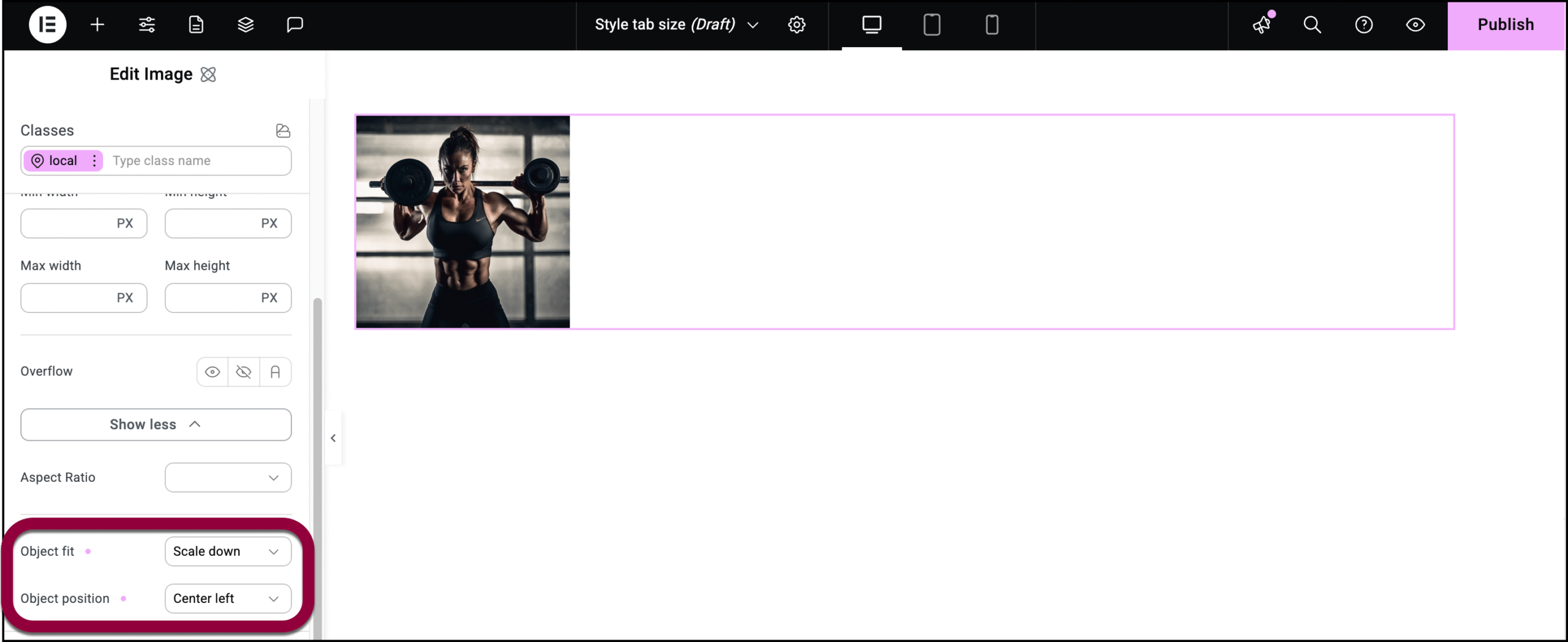
Scales the image down so it retains its proportions but fits within your element. If you select Scale down, the Object position menu appears and you can use it to determine the position of the image within the element.
- Fill:
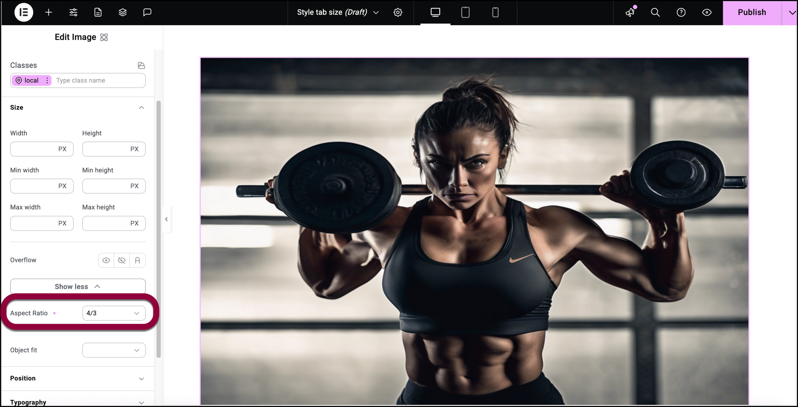
Change the Aspect ratio of an image or video
Aspect ratio is the proportional relationship between their width and height, typically expressed as two numbers separated by a colon (e.g., 16:9). This mostly applies to images and videos. You can control the aspect ratio using the Size tab.
To change the aspect ratio of a video or image:
- Add an image to the canvas using the Image element.
The controls appear in the left panel. - Click the Style tab.
- Open the Size field.
- Click Show more.
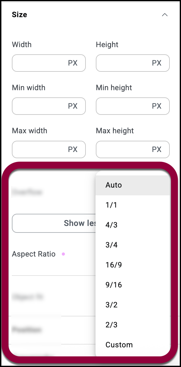
- Use the Aspect ration dropdown to select an aspect ration or use the Custom setting to set your own aspect ratio.