The Layout section determines how the elements will be displayed. There are three basic types of layouts:
- Block
- Flex
- Inline-block
- None
Block layout
In block layout, the element will take up the full width of the screen, however, you will still be able to control the element’s size in the Space field.
Flex layout
Flex layout is the most complex of the three layout choices and is mostly used for layout elements such as the Div Block element. When you select the Flexbox layout, several other options become available:
- Direction: Flex layout elements generally contain other elements. Set a direction to determine if these inner, or child elements, line up:
Horizontally from top to bottom.
Horizontally from bottom to top.
Vertically from left to right.
Vertically from right to left.
- Justify content: Align the content within the element:
- or Start: Items are aligned to the start of the container.
or
Center: Items are aligned to the center of the container.
or
End: Items are aligned to the end of the container.
or
Space between: Items are spaced evenly across the element. The first item aligns with the start and the final item with the end.
or
Space Around: Items have an equal space between themselves. There is an equal amount of space between the items and there is equal space between the first and last items and the container’s edges.
or
Space Evenly: Items have equal space between themselves and the container’s edges.
- Align items: Control how the contained items will align on their center axis, depending on the direction chosen in the Direction field:
- Start: Items are aligned to the start of the element.
- Center: Items are aligned to the center of the element.
- End: Items are aligned to the end of the element.
- Stretch: Items are stretched across the height or width of the element.
- Gaps: Enter a number in the number field to create space between child elements in this element.
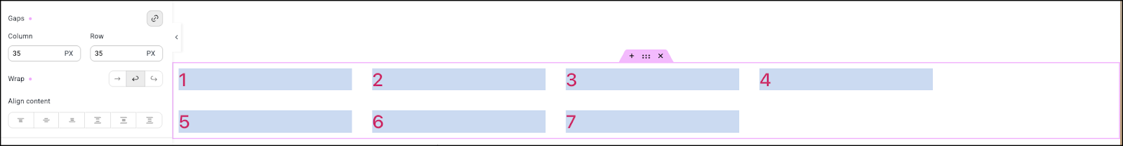
- Wrap: If the child elements don’t fit within the parent element, visitors can either scroll to see all the elements or the elements can wrap around to the next row or column, depending on the direction chosen in the Direction field:
- No wrap: The extra elements are cut off.
- Wrap: The elements will wrap around to the next row or column, depending on the chosen direction. Below is an example of element wrapping:
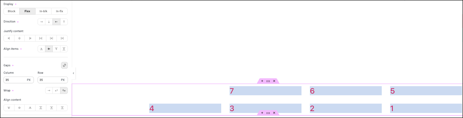
- Reverse wrap: Works like wrap but the first element becomes the last. Below is an example of a reverse wrap:
Inline Block layout
The Inline Block layout allows you to add content without creating a new block, while allowing the element to have its own height and width. This can help cut down the number of div’s used on your page, helping improve performance.
None
This setting is primarily used for responsive editing. When you select None, the element is hidden when the selected screen size is being used. For instance, if there is a heading you want to display on desktops and tablets but not on mobiles, create the heading, switch to mobile editing and select None. The heading will not display on mobile devices. For more details about responsive editing, see Responsive editing.