Help Center / Themes / Hello Commerce Theme / Customize your Hello Commerce Footer

Customize your Hello Commerce Footer

Last Update: August 4, 2025

What is the Hello Commerce Footer?

The Hello Commerce Footer generally appears at the bottom of all your site’s pages. The Footer usually contains information such as:

  • Contact details (email, phone, address)
  • Navigation links (to main pages like About, Services, or Blog)
  • Social media icons
  • Copyright notice


Note
In this example, we’ll edit the footer found in a website template kit.
 

See all the options available for the Footer.  

Customizing your Footer

To edit the Footer:

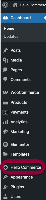
  1. From WP Admin, navigate to Hello Commerce.

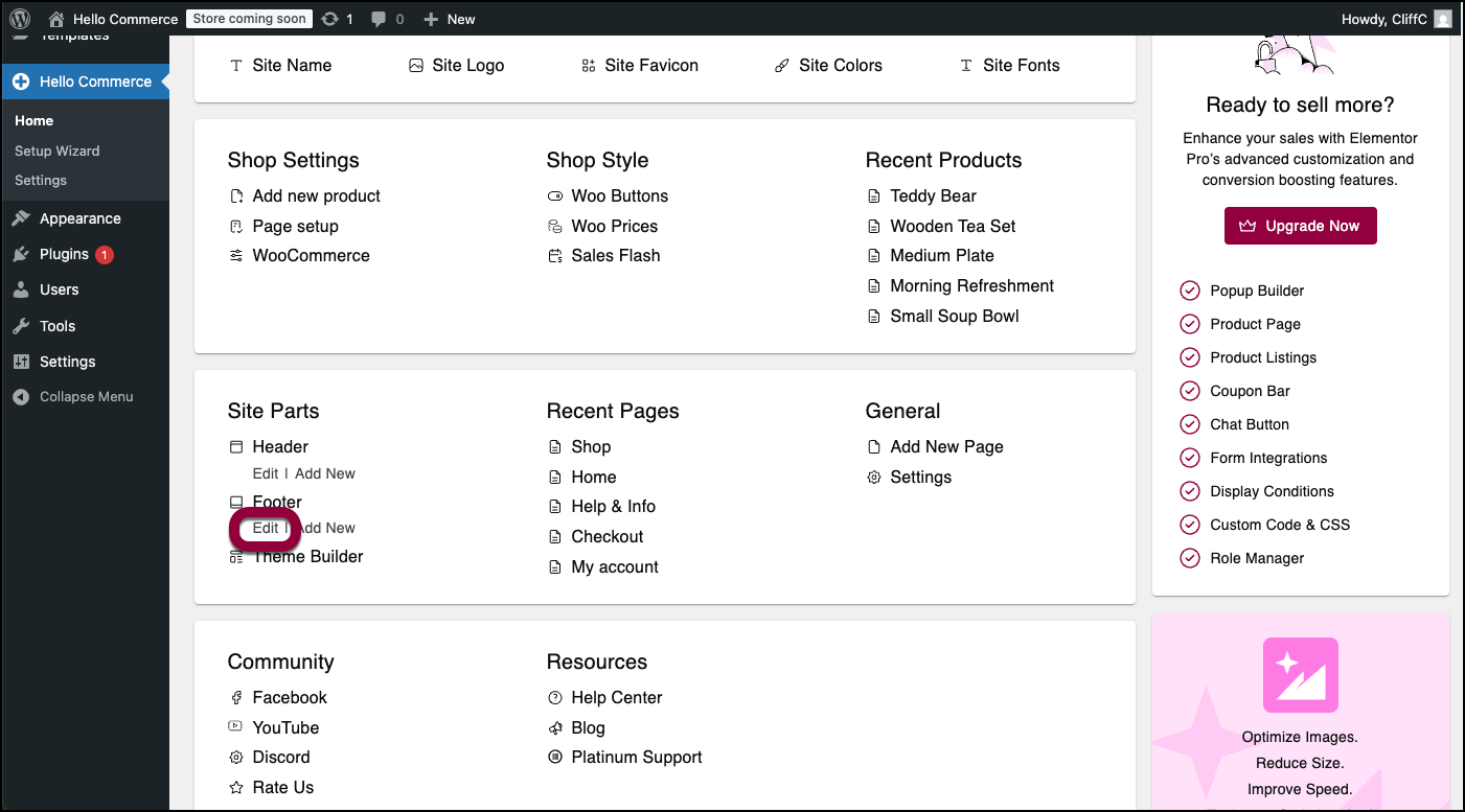
  2. Scroll down to the Site Parts section.
  3. Under Footer, click Edit.

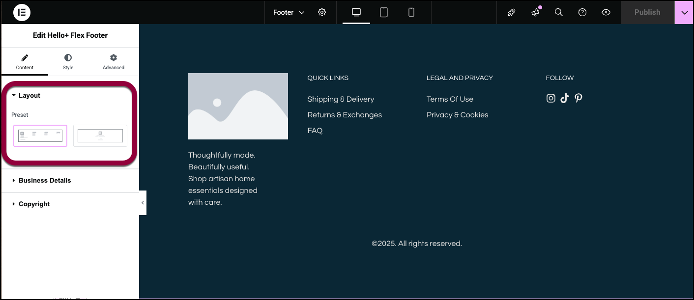
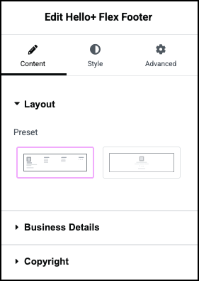
  4. Select a layout to determine a general setup for your footer.

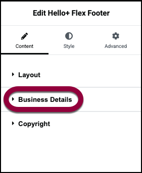
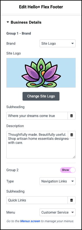
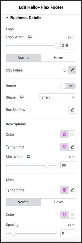
  5. Open the Business Details section.

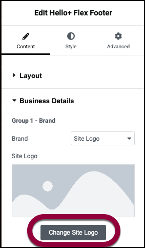
  6. Selecting a logo is part of customizing your site. You can change your logo by clicking Change Site Logo in the panel. For details, see Adding images and icons. 

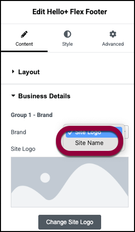
  7. If you prefer to use the site name in the footer, use the dropdown menu to choose Site Name.

  8. (Optional) Add a subheading to the footer.

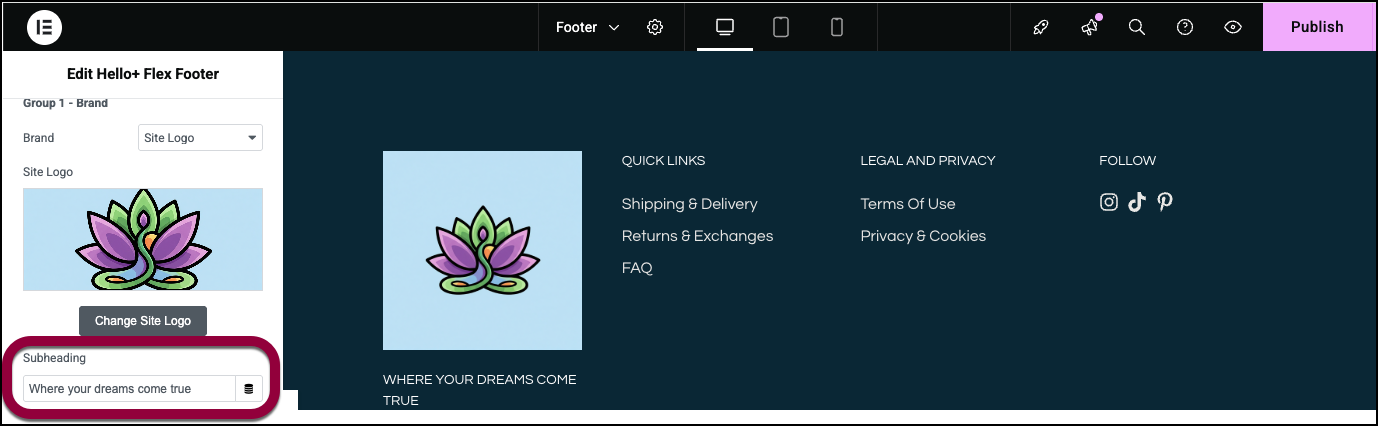
  9. (Optional) Add a description of your site or business.

    The footer has room for several groups of information. See the Settings section below for a complete list of all the options available for these groups.

  10. In Group 2, we’ll leave the default settings:

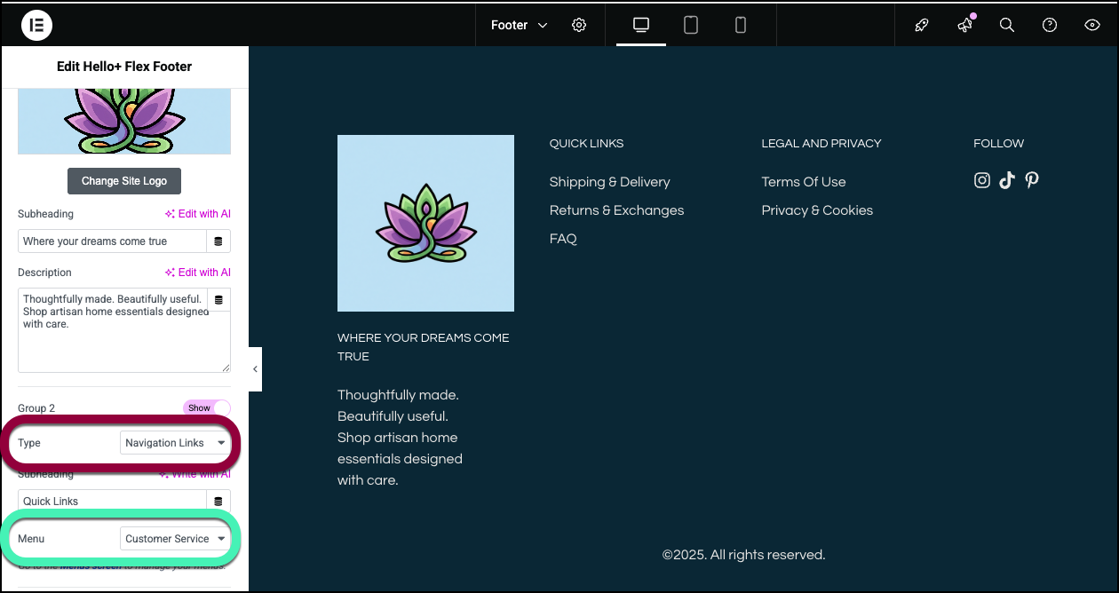
        1. The group toggle is set to Show, meaning this group is displayed.

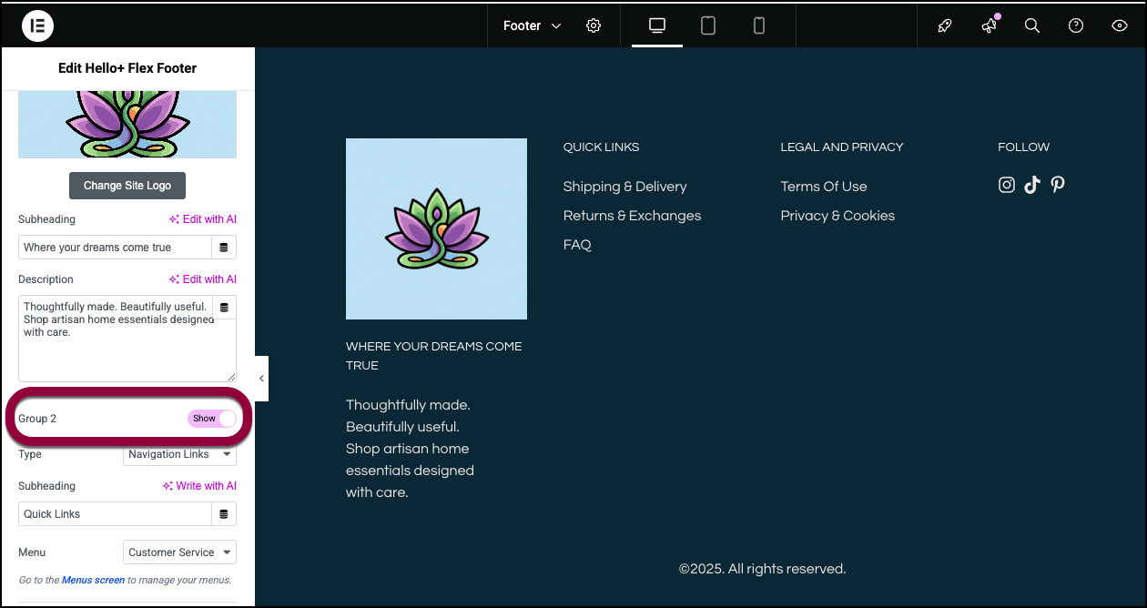
        2. The Type is Navigation Links. Navigation Links provides a quick way for visitors to jump to selected pages. The pages available in this group depends on what menu is selected on the Menu dropdown. For more details about working with WordPress menus, see Create a navigation menu.
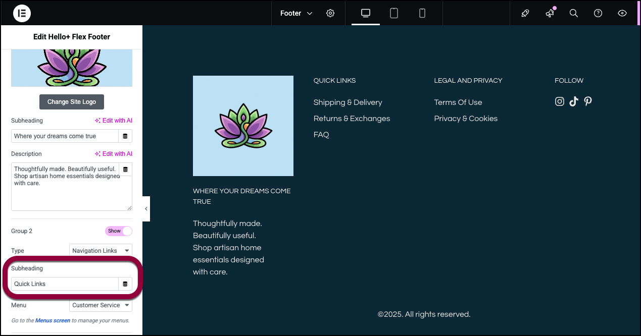
        3. Use the Subheading text box to enter a name for your navigation links.

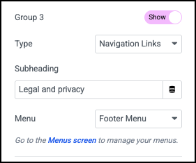
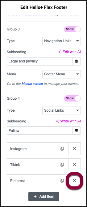
          Group 3 contains links to pages about legal information. It also uses navigation links but is based in the Footer Menu.

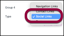
          Group 4 contains links to the business’ social media.

  11. Use the Type dropdown to select Social Links.
  12. Social Links adds several default social media. For this example, the business does not have a Pinterest account, so click the X to delete Pinterest. 

    Note
    Contact links are often used to open other apps such as Waze or WhatsApp and the URL contact link can open another web page. See Settings down below for a detailed look at Contact Links.
  13. However, the company does have a Facebook page so we’ll add that to the social icons. Start by clicking Add Item.
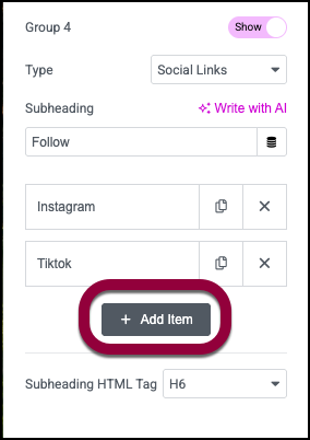
  14. In Accessible Name, enter Facebook. Social links are all icons but you need to add a name so screen readers know what the icon represents. 

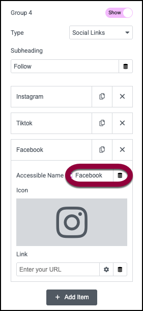
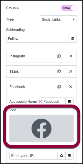
  15. Click the icon field to add the Facebook icon. For more details, see Adding images and icons. 

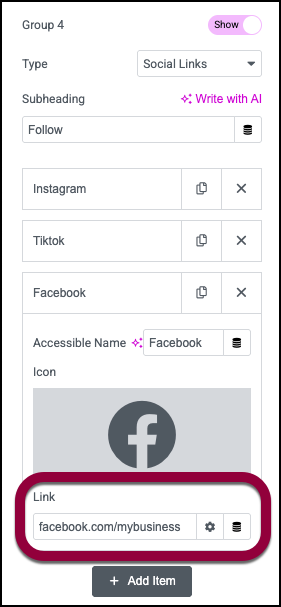
  16. Add the link to the Facebook page.

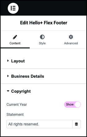
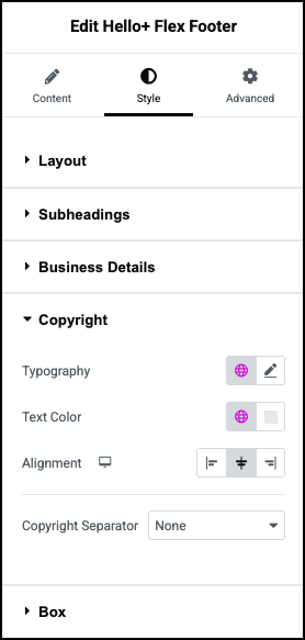
    Footers generally contain a general copyright statement so their content can’t be copied by others. The default setting is to show the current year and a brief statement. There’s no need to change this default setting. This statement appears at the bottom of the footer.

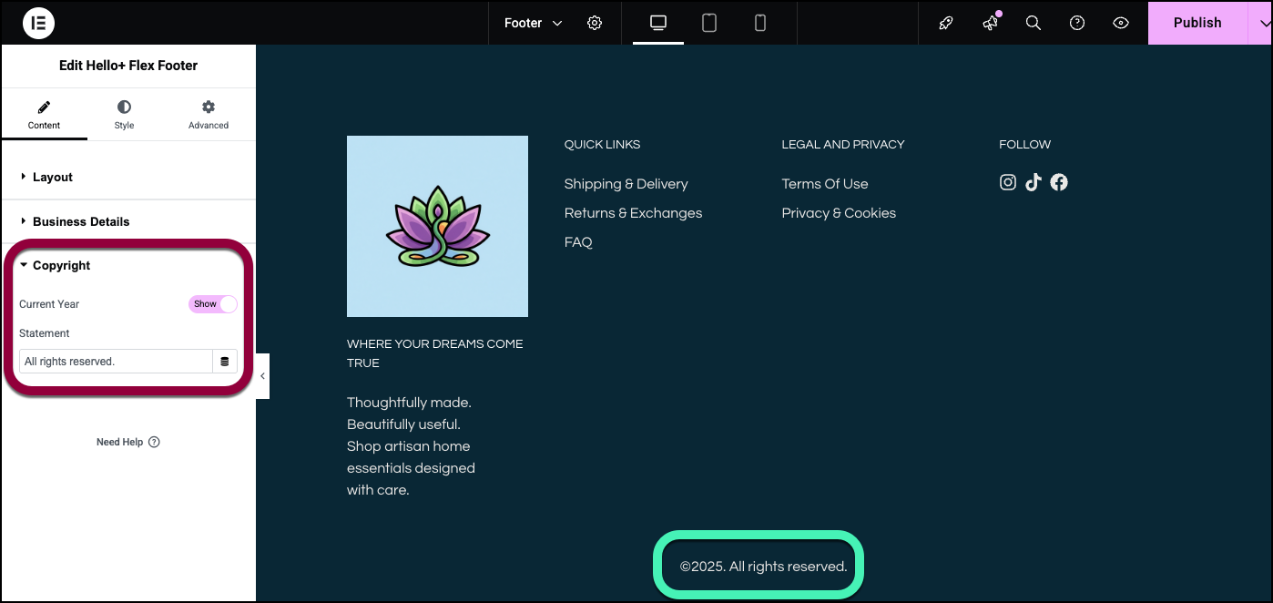
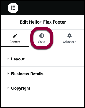
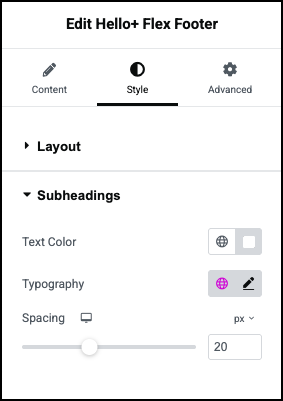
    The Style tab is used to adjust the look and feel of the footers parts.
  17. Click the Style tab.

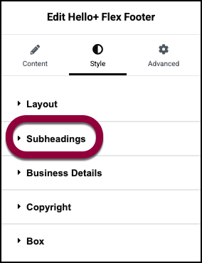
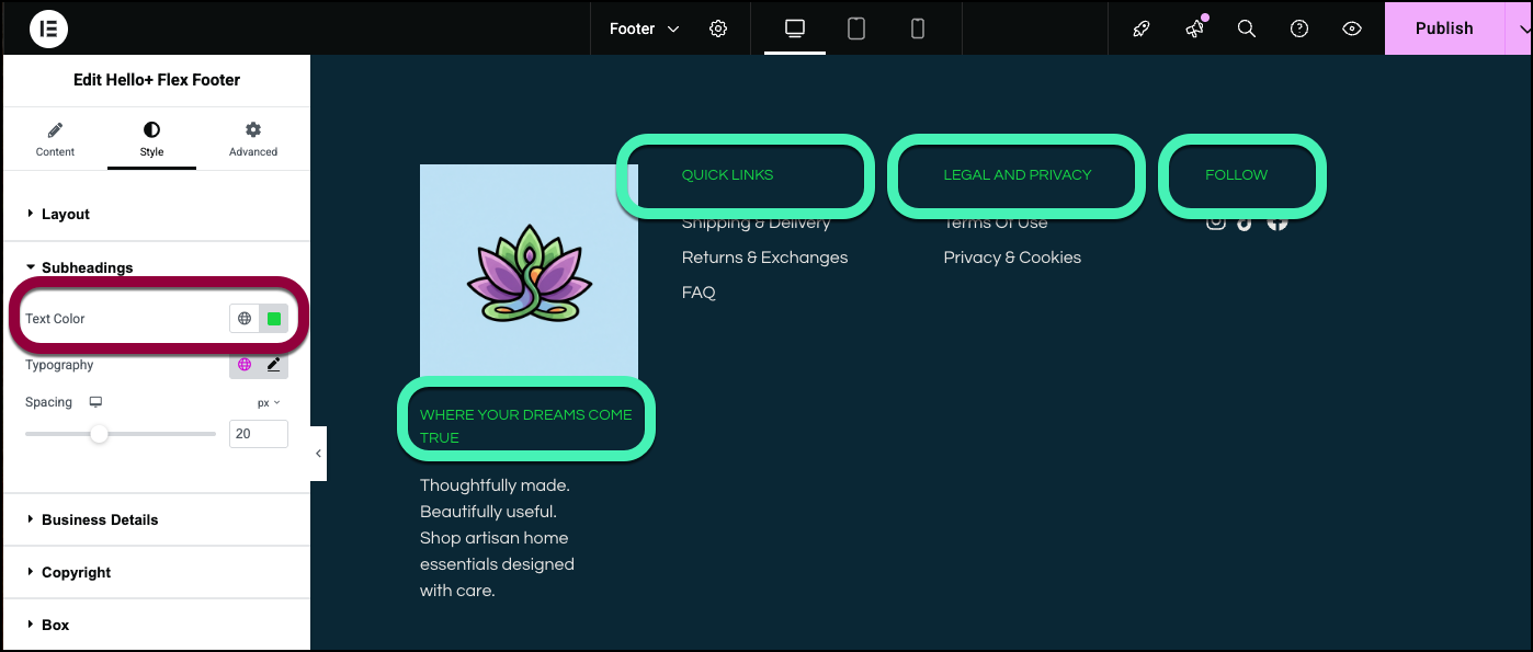
    For this example, let’s change the subheading text color.
    For complete details about the style options, see Style Settings below. 
  18. Open the Subheadings section.
  19. Click Text Color and change the color to green. For details, see Choose a color.

    Your footer is ready.

Settings for the Footer

You can customize your widgets using content, style, and other advanced parameters, offering you great flexibility in tailoring them to your needs. Click the tabs below to see all the settings available for this widget.

Content tab

Add, delete, and edit Footer items and controls. 

Choose a preset layout to give your footer a basic design.

The footer design is divided into different groups. Each group contains related information. 

Group 1 is the only group you must display.

Enter information about your business.

  • Use the dropdown menu to choose:
    • Site Logo: display your logo in the header. 
    • Site Name:  Display your company name in the Header. You can use the dropdown menu to change the HTML tagof the site name. We recommend using the default tag.
    • Change Site logo: If you’re using a logo, click to select a different logo. For details, see Adding images and icons.
  • Subheading: Add a phrase describing your business or site.
  • Description: Enter two or three sentences about your business or site.

Aside from Group 1, you can choose not to display groups be toggling this switch to Hide.

Navigation links provide quick access to other pages on the site. The links are based on your WordPress menus. If you choose Navigation links, you also need to choose:

  • (Optional) Subheading: A title for the links.
  • Menu: Select which WordPress menu is displayed. For more details about WordPress menus, see Create a navigation menu.

Contact links provide an easy way for visitors to contact you.

If you choose Contact links you’ll also need to choose:

  • (Optional) Subheading: A title for the links.
  • Links: A method of contact. The following are available:
    • Email: Lets visitors send you an email. If you use this, you’ll need to add:
      • Icon: Choose an image to represent sending an email.
      • Label: Give a name to the action/app. This will help accessibility programs understand what the icon represents.
      • Platform: Select Email from the dropdown menu.
      • Email: The email address where the email is sent.
      • Subject: Create a default subject line for the email.
      • Message: Create a default subject line for the email.
    • Telephone: Lets visitors easily call your business. If you use this, you’ll need to add:
      • Icon: Choose an image to represent sending making a phone call.
      • Label: Give a name to the action/app. This will help accessibility programs understand what the icon represents.
      • Platform: Select Telephone from the dropdown menu.
      • Number: The phone number they are calling.
    • SMS: Lets visitors send you messages.
      • Icon: Choose an image to represent sending an SMS.
      • Label: Give a name to the action/app. This will help accessibility programs understand what the icon represents.
      • Platform: Select SMS from the dropdown menu.
      • Number: The phone number they are texting.
    • WhatsApp: Lets visitors send you Whatsapp messages
      • Icon: Choose an image to represent sending an WhatsApp message.
      • Label: Give a name to the action/app. This will help accessibility programs understand what the icon represents.
      • Platform: Select WhatsApp from the dropdown menu.
      • Number: The phone number they are messaging.
    • Messenger: Lets visitors send you Facebook messages.
      • Icon: Choose an image to represent sending a message.
      • Label: Give a name to the action/app. This will help accessibility programs understand what the icon represents.
      • Platform: Select Messenger from the dropdown menu.
      • Username: Your businesses Facebook username. This is where the messages are sent. 
    • Viber: Lets visitors send you Viber messages or call you via Viber.
      • Icon: Choose an image to represent sending an Viber message or making a Viber call.
      • Label: Give a name to the action/app. This will help accessibility programs understand what the icon represents.
      • Platform: Select Viber from the dropdown menu.
      • Number: The Viber number they are messaging or calling.
      • Action: Use the dropdown menu to choose whether visitors will Chat or Call with Viber.
    • Map: Open Google Maps to guide visitors to your location.
      • Icon: Choose an image to represent sending launching Google Maps.
      • Label: Give a name to the action/app. This will help accessibility programs understand what the icon represents.
      • Platform: Select Maps from the dropdown menu.
      • Link: Link to the Google Maps app. For details see Google Maps integration.
    • Waze: Open the Waze app to guide visitors to your location.
      • Icon: Choose an image to represent sending launching Waze.
      • Label: Give a name to the action/app. This will help accessibility programs understand what the icon represents.
      • Platform: Select Waze from the dropdown menu.
      • Link: Link to the Waze app.
    • URL: Icon with a link to a webpage.
      • Icon: Choose an image to represent a link.
      • Label: Give a name to the action/app. This will help accessibility programs understand what the icon represents.
      • Platform: Select URL from the dropdown menu.
      • Link: The URL of the page visitors will be sent to.
    •  

Social links provide visitors a quick way to see your social media. 

  • Click an item to edit it, adding a link to your social media account.
  • Click the delete icon to erase a social media icon..
  • Click the copy icon to duplicate a social media item.
  • Click +Add Item to add another social media item. 

For details, see Social Icons widget.

Text allows you to input free text and is used to add information such as your address, opening hours and phone number. If you use Text you’ll need to add:

  • (Optional) Subheading: A couple words describing the contents.
  • Text: The content you want to add.

Toggle to Hide if you don’t want the current year to appear in the copyright.

If you have a customized copyright message, enter it in the text box.

Style tab

Determine the look and feel of the Header.

Business Details controls the look and feel of the general layout.

  • Columns: The footer is divided into a number of columns. It’s often a good idea to divide each group into its own column. Use the dropdown menu to set the number of columns in the footer.
  • Gaps: The footer’s columns and rows have a set space between them. Use the text boxes to set this number. 
  • Align Center on Mobile: Since mobile screens have less space, you may want to center the footer for these devices. Toggle to Yes to center the footer on mobiles.

Set the subheadings’ color. For details, see Choose a color or Use global fonts and colors. 

Set the font type and size. For details, see Typography.

Control the amount of space between the subheading and the content it describes.

Set the look and feel of the logo.

  • Logo Width: Use the slider to grow and shrink the logo.
  • Normal:  Determine how the logo appears by default. 
  • Hover: Determine how the logo appears when moused over.  
  • CSS Filters: A series of sliders that lets you control:
    • Blur: Applies a soft focus effect by blurring elements based on pixel radius.
    • Brightness: Adjusts the brightness of an element by modifying its light intensity.
    • Contrast: Enhances or reduces image and element color contrast for better visual distinction.
    • Saturation: Adjusts image or element colors by increasing or decreasing their color intensity.
    • Hue: The CSS hue filter adjusts colors by rotating their hue around the spectrum.
  • Border: Toggle to Yes to add a border to the logo. If you add a border you’ll need to set a border width and color.
  • Shape: Set the logo shape. Use the dropdown to select:
    • Round: Buttons appear with smooth corners.
    • Rounded: Buttons appear with evenly curved edges.
    • Sharp: Rectangular buttons.
    • Custom: Adjust the radius, using the four counters to adjust each individual corner. Learn more about these measurement methods. 
  • Box Shadow: Add depth to your logo with shadows. For details, see What is Shadow, Text Shadow and Boxed Shadow? 
  • Color: Set the font color of the descriptions. For details, see Choose a color or Use global fonts and colors.
  • Typography: The font type and size of the descriptions. For details, see Typography.
  • Max Width: Use the slider to determine the maximum width any descriptive text can take up.
  • Typography: The font type and size of any footer text containing a link.  For details, see Typography.
  • Normal/Hover –  
    • Normal:  Determine how the the text appears by default. 
    • Hover: Determine how the text appears when moused over. 
  • Color: Set the font color of the footer’s links. For details, see Choose a color or Use global fonts and colors.
  • Spacing: Use the slider to determine the amount space between the letters of the footer’s links.

The font type and size of the title above the contact information. For details, see Typography.

Set the font color of the contact details. For details, see Choose a color or Use global fonts and colors.


Determine if the copyright notice appears in the right, center or left of the footer.

Use a visual indicator to separate the copyright from the rest of the footer:

  • None: No visual indicator.
  • Divider: Use a bar to separate the copyright.
  • Background: Change the background color of the area where the copyright is located.

Background type: Set a background for the footer. Use the icons to switch between:

  • A solid background (Classic)
  • A blended background (Gradient).

For details, see Create a Background.

Color: The color of the background. For details, see Choose a color or Use global fonts and colors.

Toggle to Yes to add a border around the Footer. If you add a border, you’ll need to determine:

Border Width: Use the slider to set how thick the border is.

Color: The color of the border. For details, see Choose a color or Use global fonts and colors.

Click the pencil icon to add shadow to the footer. Learn more about shadows.

Add space between the footer’s border and the contents. For details, see Padding and margins.

Advanced tab

Control the placement of your widget, insert links, add custom code and more.

Most of the options available in the Advanced tab can be found in Advanced tab settings.

Responsive is an additional function. It allows you to hide the footer on certain screen sizes. 

On this page

Share this article

Hosted with