
This guide provides a comprehensive walkthrough for web creators on how to master WordPress background images. We will explore various methods, from the native WordPress tools to the advanced capabilities of the Elementor editor. You’ll learn how to add, edit, and customize backgrounds for any part of your site, all while maintaining optimal performance and a professional workflow.
Why Your Website’s Background Matters
Before diving into the “how,” it’s important to understand the “why.” A background image is a fundamental design element that significantly influences user perception and site performance. When used strategically, it can be a powerful tool in your web creation arsenal.
Enhancing Visual Appeal and Brand Identity
First impressions are overwhelmingly visual. A striking background image is one of the quickest ways to establish a specific mood—be it the clean, corporate feel of an abstract geometric pattern or the adventurous spirit of a sweeping mountain landscape. Research shows that it takes only about 50 milliseconds for users to form an opinion about your website, and that initial judgment is primarily design-driven.
Your background should be an extension of your brand. Using custom photography or graphics that align with your color palette and messaging creates a cohesive and memorable visual identity. This consistency helps build brand recognition and fosters a deeper connection with your audience.
Improving User Experience and Readability
A great background does its job without stealing the show. Its primary role is to support the foreground content, not compete with it. A subtle, low-contrast background can effectively guide the user’s eye toward key elements like headlines, call-to-action buttons, and important text.
Conversely, a busy or overly vibrant background image can be distracting and detrimental to readability. If users have to strain to read your text, they are more likely to leave. This is why techniques like using background overlays are critical. By placing a semi-transparent color layer between your image and your text, you can ensure your content remains crisp and legible while still benefiting from the visual appeal of the image.
Impact on Website Performance
While visually impressive, high-resolution images are often large files that can drastically slow down your website. Performance is a critical component of user experience and SEO. Studies consistently show that as page load time increases, the probability of a user bouncing (leaving your site) skyrockets. For instance, the probability of bounce increases by 32% as page load time goes from 1 second to 3 seconds.
Therefore, optimizing your background images isn’t just a recommendation; it’s a necessity. Choosing the right file format, compressing the image to reduce its size without sacrificing quality, and using tools that streamline this process are essential steps. An image optimization plugin can automate this workflow, ensuring your site remains fast and responsive.
Finding and Preparing the Perfect Background Image
The process of creating an effective background begins long before you upload it to WordPress. It starts with sourcing the right image and meticulously preparing it for the web.
Where to Find High-Quality Images
You have several options for finding imagery, each with its own advantages.
Free Stock Photo Websites
For projects with limited budgets, free stock photo sites are an invaluable resource. Platforms like Unsplash, Pexels, and Pixabay offer vast libraries of high-resolution images contributed by photographers around the world. These are great for finding generic landscapes, textures, and abstract shots that work well as backgrounds.
Premium Stock Photo Websites
If you need a more specific or unique image, premium stock photo services like Adobe Stock or Getty Images are worth the investment. They offer curated collections, often with higher production quality and exclusive content, which can help your website stand out from competitors who rely on the same free resources.
Creating Your Own Custom Graphics
The best way to ensure your website is completely unique is to create your own visuals. This could involve hiring a photographer to capture images that reflect your brand’s story or using graphic design tools to craft custom illustrations and patterns. For example, a tool like Canva allows you to design unique graphics that can be used as background elements.
Choosing the Right Image: Design Considerations
Not every beautiful image makes a good background. When selecting an image, consider the following principles.
- Keep it Simple: The most effective background images are often the simplest. Busy photographs with multiple subjects or complex details tend to distract from the main content. Look for images with ample negative space, subtle textures, abstract patterns, or minimalist landscapes. These provide visual interest without overwhelming the user.
- Consider Color and Contrast: The background image must work in harmony with your site’s color scheme and, most importantly, provide enough contrast for your text to be easily readable. If your text is light, choose a dark background image or apply a dark overlay. If your text is dark, do the opposite.
- Image Subject and Mood: The subject of your image should align with your brand’s industry and message. A tech startup might use an abstract network graphic to convey innovation, while a wellness blog might use a serene nature photo to evoke calmness.
Image Optimization: The Key to a Fast Website
Image optimization is the process of reducing the file size of your images as much as possible without a noticeable loss in quality. This is arguably the most critical step in preparing your background image.
Why Optimization is Crucial
Images are often the heaviest elements on a webpage, accounting for a significant portion of its total weight. An unoptimized, multi-megabyte image uploaded directly from a camera can bring your site’s loading speed to a crawl. By optimizing your images, you directly improve Core Web Vitals, which are key metrics Google uses to measure user experience and determine search rankings.
How to Optimize Your Images
Optimization involves a few key techniques:
- File Format: Different formats are suited for different purposes.
- JPEG: Best for photographs and complex images with many colors. You can adjust the compression level to find a good balance between quality and file size.
- PNG: Ideal for graphics with transparency, like logos or icons. It uses lossless compression, meaning no quality is lost, but file sizes can be larger than JPEGs.
- WebP & AVIF: These are modern, next-gen formats that offer superior compression and quality compared to JPEG and PNG. They can significantly reduce file sizes and are supported by all major browsers. Converting your images to WebP or AVIF is a highly effective optimization strategy.
- Image Compression: This is the process of reducing file size by removing redundant image data.
- Lossy Compression: Removes some data permanently from the file. This results in much smaller file sizes but can lead to a slight reduction in quality if overdone.
- Lossless Compression: Reduces file size without removing any data, so there is no loss of quality. File size reduction is less significant than with lossy compression.
- Correct Sizing: Resize your images to the dimensions they will be displayed at before uploading them to WordPress. A background image for a full-width screen rarely needs to be wider than 1920 pixels. Uploading a 5000-pixel-wide image is unnecessary and adds significant weight.
WordPress Image Optimization Plugins
Manually optimizing every image can be tedious. Fortunately, plugins can automate this process for you. These tools can compress images upon upload, convert them to next-gen formats, and resize them automatically.
For web creators who need an efficient solution that works across any WordPress site, the Image Optimizer by Elementor is an excellent choice. It’s built to improve performance without adding complexity to your workflow. Key capabilities include:
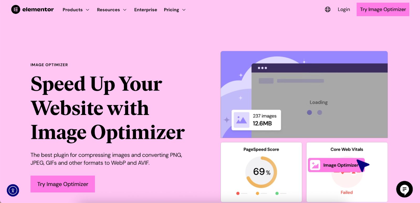
- AVIF and WebP conversion to serve modern, lightweight image formats.
- Bulk optimization to compress your entire existing media library at once.
- Lossy and Lossless compression options to give you control over the quality-to-size ratio.
- Automatic optimization of new images as they’re uploaded, saving you time.
- Support for unlimited websites, making it a scalable solution for freelancers and agencies.
Other options include plugins like ShortPixel and Smush, which also provide image optimization services.
Method 1: Adding a Site-Wide Background with the WordPress Customizer (Classic Themes)
For websites using classic WordPress themes, the Theme Customizer offers a straightforward way to set a single background image for your entire site.
What is the WordPress Customizer?
The Customizer is a native WordPress feature that provides a live preview interface for making changes to your theme’s appearance. You can see your modifications in real-time before publishing them.
Step-by-Step Guide
- From your WordPress dashboard, navigate to Appearance > Customize.
- Look for an option labeled “Background Image.” Note that its availability and location can vary depending on your active theme. Some themes may place this setting under a different panel, like “General Settings” or “Site Identity.”
- Click “Select Image” to open your Media Library. You can upload a new image or choose an existing one.
- Once you’ve selected an image, you’ll see a set of options:
- Preset: Choose how the image fits the screen. Options typically include “Fill Screen” (which scales the image to cover the entire area), “Fit to Screen” (which scales the image to fit without cropping), and “Repeat” (which tiles the image).
- Image Position: Use the arrows to align the image (center, top right, bottom left, etc.).
- Scroll with page: If this box is checked, the background will scroll with the rest of the content. Unchecking it can sometimes create a simple fixed background effect, though this is less reliable than modern methods.
- Click “Publish” to save your changes.
Limitations of the Customizer Method
While direct, this method is quite limited and may not be sufficient for professional web creators. The primary drawbacks include:
- Theme-Dependence: The functionality is entirely controlled by your theme. If the theme developer didn’t include robust background options, you’re out of luck.
- Lack of Granular Control: You can only set one global background. There is no built-in way to assign different backgrounds to different pages or sections.
- No Advanced Features: You cannot add color overlays for readability, use video backgrounds, or define different images for mobile and desktop devices.
Method 2: Using the Full Site Editor (Block Themes)
For those using modern block themes (like Twenty Twenty-Four), the Full Site Editor (FSE) replaces the Customizer as the primary tool for site-wide design.
Understanding the Full Site Editor (FSE)
The FSE is a block-based interface that allows you to edit every part of your site—including the header, footer, and page templates—using the same block editor you use for posts and pages.
Setting a Global Background Image
- From the dashboard, navigate to Appearance > Editor. This will open the FSE interface.
- In the left-hand menu, select Styles. Click on the main preview area to start editing the global styles.
- In the block settings sidebar on the right, look for the “Background” option under the “Color” tab.
- From here, you can upload an image and adjust its properties, such as size and repeat settings. You can apply this to the root of the site, making it a global background.
Setting a Background for a Specific Section
A more common approach in the FSE is to apply backgrounds to specific container blocks. The Group block is perfect for this.
- Open the template you want to edit (e.g., the Page template).
- Wrap your page content in a Group block.
- With the Group block selected, go to the Style tab in the settings sidebar.
- Under Background, upload your image. You can also control the opacity to create a faded look.
The Cover block is another powerful option specifically designed for creating hero sections with text and other elements overlaid on an image or video background.
Pros and Cons of the FSE Method
The FSE offers more flexibility than the classic Customizer and is integrated directly into the WordPress core. However, it still presents challenges for creators seeking complete control:
- Achieving complex layouts can require nesting multiple blocks, which can feel clunky.
- The styling options, while growing, are not as extensive as those found in dedicated page builders.
- The workflow can have a steeper learning curve for users accustomed to more visual, drag-and-drop interfaces.
Method 3: The Professional Approach: Using Elementor for Full Control
For web creators who need to deliver professional websites without limitations, a page builder like Elementor is the ideal tool. It provides an intuitive, drag-and-drop editor with a vast suite of design tools that offer complete creative control over every aspect of your site, including backgrounds.
Adding a Background to a Section in Elementor
Elementor’s page structure is built around Sections, Columns, and Widgets. You can apply a unique background to any Section, giving you precise control over your page design.
Step-by-Step Guide
- Create a new page or post and click “Edit with Elementor.”
- Add a new Section to your page by clicking the ‘+’ icon.
- Click on the Section’s handle (the blue tab at the top center) to open its settings in the left-hand panel.
- Navigate to the Style tab.
- You will see the Background settings. Choose the Classic type (the paintbrush icon) and click the ‘+’ sign under Image to select your background.
Exploring the Background Settings
Elementor provides a rich set of controls to perfect your background image:
- Position: Control the focal point of the image. “Center Center” is a common choice, but you can also align it to any corner or side.
- Attachment:
- Scroll: The background moves with the page content.
- Fixed: The background stays in place as the user scrolls, creating a popular parallax effect.
- Repeat: Choose if and how the image tiles. “No-repeat” is standard for single background images.
- Size: This determines how the image scales.
- Cover: Scales the image to fill the entire section, cropping as necessary. This is usually the best option for responsive, full-width backgrounds.
- Contain: Scales the image to be fully visible without cropping, which may leave empty space.
- Custom: Allows you to define a specific width and height.
Advanced Background Techniques in Elementor
Elementor’s capabilities extend far beyond static images. These advanced features are where professional creators can truly elevate their designs.
Background Overlays
As mentioned, overlays are essential for ensuring text readability. Elementor makes this simple:
- In the Section’s Style tab, click on Background Overlay.
- Choose a Classic (solid color) or Gradient background type.
- Select your color(s) and adjust the Opacity slider to control the transparency. A value between 0.5 and 0.8 often works well.
Video Backgrounds
Dynamic video backgrounds can capture attention instantly.
- In the Section’s Style > Background settings, select the Video background type.
- Paste a link from YouTube or Vimeo, or provide a link to a self-hosted video file (e.g., .mp4).
- You can set a start and end time, choose to play the video only once, and set a fallback image for mobile devices where video backgrounds are often disabled for performance reasons.
Slideshow Backgrounds
Create an engaging, dynamic background with a slideshow of images.
- Select the Slideshow background type.
- Click the ‘+’ icon to add multiple images to the gallery.
- Customize the transition effect (e.g., fade, slide), duration, and other settings.
Responsive Backgrounds
A key benefit of using Elementor is its robust responsive controls. A background that looks perfect on a desktop might be awkward on a mobile phone. Elementor lets you tailor the experience for every device.
- At the bottom of the Elementor panel, click the Responsive Mode icon.
- Select the Tablet or Mobile view.
- Now, any change you make to the background settings will apply only to that specific device. You can:
- Upload a completely different, mobile-optimized image (e.g., a vertically-oriented version).
- Adjust the background position or size to focus on the most important part of the image.
- Disable a heavy video background on mobile and show a static image instead.
Setting a Page-Wide or Site-Wide Background with Elementor
Elementor also provides tools for applying backgrounds beyond a single section.
- For a Single Page: Click the gear icon in the bottom-left corner of the Elementor editor to open the Page Settings. Go to the Style tab and set a background image for the page’s <body> tag. This will appear behind all of your content on that specific page.
- Using the Theme Builder for Global Backgrounds: For ultimate control, Elementor’s Theme Builder lets you design templates for your entire website. You can create a new
Page Template, for example, design it with a specific background, and then set its display conditions to “Entire Site.” This ensures every page on your website shares the same consistent and professionally designed background.
Best Practices for Effective Background Images
Implementing a background image is just the first step. Following these best practices will ensure your design is both beautiful and effective.
- Prioritize Readability Above All: Your message is the most important part of your website. Always use overlays, blur effects, or choose images with enough simplicity to ensure your text has high contrast and is effortless to read.
- Maintain Performance: Never skip image optimization. Compress every background image, resize it appropriately, and use next-gen formats like WebP. Tools like Elementor’s Image Optimizer can automate this process and ensure your website stays fast.
- Ensure Accessibility: Visual design and accessibility go hand-in-hand. Ensure your text-to-background contrast ratio meets WCAG guidelines. For WordPress creators looking to improve their site’s accessibility, Ally by Elementor is a plugin that provides tools and guidance to make your site more usable for everyone. It can help with things like contrast adjustments and guided remediation.
- Test on Multiple Devices: Always check how your backgrounds look on different screen sizes. Use Elementor’s responsive mode to fine-tune the appearance on desktop, tablet, and mobile, ensuring a flawless experience for every visitor.
Troubleshooting Common Background Image Issues
Even with the best tools, you might occasionally run into issues. Here are solutions to some common problems.
- Background Image Not Showing Up: This is often caused by a caching plugin. Clear your website and browser cache first. If that doesn’t work, check that the image URL is correct and use your browser’s developer tools to inspect for any CSS conflicts from another plugin or your theme.
- Background Image is Tiling or Repeating: This happens when the image is smaller than its container. The solution is to set the background-repeat property to no-repeat and the background-size property to cover. In Elementor, these settings are clearly available in the Section’s Style tab.
- Background Image Looks Pixelated or Blurry: This means the image resolution is too low for the space it’s trying to fill. You’ll need to upload a higher-resolution version. For full-screen backgrounds, an image that is at least 1920 pixels wide is a good starting point. Remember to optimize it after resizing.
- Fixed Background (Parallax) is Janky on Mobile: The CSS property that creates this effect (background-attachment: fixed) is known to perform poorly on many mobile browsers. To solve this, use Elementor’s responsive controls to change the Attachment setting to Scroll specifically for the mobile and/or tablet breakpoints.
Conclusion
A background image is a foundational element that can define a website’s entire aesthetic and user experience. While WordPress offers basic built-in tools for the task, they often lack the precision and power required for professional projects. The classic Customizer is theme-dependent and limited, while the Full Site Editor, though more flexible, still falls short of a dedicated builder.
For web creators who demand complete creative freedom, robust features, and an efficient workflow, Elementor provides the definitive solution. Its intuitive controls for adding and customizing static, video, or slideshow backgrounds—combined with advanced features like overlays and device-specific responsive settings—empower you to build visually stunning and highly functional websites. By pairing these powerful tools with best practices in image optimization and design, you can ensure your backgrounds enhance your site without compromising on speed or usability, allowing you to deliver professional results every time.


