
This guide explores the key principles that will define successful web design in 2025. We will cover everything from user experience and mobile-first principles to performance optimization and accessibility. By implementing these practices, you can create a website that meets modern user expectations and delivers measurable results for your business or clients.
Understanding the Modern User: The Foundation of Good Design
Before diving into specific design techniques, it’s crucial to understand the expectations of today’s internet users. Their behavior has been shaped by years of interacting with fast, intuitive, and personalized digital products. Meeting these expectations is the first step toward a successful website.
What Today’s Users Expect from a Website
Modern users are short on time and have high standards. When they land on a website, they expect to find what they’re looking for quickly and without friction. Research shows that a website has mere seconds to make a good impression before a visitor decides to leave.
Key user expectations include:
- Speed: Users expect pages to load almost instantly. A study by Google found that the probability of a visitor bouncing increases by 32% as page load time goes from one to three seconds.
- Clarity and Simplicity: The website’s purpose and navigation should be immediately obvious. A cluttered or confusing layout leads to frustration and high bounce rates.
- Mobile Compatibility: With over 60% of website traffic coming from mobile devices, a seamless experience on smartphones and tablets is essential.
- Security: Users need to feel that their data is safe, especially on ecommerce or lead generation sites. A visible SSL certificate (HTTPS) is a basic requirement.
- Personalization: While not always possible for every site, users appreciate content and offers that are relevant to their interests and past behavior.
The Role of User Intent in Web Design
Understanding why a user is visiting your site is as important as knowing who they are. User intent can generally be broken down into four categories:
- Informational: The user is looking for specific information (e.g., “how to bake a cake,” “what is web accessibility”).
- Navigational: The user wants to go to a specific website (e.g., typing “Facebook” into Google).
- Transactional: The user intends to make a purchase (e.g., “buy running shoes”).
- Commercial Investigation: The user is comparing products or services before making a purchase (e.g., “best website builders,” “Elementor vs. Webflow”).
Your design choices should directly support the primary intent of your visitors. An ecommerce site (transactional) needs prominent product displays and a streamlined checkout process. A blog (informational) should prioritize readability and easy access to related articles.
By keeping the modern user’s expectations and intent at the forefront, you create a solid foundation upon which to build an effective and engaging website.
Core Principles of User-Centric Web Design
User-Centric Design (UCD) is a design philosophy that places the user at the center of the creative process. The goal is to create a website that is not only easy to use but also enjoyable to interact with. This approach focuses on clarity, intuition, and providing a logical path for the user to follow.
Intuitive Navigation and Clear Information Architecture
Information Architecture (IA) is the practice of organizing and structuring content on a website in a way that is logical and easy for users to understand. Good IA helps users find the information they need with minimal effort.
Best Practices for Navigation:
- Keep it Simple: Limit the number of top-level menu items. Too many choices can overwhelm visitors. A good rule of thumb is to have no more than seven main navigation links.
- Use Descriptive Labels: Avoid vague or clever labels. Users should know exactly where a link will take them. For example, use “Services” instead of “What We Do.”
- Follow Conventions: Stick to familiar navigation patterns. Users expect to find the main menu at the top of the page and contact information in the footer.
- Include a Search Bar: For content-heavy sites, a prominent and functional search bar is essential.
- Ensure Mobile Navigation is Flawless: On smaller screens, a “hamburger” menu is a common and effective solution. Make sure the menu is easy to tap and the links are legible.
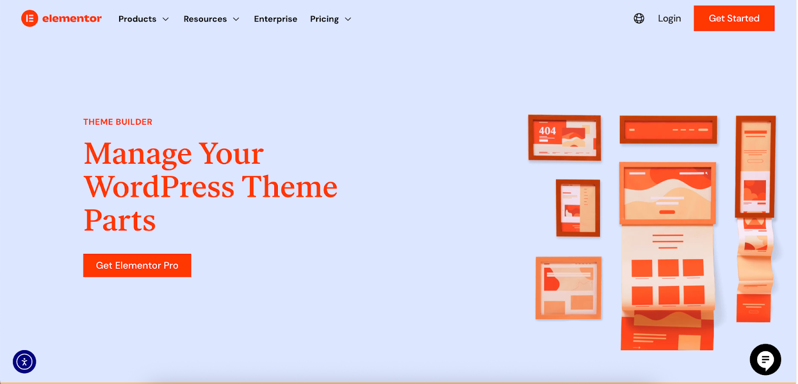
With a tool like Elementor’s Theme Builder, you gain complete control over your site’s navigation. You can visually design custom headers and footers, ensuring they are consistent across your entire website and optimized for both desktop and mobile devices. This allows you to implement these navigational best practices without writing any code.
The Importance of a Clear Visual Hierarchy
Visual hierarchy is the arrangement of elements on a page in a way that implies importance. It guides the user’s eye to the most critical information first. A strong visual hierarchy improves scannability and comprehension.
Techniques for Establishing Hierarchy:
- Size and Scale: Larger elements naturally draw more attention. Your most important headlines and calls-to-action should be larger than other text.
- Color and Contrast: Bright colors and high-contrast elements stand out. Use them strategically to highlight key buttons or information.
- Typography: Use different font sizes, weights (bold, regular), and styles (italics) to distinguish between headings, subheadings, and body text.
- Whitespace: Ample space around elements helps them breathe and draws attention to them. Don’t be afraid of empty space; it’s a powerful design tool.
- Placement: Elements placed at the top of the page or in the center are perceived as more important.
Compelling Calls-to-Action (CTAs)
A Call-to-Action is an instruction to the audience designed to provoke an immediate response, usually using an imperative verb such as “Sign Up Now,” “Learn More,” or “Buy Now.” An effective CTA is clear, concise, and visually distinct.
CTA Best Practices:
- Action-Oriented Language: Start with a strong verb that tells the user exactly what will happen when they click.
- Create Contrast: Your CTA button should stand out from the rest of the page. Use a color that contrasts with the background and surrounding elements.
- Make it Obvious: It should be clear that your CTA is a clickable button. Use shadows, gradients, or other visual cues to make it look interactive.
- Strategic Placement: Place CTAs where users are most likely to take action, such as after a compelling value proposition or at the end of a service description.
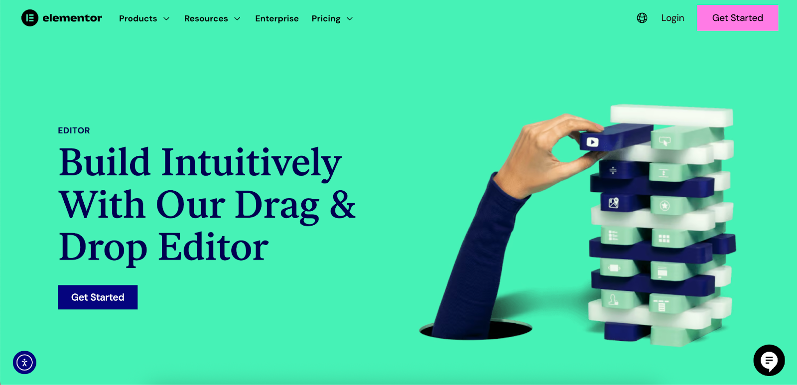
Elementor’s drag-and-drop editor allows for extensive customization of buttons and other elements, making it straightforward to apply these CTA best practices and create high-converting pages.
Mobile-First Design: A Non-Negotiable Approach
Mobile-first design is an approach where you begin the design process with the mobile version of a website before moving on to the desktop version. Given that mobile devices account for the majority of web traffic, this strategy ensures that the user experience is optimized for the largest segment of your audience.
Why Mobile-First Matters in 2025
Designing for mobile first forces you to prioritize what’s most important. The limited screen space of a mobile device means you must focus on core content and functionality, eliminating anything that isn’t essential. This often results in a cleaner, more focused design that also benefits desktop users.
Furthermore, Google uses mobile-first indexing, meaning it predominantly uses the mobile version of the content for indexing and ranking. A poor mobile experience can directly harm your SEO performance.
Responsive Design vs. Mobile-First
While related, responsive design and mobile-first are not the same.
- Responsive Design: This is a technical approach where the website layout adapts to the size of the screen it’s being viewed on. A single codebase serves all devices.
- Mobile-First: This is a design strategy. It dictates the order in which you design. You start with the smallest screen and progressively enhance the design for larger screens.
A mobile-first approach almost always results in a responsive design, but a responsive design isn’t necessarily mobile-first. A “desktop-down” responsive design can sometimes result in a mobile experience that feels cluttered or like a shrunken-down version of the desktop site.
Key Considerations for Mobile Design
- Thumb-Friendly Navigation: Design for how people actually hold and use their phones. Place key navigation elements and CTAs within easy reach of the user’s thumb.
- Simplified Forms: Long, complex forms are difficult to fill out on a mobile device. Break them down into smaller steps and only ask for essential information.
- Legible Typography: Use a readable font size (a minimum of 16px is often recommended for body text) and ensure there is sufficient contrast between the text and the background.
- Optimized Images: Large, unoptimized images can drastically slow down a mobile site. Use responsive images that serve different sizes based on the user’s screen.
- Avoid Pop-ups: Intrusive pop-ups can be particularly disruptive on a small screen and are penalized by Google. If you must use them, ensure they are easy to dismiss.
Elementor provides robust responsive controls that allow web creators to customize the appearance of their website for any device. You can adjust settings for each breakpoint (desktop, tablet, mobile) to ensure a polished experience, all without needing to write a single line of code.
Visual Design and User Interface (UI) Best Practices
While user experience (UX) focuses on the overall feel of the site, user interface (UI) design is concerned with the look and layout. It’s about crafting the aesthetics of the site and its interactive elements. A great UI contributes to a great UX.
Establishing a Consistent Brand Identity
Your website is a key expression of your brand. Consistency in visual elements helps build brand recognition and trust.
Elements of a consistent brand identity include:
- Logo: Your logo should be prominently displayed, typically in the top-left corner of the header.
- Color Palette: Use a consistent set of colors throughout the site. Define primary, secondary, and accent colors and use them purposefully.
- Typography: Choose a set of fonts that reflect your brand’s personality and use them consistently for headings and body text.
- Imagery: The style of photos and illustrations should be consistent and align with your brand’s message.
Elementor’s Theme Builder and Global Styles features are designed to help maintain this consistency. You can set your brand’s colors and fonts in one place, and these settings will apply across your entire site, ensuring a cohesive look and feel.
Leveraging High-Quality Visuals
Humans are visual creatures. High-quality images, videos, and illustrations can make your website more engaging and help communicate your message more effectively.
Best Practices for Visuals:
- Use Authentic Imagery: Stock photos can sometimes feel generic. Whenever possible, use professional photos of your actual team, products, or location.
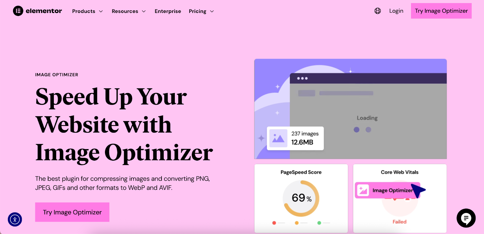
- Optimize Image File Sizes: High-resolution images are great, but they can be large files that slow down your site. It is critical to optimize them for the web without sacrificing too much quality. The Image Optimizer by Elementor is a useful tool that automatically compresses images, converts them to next-gen formats like WebP or AVIF, and helps improve site speed.
- Incorporate Video: Video can be a powerful tool for storytelling and product demonstrations. 86% of marketers report that video has helped them increase sales.
- Use Illustrations and Icons: Custom illustrations and icons can add personality to your site and help break up long blocks of text. They are also great for explaining complex ideas visually.
The Power of Whitespace
Whitespace (or negative space) is the empty space between elements on a page. It is one of the most important, yet often overlooked, elements of good design.
Benefits of using whitespace effectively:
- Improved Readability: It increases the space between lines of text and paragraphs, making content easier to read.
- Increased Focus: It helps to isolate and draw attention to important elements like CTAs.
- A More Professional Look: A clean, uncluttered layout feels more modern and sophisticated.
Don’t treat whitespace as empty space to be filled. Instead, see it as an active element that helps you create a balanced and effective composition.
Website Performance and Speed Optimization
Website performance, particularly page load speed, is a critical factor in user experience and SEO. Users have little patience for slow websites. A fast-loading site feels more professional and reliable.
Why Speed Matters
- User Experience: Slow sites are frustrating. As mentioned, the longer a page takes to load, the more likely a visitor is to leave.
- Conversion Rates: A delay of even one second in page load time can result in a 7% reduction in conversions. For an ecommerce site, this can mean a significant loss in revenue.
- SEO: Google uses page speed as a ranking factor for both desktop and mobile searches. Faster sites are more likely to rank higher.
Measuring and Auditing Your Site’s Performance
Before you can optimize your site, you need to know how it’s currently performing. Tools like Google PageSpeed Insights, GTmetrix, and Pingdom can analyze your site and provide a detailed report on its performance, along with recommendations for improvement.
These tools often measure metrics known as Core Web Vitals, which are Google’s set of signals for real-world user experience:
- Largest Contentful Paint (LCP): Measures loading performance. To provide a good user experience, LCP should occur within 2.5 seconds.
- First Input Delay (FID): Measures interactivity. For a good user experience, pages should have an FID of 100 milliseconds or less.
- Cumulative Layout Shift (CLS): Measures visual stability. A good CLS score is 0.1 or less.
Key Techniques for Improving Load Times
- Image Optimization: This is often the biggest factor in page load speed. Compressing images and using next-gen formats like WebP can dramatically reduce file sizes. The Image Optimizer plugin by Elementor, for example, can reduce image file sizes by an average of 60%.
- Enable Caching: Caching stores a static version of your website, which can be served to visitors more quickly. There are two main types:
- Browser Caching: Stores files on the user’s local computer.
- Server Caching: Stores files on the web server.
- Minify CSS, JavaScript, and HTML: Minification is the process of removing unnecessary characters (like spaces and comments) from code to reduce file size.
- Use a Content Delivery Network (CDN): A CDN stores copies of your site on servers around the world. When a user visits your site, they are served content from the server closest to them, which reduces latency. Elementor Hosting, for instance, includes a Cloudflare Enterprise CDN with every plan.
- Choose a Quality Hosting Provider: Your web host has a significant impact on your site’s performance. A managed hosting solution built for performance, like Elementor Hosting, can make a big difference. It is built on top of Google Cloud infrastructure and is designed to handle traffic peaks without slowing down.

Accessibility: Designing for Everyone
Web accessibility (often abbreviated as A11y) is the practice of ensuring that your website can be used by everyone, including people with disabilities. This includes individuals with visual, auditory, motor, and cognitive impairments. Designing for accessibility not only is the right thing to do but also benefits all users and can improve your SEO.
Understanding WCAG
The Web Content Accessibility Guidelines (WCAG) are a set of internationally recognized standards for web accessibility. They are organized around four main principles, often remembered by the acronym POUR:
- Perceivable: Information and user interface components must be presentable to users in ways they can perceive. This means providing text alternatives for non-text content (like alt text for images) and ensuring good color contrast.
- Operable: User interface components and navigation must be operable. This includes making all functionality available from a keyboard and giving users enough time to read and use content.
- Understandable: Information and the operation of the user interface must be understandable. This means making text readable and understandable and making web pages appear and operate in predictable ways.
- Robust: Content must be robust enough that it can be interpreted reliably by a wide variety of user agents, including assistive technologies (like screen readers).
Practical Steps to Improve Website Accessibility
- Use Alt Text for Images: Provide descriptive alt text for all meaningful images. This allows screen readers to describe the image to visually impaired users.
- Ensure Sufficient Color Contrast: The contrast between your text and background colors should be high enough to be readable for people with low vision. Tools like the WebAIM Contrast Checker can help you test your color combinations.
- Use Semantic HTML: Use HTML elements for their intended purpose. For example, use <h1> for the main heading, <p> for paragraphs, and <button> for buttons. This helps assistive technologies understand the structure of your page.
- Design for Keyboard Navigation: Ensure that all interactive elements (links, buttons, form fields) can be accessed and operated using only the Tab key.
- Provide Captions and Transcripts for Videos: For users who are deaf or hard of hearing, provide captions for all video content. Transcripts are also helpful.
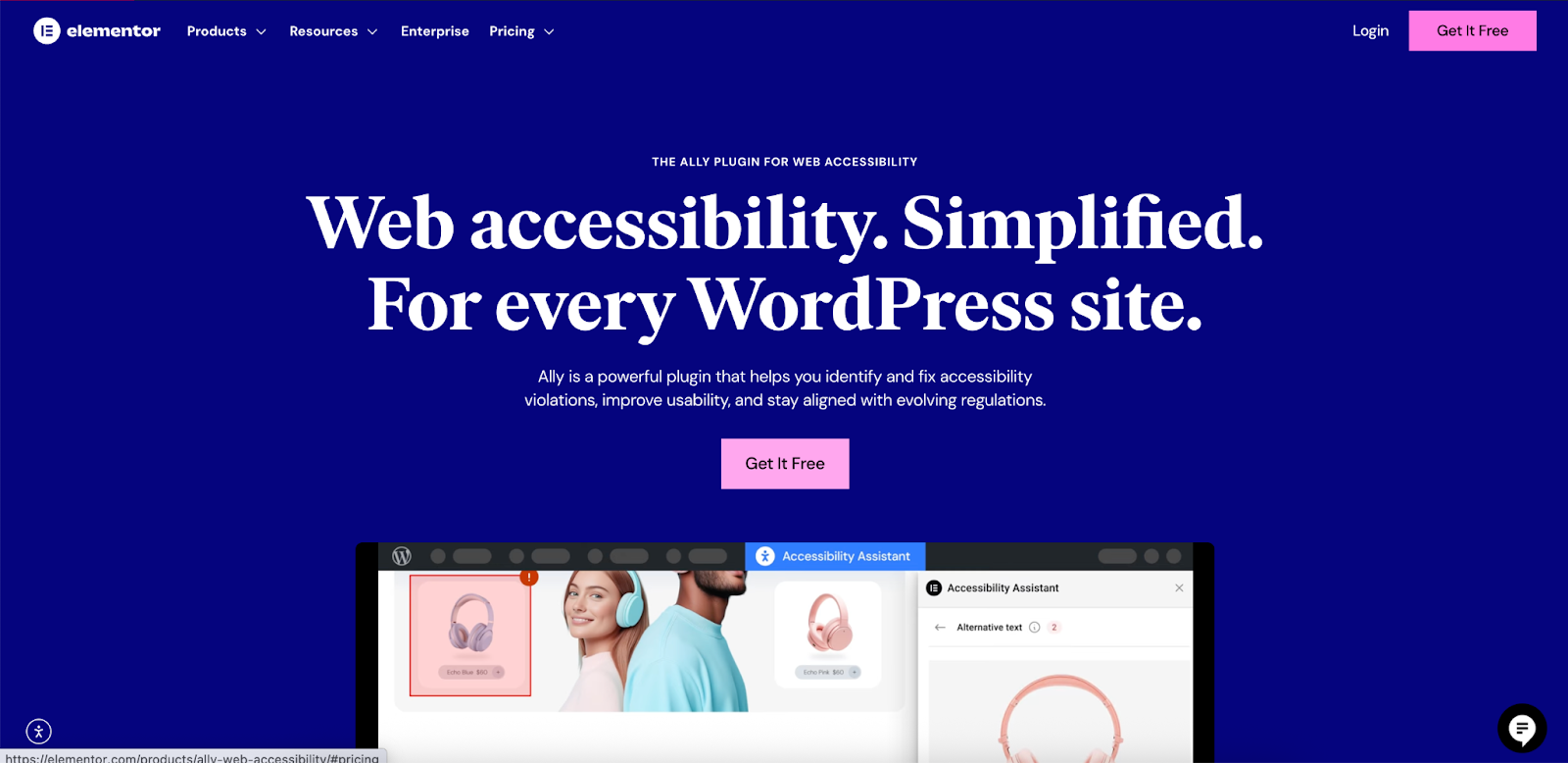
Tools are emerging to help creators address these challenges. Ally by Elementor, for example, is a plugin designed to make websites more accessible with visual tools and guided setup, helping creators make progress even without deep technical knowledge.
SEO Best Practices for Web Design
Search Engine Optimization (SEO) is the process of improving your site to increase its visibility when people search for products or services related to your business in Google, Bing, and other search engines. Good web design and good SEO go hand-in-hand. A well-designed site is easier for search engines to crawl and understand, which can lead to higher rankings.
On-Page SEO Elements to Consider During Design
- Title Tags and Meta Descriptions: While not strictly a design element, the structure of your templates should allow for unique, descriptive title tags and meta descriptions for every page.
- Heading Tags (H1, H2, H3): Use heading tags to structure your content logically. There should be only one <h1> tag per page, which typically contains the main title. Subheadings (<h2>, <h3>, etc.) should be used to break up content into readable sections.
- URL Structure: Create clean, descriptive URLs that are easy for both users and search engines to understand (e.g., yourdomain.com/services/web-design instead of yourdomain.com/p?123).
- Internal Linking: Link to other relevant pages on your website. This helps search engines understand the relationship between your pages and helps users discover more of your content.
- Mobile-Friendliness: As discussed, Google uses mobile-first indexing, so a mobile-friendly design is a critical SEO factor.
The Role of User Experience in SEO
Google’s algorithms are increasingly focused on user experience. Metrics like bounce rate, time on page, and click-through rate can all influence your rankings. A website that provides a good user experience is more likely to perform well in search results.
This means that all the best practices we’ve discussed so far—fast load times, intuitive navigation, clear visual hierarchy, and mobile-friendliness—are also SEO best practices.
Security: Protecting Your Website and Its Users
Website security is a crucial aspect of web design that is often overlooked. A security breach can damage your brand’s reputation, lead to loss of data, and result in financial penalties. Building security into your website from the beginning is far more effective than trying to add it on later.
Essential Security Measures
- Use HTTPS: An SSL certificate encrypts the data transfer between the user’s browser and your website. This is essential for all sites, not just those that handle sensitive information. Modern browsers will flag sites without HTTPS as “Not Secure.”
- Keep Software Updated: If you’re using a CMS like WordPress, it’s vital to keep the core software, plugins, and themes up to date. Updates often contain important security patches.
- Use Strong Passwords: Enforce strong password policies for all user accounts, especially for administrators.
- Implement a Web Application Firewall (WAF): A WAF sits between your website and the rest of the internet, filtering out malicious traffic before it can reach your site.
- Regular Backups: Regularly back up your website files and database. In the event of a security breach or other issue, you can restore your site from a backup.
Choosing a hosting provider that prioritizes security can alleviate many of these concerns. Elementor Hosting, for example, provides enterprise-grade security features like a premium SSL certificate, anti-DDoS protection, and a WAF with every plan.
Streamlining Your Workflow with Efficient Tools
Building a professional website involves many steps, from initial planning and client discovery to design, development, and launch. Using the right tools can streamline this process, save time, and help you deliver better results.
From Idea to Wireframe in Minutes
The initial planning phase of a project can be time-consuming. Traditionally, it involves client meetings, creating briefs, and then manually building wireframes. This process can take days or even weeks.
AI-powered tools are changing this dynamic. Elementor’s Site Planner, for example, can generate a complete website wireframe, including page layouts and AI-generated content, in minutes. It guides you through a series of questions about the project and then builds a multi-page site draft inside the Elementor ecosystem. This allows you to present a tangible plan to clients from day one, speeding up alignment and reducing revisions.
The Rise of AI in Web Creation
AI is becoming an increasingly powerful assistant for web creators. It can help with a wide range of tasks, from generating content to writing code.
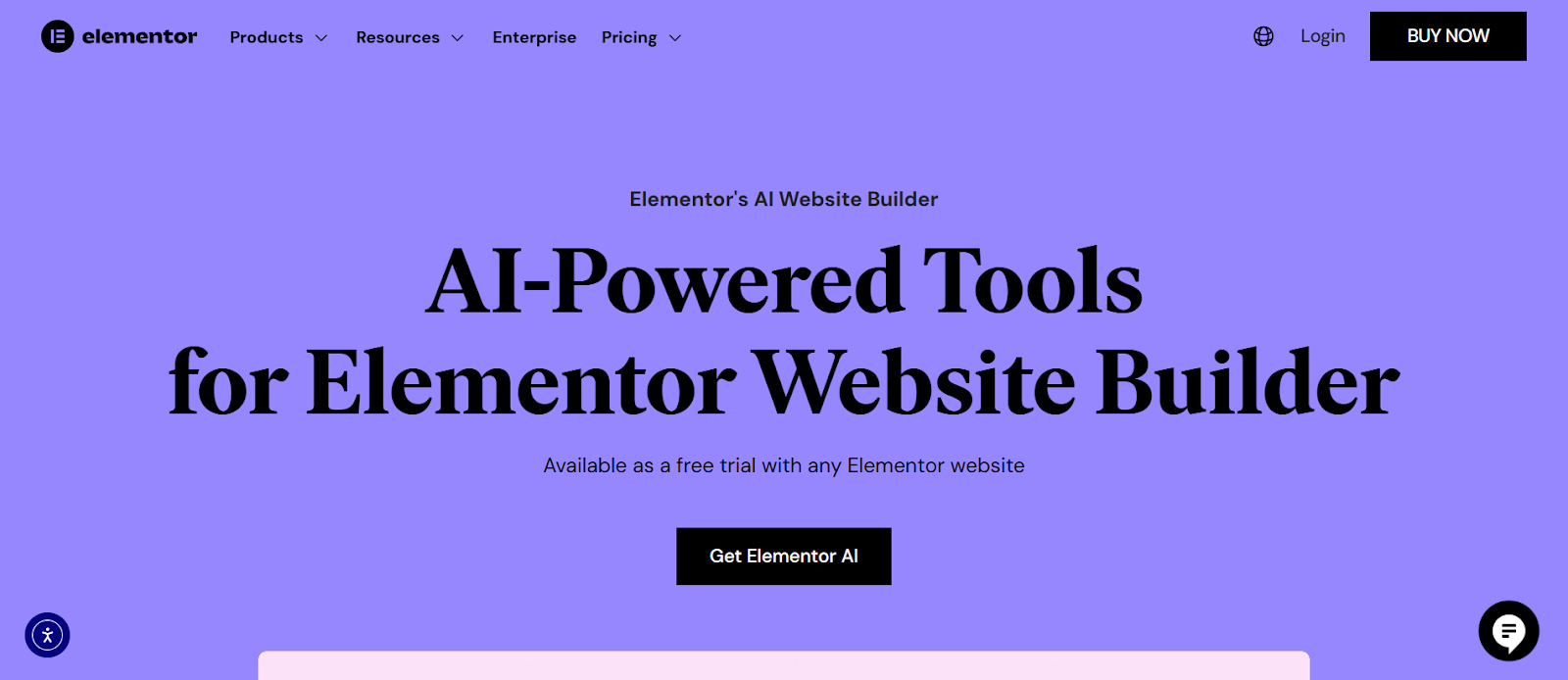
Elementor AI is a creative assistant built directly into the Elementor Editor. It can help you:
- Generate and refine text: Create headlines, descriptions, and other copy without leaving your workflow.
- Write custom CSS: Add custom styling and effects by describing what you want in a simple prompt.
- Create layouts: Generate entire page sections based on your goals.
- Edit images: Remove backgrounds or generate new, on-brand images directly within the editor.
By integrating these capabilities into a single platform, you can reduce the need to switch between multiple disconnected tools, which helps maintain creative momentum and improves efficiency.
Conclusion
The landscape of web design is constantly evolving, but the core principles of creating a positive user experience remain the same. By focusing on the needs of the modern user, adhering to best practices in UX and UI design, prioritizing mobile-friendliness and performance, ensuring accessibility and security, and leveraging efficient tools, you can create websites that are not only beautiful but also highly effective.
Whether you are a freelancer, part of an agency, or a business owner building your own site, implementing these best practices will set your projects up for success in 2025 and beyond. The goal is to create a digital experience that feels intuitive, engaging, and trustworthy—a website that visitors will want to return to again and again.


