
Creating emails that not only look beautiful but also perform exceptionally requires a blend of artistic creativity and scientific strategy. This guide covers everything you need to know about email design in 2025, from foundational principles and key structural elements to advanced techniques in accessibility and mobile optimization. We’ll explore the strategic thinking behind every design choice and introduce the tools that help bring your vision to life, enabling you to build emails that engage, convert, and strengthen your brand.
The Foundation: Core Principles of Effective Email Design
Before you choose a color palette or font, it’s crucial to understand the strategic principles that underpin every successful email campaign. Great design is not just about aesthetics; it’s about clear communication and guiding the user toward a specific action.
1. Start with a Goal-Oriented Strategy
Every email you send should have a clear and singular purpose. The design’s primary function is to support that goal. Are you trying to drive sales for a new product, increase readership for a blog post, or announce a new feature? The objective will dictate the entire layout, from the headline to the call-to-action.
Different types of emails have distinct goals:
- Promotional Emails: These are focused on conversion. The design should be clean, product-focused, and lead the user directly to a prominent call-to-action (CTA).
- Newsletters: The goal here is engagement and relationship-building. The design can accommodate more content, such as multiple articles or updates, but should still be organized and easy to navigate.
- Transactional Emails: These include order confirmations, shipping notices, and password resets. Their primary goal is to convey critical information clearly and concisely. The design should be simple, trustworthy, and heavily branded to reassure the customer.
With an average return on investment (ROI) of $36 for every $1 spent, email marketing is an incredibly powerful channel. A goal-oriented design strategy is essential to unlocking that potential.
2. Establish a Clear Visual Hierarchy
Visual hierarchy is the art of arranging elements to show their order of importance. When a subscriber opens your email, their eyes should be naturally guided through the content in a logical sequence. A strong hierarchy ensures your main message is understood in seconds, even by someone skimming.
You can create this hierarchy using several design elements:
- Size and Scale: Your most important element—usually the main headline or a hero image—should be the largest. Subheadings should be smaller, and body text smaller still.
- Color and Contrast: Bright, contrasting colors should be reserved for key elements like CTAs to make them stand out.
- Whitespace: The empty space around your content is just as important as the content itself. Ample whitespace prevents a design from feeling cluttered and helps separate different sections, making the email easier to read and digest.
3. Maintain Brand Consistency
Your emails are an extension of your brand. Every design choice should align with the branding on your website and other marketing materials. This consistency is crucial for building trust and recognition. In fact, consistent brand presentation has been shown to increase revenue by up to 33%.
- Logo Placement: Your logo should appear in a consistent location, typically at the top of the email header.
- Color Palette: Stick to your established brand colors. Use them strategically to create a familiar look and feel.
- Typography: Use the same fonts that appear on your website. This reinforces your brand identity and contributes to a cohesive user experience.
4. Prioritize a Clean, Scannable Layout
People rarely read emails word-for-word. Most users scan for key information. Your design must cater to this behavior by being as scannable as possible.
A single-column layout is often the most effective choice. It simplifies the visual experience and, most importantly, adapts perfectly to mobile devices, where a majority of emails are opened.
To further improve scannability:
- Use short paragraphs.
- Incorporate bulleted or numbered lists for key features or steps.
- Break up content into distinct sections with clear headings.
This approach ensures your message gets across quickly and effectively, respecting your audience’s time and attention.
The Building Blocks: Key Elements of an Email
Every well-designed email is constructed from a set of essential components. Understanding the role of each element allows you to build a cohesive and effective structure.
The Pre-Header and Header
These are the first elements a subscriber sees and play a critical role in whether your email gets opened.
Pre-Header Text
The pre-header is the short snippet of text that appears next to or below the subject line in most email clients. It offers a secondary opportunity to entice the reader to open the email. A well-crafted pre-header should complement the subject line and provide a compelling preview of the email’s content. Avoid generic text like “View this email in your browser” and instead use this valuable real estate to add context or create urgency.
The Header
The email header sits at the very top of your email content. Its primary role is to immediately identify your brand. This is typically achieved by placing your company logo in a prominent, clean space. Keep the header design simple and uncluttered to avoid distracting from the main message.
The Email Body: The Core Message
This is where you deliver your main content and guide the user toward your desired action.
Compelling Imagery and Visuals
Images are powerful tools for capturing attention and conveying emotion. Whether you use high-quality photographs, custom illustrations, or animated GIFs, your visuals should be relevant, on-brand, and support the core message.
However, visuals come with technical considerations:
- Image Compression: Large image files can dramatically slow down email load times, especially on mobile networks. Always compress your images before uploading them to find the right balance between quality and file size.
- ALT Text: Some email clients block images by default, and screen readers for visually impaired users rely on ALT text to describe the image’s content. Always write descriptive ALT text for every image to ensure your message is understood by everyone, regardless of how they access your email.
Typography that Enhances Readability
The fonts you choose have a major impact on how readable and professional your email feels.
- Font Choice: While you can embed custom fonts, not all email clients support them. It’s often safer to stick with web-safe fonts like Arial, Helvetica, Georgia, and Times New Roman, which render correctly everywhere.
- Font Size and Line Height: For body copy, a font size of 14-16px is generally recommended for optimal readability on both desktop and mobile. Line height (the space between lines of text) should be approximately 1.5 times the font size to ensure text doesn’t feel cramped.
- Color Contrast: Ensure there is sufficient contrast between your text color and background color. This is an essential accessibility practice that makes your content easier to read for everyone, especially users with low vision.
The Call-to-Action (CTA): The Engine of Conversion
Your CTA is arguably the most important element in any promotional email. It’s the button or link that directs users to take the next step. An effective CTA is:
- Action-Oriented: Use strong, clear verbs like “Shop Now,” “Read More,” “Get Your Free Trial,” or “Book Your Spot.”
- Visually Prominent: The CTA button should use a color that contrasts with the background, making it impossible to miss.
- Clearly Placed: Position the CTA logically where the user would expect to find it after reading your main message.
- HTML-Based: Whenever possible, use an HTML-based “bulletproof” button instead of an image-based one. HTML buttons load even when images are blocked, ensuring your CTA is always visible and clickable.
The Footer: The Final Touchpoint
The email footer is more than just a formality; it’s a critical component for building trust and complying with legal regulations.
Every email footer should include:
- Unsubscribe Link: This is legally required by regulations like the CAN-SPAM Act and GDPR. Make it easy to find to maintain a healthy email list and avoid spam complaints.
- Company Information: Include your physical mailing address to comply with anti-spam laws.
- Links to Social Media: Offer subscribers another way to connect with your brand.
- Contact Information or a Link to Your Help Center: Provide a path for customers who need support.
Mobile-First and Responsive Design: A Non-Negotiable Approach
Designing for email today means designing for mobile first. With over 60% of emails being opened on a mobile device, a seamless mobile experience is essential for success.
Why Mobile-First is Critical
A mobile-first approach means you design the mobile version of your email before you design the desktop version. This forces you to prioritize essential content and create a clean, uncluttered layout that works perfectly on a small screen.
This is closely tied to responsive design, which uses flexible grids and CSS media queries to automatically adapt your email’s layout to the screen size it’s being viewed on. A responsive email will look great on a tiny smartphone screen, a tablet, and a large desktop monitor.
Best Practices for Responsive Email Design
- Embrace the Single-Column Layout: This is the most reliable way to ensure your content is presented in a clear, logical order on any device.
- Use Large, Tappable CTAs: Buttons should be at least 44×44 pixels to be easily tappable with a thumb.
- Ensure Readable Font Sizes: Users should not have to pinch and zoom to read your text. A 16px font size is a great baseline for mobile body copy.
- Optimize Images for Speed: Mobile users are often on slower networks. Keep image file sizes small to ensure your email loads quickly.
- Utilize Ample Whitespace: This prevents your design from feeling crowded on a small screen and helps separate tappable elements, reducing accidental clicks.
Advanced Design Techniques and Modern Trends
Once you’ve mastered the fundamentals, you can explore more advanced techniques to make your emails stand out and provide an even better user experience.
Designing for Dark Mode
Dark mode has become an incredibly popular setting on both desktop and mobile operating systems. Instead of designing for a single light background, you now need to consider how your emails will look when the interface is inverted to a dark theme.
This presents a few challenges:
- Logo Inversion: Dark logos or logos with transparent backgrounds can disappear on a dark background.
- Color Changes: Some email clients automatically invert colors, which can clash with your brand identity.
Tips for dark mode design:
- Use high-quality PNGs with transparent backgrounds for your logos. You can add a subtle white or light-colored stroke around dark logos to ensure they remain visible.
- Test your emails in both light and dark mode across multiple email clients (like Apple Mail, Gmail, and Outlook) to see how they render.
Accessibility in Email Design (A11y)
Accessibility means designing your emails so everyone, including people with disabilities can use them. This is not only the right thing to do but also expands your potential audience.
Key Accessibility Considerations:
- Use Semantic HTML: Structure your content with proper HTML tags (e.g., <h1> for headlines, <p> for paragraphs). This helps screen readers interpret your content correctly.
- Ensure Sufficient Color Contrast: Use online tools to check that your text and background colors meet Web Content Accessibility Guidelines (WCAG).
- Write Descriptive ALT Text: As mentioned earlier, ALT text is crucial for users who cannot see images.
- Use Descriptive Link Text: Instead of “Click Here,” make your link text descriptive, such as “Read our 2025 Market Report.”
- Set the Language Attribute: Declaring the language in your HTML (<html lang=”en”>) helps screen readers pronounce your content correctly.
Incorporating Interactivity and Dynamic Content
Modern email design is pushing the boundaries of what’s possible inside the inbox.
- Interactive Elements: Using advanced CSS, some designers incorporate elements like image carousels, accordions for hiding and showing content, and stylish hover effects on buttons. These can create a richer, more engaging experience, but be aware that they are not supported by all email clients.
- Dynamic Content: Personalization is a powerful driver of engagement. Dynamic content allows you to show different images or offers to different segments of your audience within the same email campaign, creating a highly tailored experience.
The Role of AI in Email Creation
Artificial intelligence is becoming a powerful assistant in the creative process. AI tools can help marketers generate effective subject lines, write compelling body copy, and even suggest design layouts. The true power of AI, however, is in streamlining the entire marketing workflow. The journey for a user doesn’t end with a click in an email; it continues on the landing page they are sent to. A disconnect between the email and the landing page can lead to lost conversions.
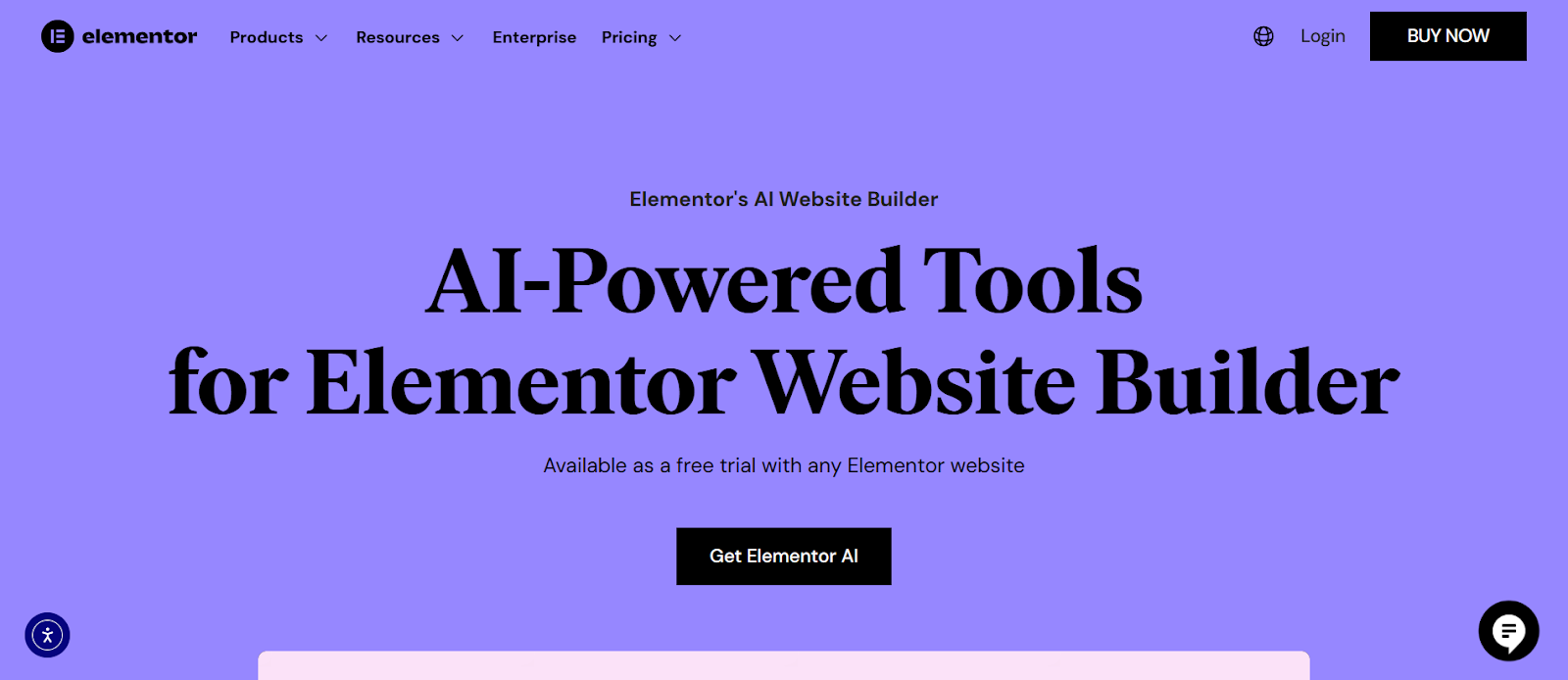
AI can bridge this gap. For example, a tool like
Elementor AI can be used to write compelling, on-brand copy for the popups, forms, and landing pages that serve as the destination for your email CTAs. This ensures the messaging and tone remain consistent from the inbox to your website, creating a smooth and persuasive user journey.
Tools and Workflow for Efficient Email Design
Having the right tools and a streamlined workflow is key to producing high-quality emails efficiently.
Choosing Your Email Design Tools
There are many tools available for designing emails. Most Email Service Providers (ESPs) like Mailchimp or ConvertKit have built-in drag-and-drop editors that are great for beginners. For more custom designs, web creators might use dedicated email design platforms like Stripo or BeeFree, which offer more flexibility and then export the HTML to their ESP.
Streamlining the Connection Between Email and Your Website
Your email list is your most valuable marketing asset, and your website is the primary place to grow that list. The effectiveness of your email campaigns begins with how you capture leads. Creating high-converting signup forms and popups is essential.
This is where a powerful website builder can play a pivotal role in your email marketing ecosystem. A platform like
Elementor offers a Form Builder and Popup Builder that allows you to design and implement these crucial elements directly on your website with complete visual control. You can create visually stunning popups with specific triggers—such as when a user is about to exit the page—to capture attention and encourage signups. The forms can be styled to seamlessly match your website’s branding, creating a professional and trustworthy experience for the user. By integrating your lead capture efforts within your web creation workflow, you create a powerful engine for growing your email list.
Testing: The Final, Crucial Step
An email can look perfect on your screen but appear broken in a recipient’s inbox. The sheer number of email clients (Gmail, Outlook, Apple Mail, etc.) and devices makes testing an absolutely critical final step.
Before sending any campaign, you should test for:
- Rendering Across Clients: How does it look on different desktop, mobile, and web-based email clients?
- Link Functionality: Are all links working and pointing to the correct URLs?
- Image Loading: Do all images load correctly? What does the email look like if images are turned off?
- Dark and Light Mode: Does the design hold up in both viewing modes?
Conclusion: Launching Your Firm with Confidence
Great email design is a thoughtful combination of art and science. It begins with a clear strategy and is built upon a foundation of visual hierarchy, brand consistency, and a deep respect for the user’s experience. From the smallest pre-header text to the most prominent call-to-action, every element has a role to play in communicating your message and driving results.
By embracing mobile-first principles, prioritizing accessibility, and leveraging the right tools to connect your website to your email strategy, you can create campaigns that do more than just land in an inbox. You can craft experiences that capture attention, build trust, and foster lasting relationships with your audience. By applying the principles in this guide, you are well-equipped to design emails that not only look professional but also deliver measurable success.


