
This guide provides a comprehensive walkthrough of everything you need to know about optimizing images for the web in 2025. We’ll explore why it’s so important, break down the most effective techniques and tools, and show you how to find the perfect balance between image quality and website speed. By the end, you’ll have an actionable framework to ensure your visuals enhance your site, rather than hinder it.
The “Why” Behind Image Optimization: More Than Just Speed
Optimizing your images is a foundational practice that influences several key areas of your online presence, from user engagement to your bottom line. It’s a solution to the common pain point of plugins and themes slowing down a website, which can hurt SEO.
Boosting User Experience and Engagement
First impressions are pivotal. When a visitor arrives on your site, they expect a swift and seamless experience. Industry data consistently shows a direct link between load time and user behavior. A one-second delay in page load time can result in a 7% reduction in conversions. As load times increase, so does the bounce rate—the percentage of visitors who leave after viewing only one page.
Slow-loading pages, frequently caused by heavy image files, are a primary source of user frustration. This friction makes visitors more likely to abandon your site, often for a competitor. By optimizing your images, you deliver the faster, more engaging experience modern users demand. This encourages them to stay longer, interact with your content, and ultimately convert, whether that means making a purchase, filling out a form, or signing up for a newsletter.
Enhancing SEO and Search Engine Rankings
Search engines like Google prioritize websites that provide a great user experience, and page speed is a confirmed, significant ranking factor. To quantify this, Google introduced Core Web Vitals, a set of metrics designed to measure the real-world user experience of a page in three key areas:
- Largest Contentful Paint (LCP): Measures loading performance. It marks the point in the page load timeline when the main content has likely loaded. Unoptimized images are one of the most common causes of a poor LCP score.
- First Input Delay (FID): Measures interactivity. It quantifies the experience users feel when trying to interact with a page that isn’t responsive. While less directly tied to images, overall page bloat from large assets can delay browser processing and negatively impact FID.
- Cumulative Layout Shift (CLS): Measures visual stability. It assesses whether elements on the page move around unexpectedly as the page loads. Images without specified dimensions are a frequent culprit, causing text and other elements to jump, which creates a jarring experience.
Improving your Core Web Vitals scores can directly lead to better search engine rankings. Beyond page speed, properly optimized images—with descriptive filenames and alt text—provide valuable context to search engine crawlers, helping them understand your visual content. This can lead to higher rankings in both standard and image search results, driving more targeted organic traffic to your site. With the Image Optimizer plugin, you can improve Core Web Vitals and aim for higher rankings on Google.
Improving Accessibility
Web accessibility is the practice of ensuring your website is usable by everyone, including people with disabilities. It’s not just a best practice; in many regions, it’s a legal requirement. Image optimization plays a direct role in creating a more accessible web.
The primary tool for this is alt text, a brief, descriptive text alternative for an image. Screen readers, used by visually impaired individuals, read this text aloud, allowing users to understand the content and context of your visuals. Without alt text, an image is essentially invisible to these users.
Writing good alt text is a skill. It should convey the purpose and meaning of the image concisely. This simple step creates a more inclusive experience and ensures you are catering to your entire potential audience.
Reducing Bandwidth and Storage Costs
Every byte counts. Optimized images have significantly smaller file sizes, which means they consume less bandwidth when a user’s browser downloads them. This is especially important for the growing number of users accessing the web via mobile devices, who may have limited data plans or be on slower network connections.
For you, the website owner, the benefits are tangible. Smaller image files require less storage space on your server, which can reduce your hosting costs. Furthermore, since you are transferring less data to your users, you will also see a reduction in bandwidth costs from your hosting provider. Over time, especially for image-heavy websites like portfolios, eCommerce stores, and blogs, these savings can be substantial.
A Strategic Approach to Image Optimization
Effective image optimization isn’t a single action but a multi-step process. It requires making informed decisions before an image is even uploaded to your site. By following a strategic workflow, you can ensure every visual asset is perfectly tuned for web performance.
H3: Choosing the Right File Format
The journey begins with selecting the right file format. Different formats use different compression methods and have unique features. Choosing the wrong one can lead to unnecessarily large files or poor visual quality.
- JPEG (or JPG): The workhorse of the web, JPEG is the best choice for photographs and other complex images with millions of colors and smooth gradients. It uses lossy compression, a method that intelligently removes some image data to dramatically reduce file size. For most photographic content, this data loss is imperceptible to the human eye, making it an ideal trade-off between quality and size.
- PNG: This format is your go-to for any image that requires a transparent background, such as logos, icons, and many interface elements. PNG uses lossless compression, meaning it reduces file size without discarding any image data, ensuring perfect quality. The trade-off is that file sizes are typically larger than JPEGs, so it should be used only when transparency or perfect detail is required.
- GIF: While once popular, GIF’s role is now highly specialized. It’s best suited for simple, short animations. Its color palette is limited to just 256 colors, making it a poor choice for photos but acceptable for basic animated graphics.
- SVG (Scalable Vector Graphics): Unlike the other formats, SVGs are vector-based, meaning they are drawn from mathematical formulas rather than a grid of pixels. This makes them infinitely scalable without any loss of quality. They are the perfect choice for logos, icons, and simple illustrations that need to look crisp on any screen size, from a small phone to a large retina display.
- WebP: Developed by Google, WebP is a modern, next-gen format that has become a new standard for web images. It provides superior lossy and lossless compression, resulting in files that are typically 25-35% smaller than equivalent JPEGs and PNGs, with no noticeable loss in quality. Most modern browsers now fully support WebP, making it a safe and highly effective choice for almost all web imagery.
- AVIF: The AV1 Image File Format is the cutting edge of image compression, offering even more significant file size reductions than WebP (often an additional 30-50% smaller). As a very new format, its browser support is still growing, but it represents the future of high-performance web imagery. Tools like the Image Optimizer by Elementor already support AVIF conversion, allowing forward-thinking creators to serve the smallest possible files to users with compatible browsers.
| File Format | Best For | Compression | Transparency | Key Consideration |
| JPEG | Photographs, complex images | Lossy | No | The universal standard for photos; provides excellent compression for complex visuals. |
| PNG | Logos, icons, graphics requiring transparency | Lossless | Yes | Use when you need a transparent background or pixel-perfect detail; files are larger. |
| GIF | Simple, short animations | Lossless | Yes | Limited to 256 colors; best for basic animated elements, not photos. |
| SVG | Logos, icons, simple illustrations | N/A (Vector) | Yes | Infinitely scalable without quality loss; lightweight and code-based. |
| WebP | All-purpose web images (replaces JPEG/PNG) | Lossy/Lossless | Yes | The modern standard; offers significantly smaller file sizes with great quality and broad browser support. |
| AVIF | High-performance, future-proofing | Lossy/Lossless | Yes | The next generation; provides the best compression available, but browser support is still expanding. |
Resizing Images to the Right Dimensions
One of the most common mistakes is uploading images directly from a high-resolution camera or stock photo site. A photo from a modern smartphone can be over 4000 pixels wide, while the content area on your website might only be 800 or 1200 pixels wide. Displaying a huge image in a small container forces the browser to download the massive file and then shrink it, wasting bandwidth and processing power.
Before uploading, always resize your images to the maximum dimensions at which they will be displayed.
- Full-Width Hero Images: Determine the maximum width of your site’s container. If your site is 1920 pixels wide, that’s a good target for your hero images.
- Content-Area Images: Check the width of your blog post or page content area. If it’s 800px wide, resize your images to match.
- Thumbnails & Gallery Images: These can be much smaller, often between 150px and 400px wide.
Tools like Adobe Photoshop, Affinity Photo, or free online editors like Canva make resizing simple. For web creators using Elementor, the editor provides extensive responsive controls, allowing you to customize the appearance of your site on any device. You can adjust settings for each breakpoint, but for optimal performance, you should still upload images that are appropriately sized for their largest intended display.
Compressing Images for Smaller File Sizes
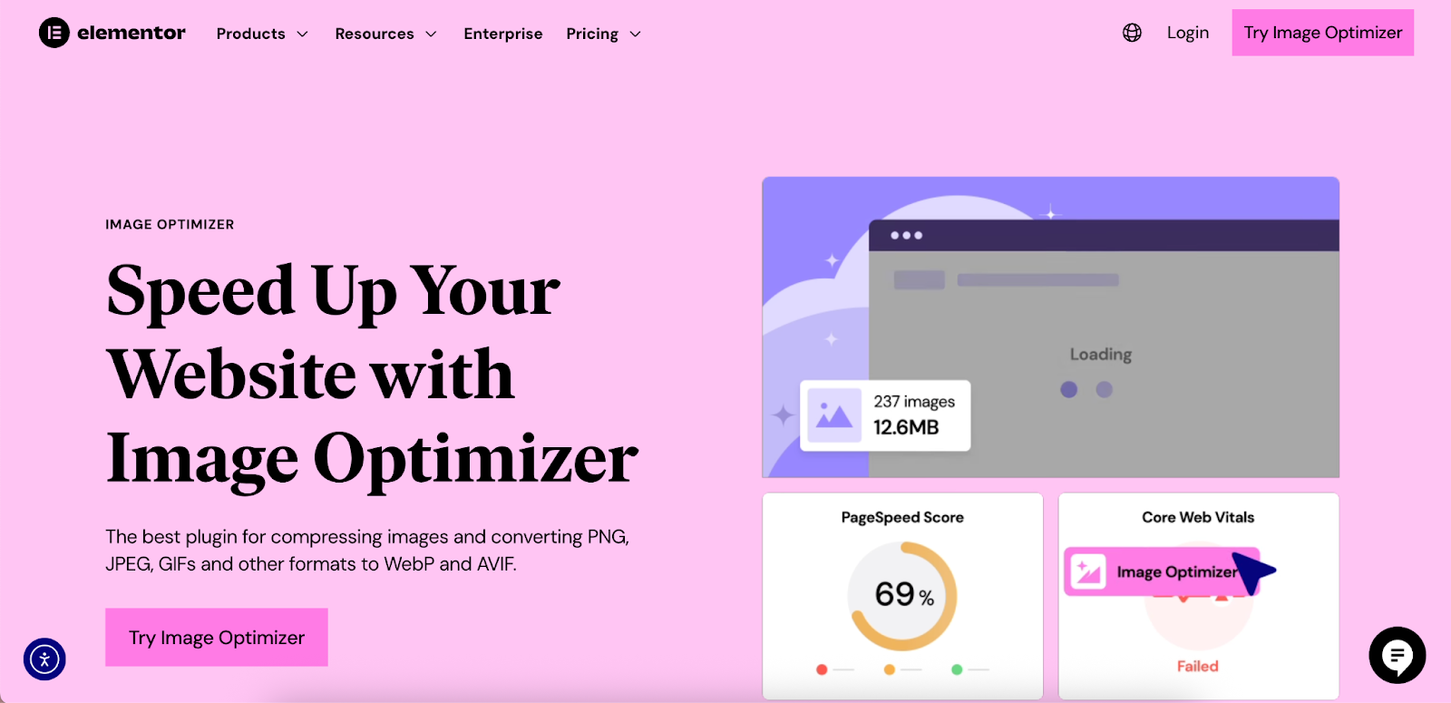
After resizing, the next step is compression. This process further reduces the file size by removing or efficiently reorganizing the image data. Using an optimization plugin can help automate this. For instance, the Image Optimizer by Elementor provides both lossy and lossless compression options to fit your needs. Over a million active installs demonstrate its effectiveness in the WordPress community.
- Lossy Compression: As mentioned, this method removes some data to achieve smaller sizes. It’s ideal for JPEGs and WebP images used for photographs. Most compression tools let you choose the level of compression (e.g., from 0 to 100). A good starting point is around 70-85% quality, which often provides a great balance.
- Lossless Compression: This method rewrites the image data more efficiently without any quality loss. It’s best for PNGs, GIFs, and SVGs where every detail must be preserved. While the file size reduction is less dramatic than with lossy compression, it’s still a crucial step.
Automating Image Optimization with Plugins
Manually resizing and compressing every single image is a tedious workflow that can break your creative momentum. This is where automation becomes a web creator’s best friend. For WordPress users, image optimization plugins can handle these tasks automatically upon upload.
The Image Optimizer by Elementor is a powerful solution designed to integrate directly with the WordPress media library, making the process effortless. It was built to solve the frustrations of slow, image-heavy sites and complex workflows.
With the Image Optimizer by Elementor, you can:
- Automate Optimization: New images are instantly optimized as they’re uploaded.
- Bulk Optimize Existing Images: Fix your entire existing media library in one go to improve site-wide performance.
- Convert to Next-Gen Formats: Automatically convert your JPEGs and PNGs to WebP and AVIF formats, serving the smallest possible files to users.
- Smart Resizing: Automatically resize oversized images to a predefined maximum width and height, preventing huge files from ever being stored on your server.
- Remove EXIF Data: Strip unnecessary metadata (like camera settings, location, etc.) from image files to shave off extra kilobytes.
- Backup & Restore: Keep backups of your original images, giving you the freedom to restore them at any time.
This plugin is designed for any WordPress website, not just those built with Elementor, and allows you to optimize images across unlimited sites. Testimonials from agencies and developers highlight its impact, with users reporting significant improvements in load times—some up to 40% faster—and a 60% average reduction in image file size.
Leveraging Browser Caching and Content Delivery Networks (CDNs)
Optimizing the image files is only part of the equation. How you deliver those files to the user is equally important.
- Browser Caching: This instructs a user’s browser to save a copy of your website’s static files (like images, CSS, and JavaScript) on their computer. When they revisit your site, the browser loads these files from its local cache instead of downloading them again from your server. This results in dramatically faster load times for repeat visitors. You can configure browser caching through your server settings or with a caching plugin.
- Content Delivery Network (CDN): A CDN is a global network of servers. It stores copies of your images and other assets on servers located around the world. When a user visits your site, the CDN delivers the assets from the server that is geographically closest to them. This reduces latency (the time it takes for data to travel) and significantly speeds up delivery. Elementor Hosting is an example of a solution that leverages top-tier cloud infrastructure, including the Cloudflare Enterprise CDN, with every plan to ensure high-performance sites.
Implementing Lazy Loading
Lazy loading is a performance technique that defers the loading of off-screen images. Instead of loading every image on a page at once, the browser only loads the images that are currently visible in the user’s viewport. As the user scrolls down, subsequent images are loaded just before they come into view.
This drastically improves the initial page load time and the LCP score, as the browser can render the visible part of the page much faster. WordPress has supported native lazy loading since version 5.5. Additionally, page builders like Elementor include lazy loading as a standard feature, ensuring your pages are optimized out of the box.
SEO for Images: Getting Your Visuals Noticed
Optimizing images for performance and for search engines go hand-in-hand. An image that loads quickly is great, but one that drives traffic is even better.
Descriptive File Names
Never use default camera filenames like IMG_4815.jpg or DSC0024.jpg. Before uploading, rename your image file with a descriptive, keyword-rich name. Use hyphens to separate words.
- Bad: IMG_4815.jpg
- Good: modern-blue-accent-chair-with-ottoman.jpg This gives search engines immediate context about the image’s subject matter.
Meaningful Alt Text
As discussed under accessibility, alt text is critical. It serves a dual purpose for SEO. It provides a text description for screen readers and also gives search engines more information to understand the image.
- Be Descriptive: Accurately describe what is in the image.
- Be Concise: Keep it brief and to the point.
- Use Keywords Naturally: If it makes sense, include your target keyword, but do not stuff keywords where they don’t belong.
- Bad Alt Text: chair
- Good Alt Text: A person sitting in a modern blue accent chair reading a book
Image Sitemaps
For image-heavy websites, an image sitemap can be beneficial. This is a separate XML file that lists all the images on your site, providing an explicit path for search engines to find and index them. This can be especially helpful if your images are loaded via JavaScript or are otherwise hard for crawlers to discover. Many popular SEO plugins can generate an image sitemap for you.
Conclusion: A Faster, More Engaging Web for Everyone
Image optimization is an indispensable skill for anyone building for the web today. It’s a discipline that sits at the intersection of design, performance, and marketing. By adopting a strategic approach—choosing the right formats, resizing and compressing effectively, and leveraging automation—you can dramatically improve your website’s performance. This leads to a better user experience, stronger SEO rankings, improved accessibility, and a more efficient use of resources.
Whether you prefer a manual workflow or embrace the efficiency of automated tools like the Image Optimizer by Elementor, the goal is the same: to make image optimization a non-negotiable step in your development process. By dedicating attention to your visual assets, you build a faster, more engaging, and more successful website that stands out in the crowded digital landscape.


