
In 2025, the landscape of image formats is more diverse than ever. From legacy workhorses to next-generation powerhouses, each format offers a unique balance of quality, compression, and functionality. Selecting the appropriate type for each specific use case—be it a stunning hero image, a crisp logo, or an engaging animation—directly impacts your site’s performance, user experience, and even your search engine ranking. Product pages with high-quality, zoomable images, for instance, can see up to 40% higher conversion rates.
This guide provides a comprehensive deep dive into the 10 most essential image file types for the web. We’ll explore the technical pros and cons of each, identify their best use cases, and show you how to make the smartest choice for your projects, ensuring your website is both beautiful and blazingly fast.
Foundational Concepts: Understanding Image DNA
Before we unpack each file type, let’s quickly cover two fundamental concepts that determine how images behave: raster vs. vector and lossy vs. lossless compression.
Raster vs. Vector
- Raster Images: Think of a raster image as a mosaic. It’s built from a fixed grid of tiny squares called pixels. Photographs and detailed illustrations are raster images. Their main characteristic is that they are resolution-dependent; if you try to enlarge a raster image beyond its original pixel dimensions, it loses quality and becomes blurry or “pixelated.” Common raster formats include JPEG, PNG, GIF, WebP, and AVIF.
- Vector Images: Instead of pixels, vector images are defined by mathematical equations, points, lines, and curves. This means they are resolution-independent and can be scaled to any size—from a tiny favicon to a massive billboard—without any loss of quality. This makes them perfect for logos, icons, and simple illustrations that need to look sharp across all devices and sizes. SVG is the most common vector format for the web.
Lossy vs. Lossless Compression
Compression is the process of reducing an image’s file size. The goal is to make web pages load faster without a noticeable drop in visual quality.
- Lossy Compression: This method reduces file size by permanently discarding some of the image’s data. The algorithm intelligently removes information that the human eye is least likely to notice. This results in significantly smaller file sizes but comes at the cost of some quality degradation. The more you compress, the smaller the file gets, but the more quality you lose. JPEG is the most well-known lossy format.
- Lossless Compression: This method reduces file size without throwing away any of the original image data. It works by identifying and eliminating statistical redundancy. When the image is uncompressed, it’s restored to its original state perfectly. As a result, file sizes are generally larger than with lossy compression, but the image quality remains pristine. PNG is a popular lossless format.
Understanding these core principles is the first step toward making informed decisions about which image format to use for each part of your website.
1. JPEG (Joint Photographic Experts Group)
JPEG (often seen with the .jpg extension) is the most ubiquitous image format on the web, and for good reason. It’s a raster format that uses lossy compression, making it the champion for displaying complex, colorful photographs and images with intricate gradients.
Its compression algorithm is incredibly efficient at shrinking the file size of photographs, which is why it has been a web standard for decades. JPEGs can display millions of colors (24-bit color), allowing for rich and vibrant visuals.
A key technical aspect of JPEG compression is chroma subsampling. This technique reduces color information (chroma) more than brightness information (luma), capitalizing on the fact that human eyes are less sensitive to variations in color than to changes in light and dark. This allows for a significant reduction in file size with minimal perceptible impact on quality.
Pros:
- Excellent Compression: Achieves very small file sizes for photographs and complex images.
- Full Color Spectrum: Supports up to 16.7 million colors, making it ideal for realistic images.
- Universal Compatibility: Supported by virtually every browser, device, and image editor in existence.
Cons:
- Lossy Compression: Quality degrades with higher compression levels and each time the file is saved.
- No Transparency: JPEGs do not support transparent backgrounds, always appearing as a solid rectangle.
- Not Ideal for Sharp Lines: The compression artifacts can make text and logos with sharp edges look blurry or fuzzy.
Best Use Cases for JPEG:
- Photographs: The undisputed king for any photographic content, from hero images and blog post photos to product shots and galleries.
- Complex Images: Any raster image with millions of colors, gradients, and complex textures will benefit from JPEG’s compression.
Working with JPEGs in Elementor:
When you use the Image widget in the Elementor editor, you can easily upload a JPEG. For best results, resize your image to the exact dimensions you need before uploading. You can then use Elementor’s style controls to adjust opacity, add CSS filters, and apply a border radius to soften the rectangular edges.
2. PNG (Portable Network Graphics)
PNG is a raster format that has become a cornerstone of modern web design, primarily because of one key feature: lossless transparency. Unlike JPEG, PNG can have a transparent background, allowing images to float seamlessly over different colored sections of a webpage.
PNG uses lossless compression, which means it reduces file size without sacrificing any image data. This preserves every detail and ensures that images with sharp lines, text, and flat colors remain perfectly crisp.
PNG comes in two main variants:
- PNG-8: Uses a limited palette of only 256 colors, similar to a GIF. This results in a smaller file size and is suitable for simple graphics like logos and icons that don’t need a full color spectrum.
- PNG-24: Supports millions of colors (24-bit) just like JPEG, but with the added benefit of lossless compression and full alpha transparency (meaning pixels can be partially transparent). This makes it perfect for high-quality images that require a transparent background.
Pros:
- Supports Transparency: Allows for images with transparent or semi-transparent backgrounds.
- Lossless Compression: No loss of quality, preserving sharp details in text, lines, and logos.
- Wide Color Range (PNG-24): Can handle complex images and photographs when quality is paramount.
Cons:
- Larger File Sizes: Lossless compression typically results in larger files compared to JPEGs, especially for photographs.
- Not for Photography (Usually): While PNG-24 can handle photos, the file size is often prohibitively large for web use compared to an optimized JPEG.
Best Use Cases for PNG:
- Logos & Icons: When you need your logo or icons to appear over a colored or textured background, PNG is the perfect choice.
- Graphics with Text: Any image that contains text, such as infographics or banners, should be a PNG to keep the text sharp and readable.
- Transparent Images: Any image that requires a transparent background, like product cutouts or design overlays.
Working with PNGs in Elementor:
Elementor fully supports PNGs. You can upload them using the Image widget or as a background for a Container. This is particularly useful for creating layered designs where a PNG with transparency sits on top of another background image or color, a common technique for professional hero sections.
3. SVG (Scalable Vector Graphics)
SVG is a vector file format built on XML. This means it’s not made of pixels but of code that describes shapes, lines, and colors. The revolutionary advantage of SVG is its scalability; you can resize an SVG to any dimension without any loss of quality. It will remain perfectly sharp and crisp whether it’s a tiny icon or a full-screen background.
Because SVGs are just code, their file sizes are often incredibly small, making them a fantastic choice for performance. They can also be manipulated with CSS and JavaScript, opening the door for interactive and animated graphics.
Pros:
- Infinitely Scalable: No quality loss at any size.
- Extremely Lightweight: Typically have very small file sizes.
- Animatable and Styleable: Can be animated and styled with CSS, making them highly interactive.
- SEO and Accessibility Friendly: As XML text, SVGs are indexable by search engines and can be made accessible with proper tags.
Cons:
- Not for Complex Images: Unsuitable for photographs or highly detailed illustrations, which would result in massive, complex code and large file sizes.
- Can Be Complex to Create: Requires vector graphic software like Adobe Illustrator or Inkscape to create and edit.
Best Use Cases for SVG:
- Logos: The ideal format for a company logo to ensure it’s sharp on all displays, from mobile to 4K monitors.
- Icons: Perfect for user interface icons that need to be clean and scalable.
- Simple Illustrations and Diagrams: Any graphic made of lines, shapes, and flat colors is a great candidate for SVG.
- Animated Graphics: For creating lightweight, high-quality animations like loading spinners or interactive infographics.
Working with SVGs in Elementor:
Elementor allows you to upload SVGs directly to your Media Library after enabling the feature in the settings for security reasons. You can then use them in the Image widget, Icon widget, or even as backgrounds. For animations, you can use Elementor’s Lottie widget with a JSON file exported from an SVG animation tool like SVGator.
4. WebP
Developed by Google, WebP is a modern raster image format designed to provide superior compression for the web. It’s a true hybrid, offering both lossy and lossless compression options that are significantly more efficient than its predecessors.
A lossy WebP image is, on average, 25-34% smaller than a comparable JPEG image. A lossless WebP image is typically 26% smaller than a PNG. This massive reduction in file size directly translates to faster page load times and better Core Web Vitals scores.
Furthermore, WebP supports both transparency and animation, making it a potential replacement for both PNG and GIF in a single, highly efficient format.
Pros:
- Superior Compression: Offers significantly smaller file sizes than JPEG and PNG at similar quality levels.
- Versatile: Supports lossy and lossless compression, transparency, and animation.
- Excellent Browser Support: Supported by all modern browsers (~97% of users globally).
Cons:
- Not Supported by Very Old Browsers: May not display on legacy browser versions, requiring a fallback image.
- Slightly More Complex Workflow: Requires conversion from formats like JPEG or PNG, though many tools now automate this.
Best Use Cases for WebP:
- Primary Image Format: For most use cases on a modern website, from photos to graphics, WebP can and should be the default choice to maximize performance.
- JPEG and PNG Replacement: Use lossy WebP for photos and lossless WebP for graphics that need transparency.
- Animated Content: A high-quality, lightweight alternative to GIF for simple animations.
Working with WebP in Elementor:
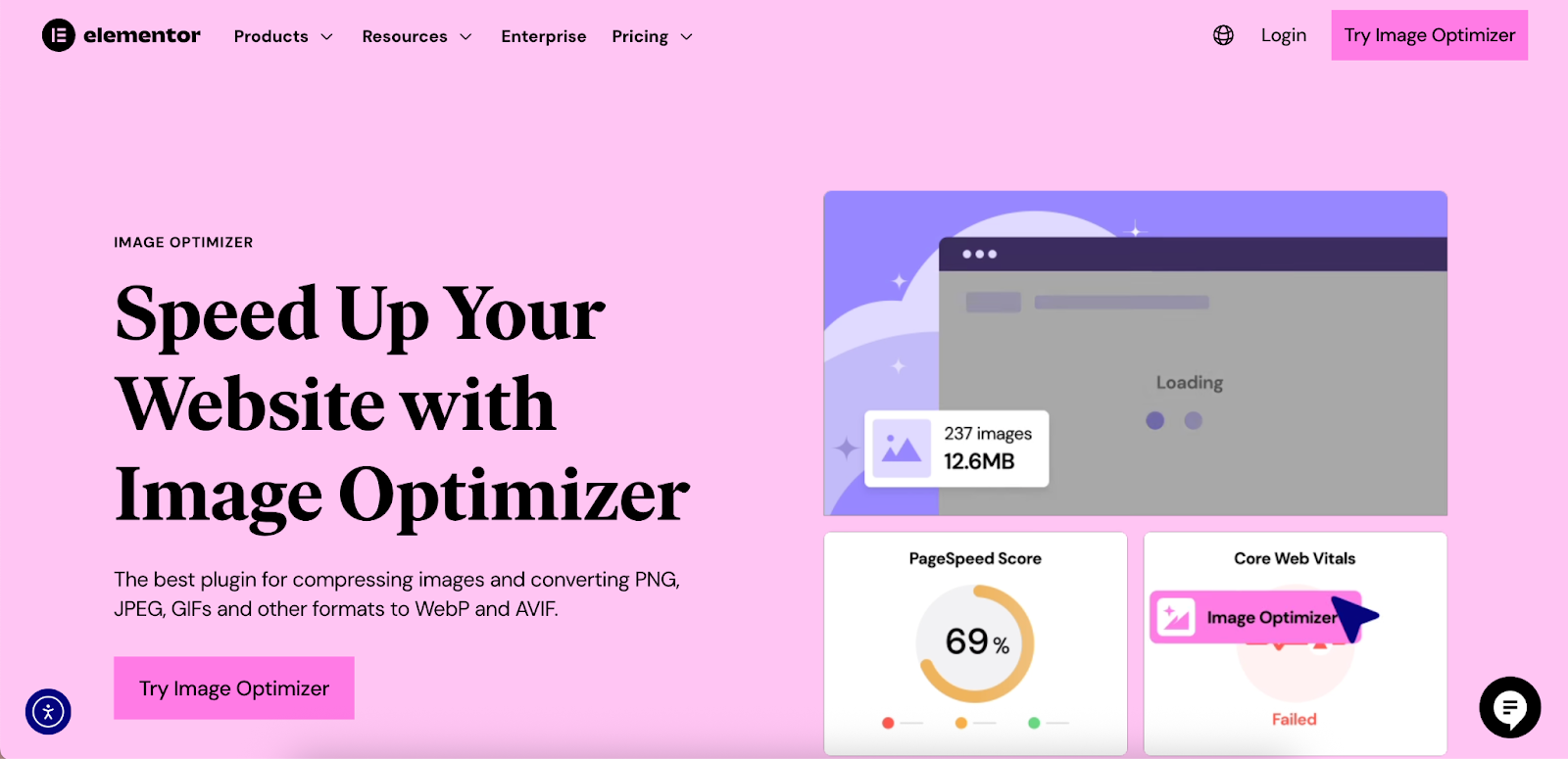
Elementor’s ecosystem makes using WebP straightforward. While WordPress now supports WebP uploads natively, the Image Optimizer by Elementor plugin simplifies the process further. It can automatically convert your existing JPEGs and PNGs to WebP, serve them to compatible browsers, and provide a fallback to the original format for those that don’t, ensuring a seamless experience for all visitors.
5. GIF (Graphics Interchange Format)
GIF is a raster format that is synonymous with one thing: animation. For decades, it was the only way to display simple, looping animations on the web. It uses lossless compression but is limited to a palette of only 256 colors.
This limited color depth is GIF’s biggest drawback. While it’s fine for simple, cartoonish animations, it makes photographs or images with smooth gradients look dithered and low-quality. It supports basic transparency, but not partial transparency like PNG; a pixel is either fully visible or fully invisible.
Pros:
- Animation Support: Its primary and most well-known feature.
- Universal Support: Works in every browser and email client.
- Small File Size for Simple Animations: The limited color palette keeps file sizes low for basic animations.
Cons:
- Limited to 256 Colors: Results in poor quality for complex images and photographs.
- No Semi-Transparency: Only supports 1-bit (on/off) transparency.
- Larger File Sizes for Complex Animations: Can become very heavy compared to modern video formats or animated WebP.
Best Use Cases for GIF:
- Short, Simple Animations: Ideal for creating reaction GIFs, simple animated icons, or demonstrating a quick UI interaction.
- Email Marketing: Due to its universal support, it’s a reliable choice for adding simple animations to email campaigns where video is not supported.
Working with GIFs in Elementor:
You can upload a GIF directly into an Image widget in Elementor, and it will play automatically. However, for performance, consider converting larger or more complex animations to a video format (like MP4) and using the Video widget, or converting it to an animated WebP for a significant file size reduction.
6. AVIF (AV1 Image File Format)
AVIF is the newest and most powerful raster image format on this list. Based on the AV1 video codec, it represents the cutting edge of image compression technology. It consistently outperforms every other format, including WebP, offering even smaller file sizes at the same or even better quality.
On average, AVIF can save around 50% on file size compared to JPEG and 20% compared to WebP. It supports 12-bit color depth (for richer colors), High Dynamic Range (HDR), and both lossy and lossless compression. It also supports transparency and animations.
Pros:
- Best-in-Class Compression: Delivers the smallest file sizes with outstanding visual quality.
- Modern Features: Supports HDR, high bit-depth color, transparency, and animations.
- Growing Browser Support: Now supported by all major browsers, covering nearly 90% of users.
Cons:
- Encoding Can Be Slow: Creating AVIF files can be more computationally intensive than other formats.
- Requires Fallbacks: While support is strong, you still need a WebP or JPEG fallback to cover all users.
Best Use Cases for AVIF:
- High-Performance Websites: For sites where every kilobyte matters, AVIF is the ultimate choice for images.
- High-Quality Visuals: Perfect for photographers, e-commerce sites, and brands that need to display stunning, high-fidelity images without the performance penalty.
Working with AVIF in Elementor:
Using AVIF effectively requires a robust delivery system. This is another area where the Image Optimizer by Elementor plugin shines. It can be configured to convert your uploads to AVIF and serve them to browsers that support it, while automatically falling back to WebP or the original format for others. This “set it and forget it” approach lets you leverage the best technology without worrying about compatibility.
7. SVG (Interactive & Animated)
While we’ve covered the basics of SVG, it’s worth dedicating a spot on our list to its dynamic capabilities. Because SVGs are XML code, they can be manipulated with CSS and JavaScript to create rich, interactive experiences.
You can animate the individual parts of an SVG—changing colors, positions, and shapes based on user interaction like a hover or a click. This opens up a world of possibilities for engaging micro-interactions, animated logos, and dynamic data visualizations that are both lightweight and perfectly crisp.
Pros:
- Highly Interactive: Responds to user actions for engaging effects.
- Performance-Friendly Animation: CSS-based SVG animations are much more performant than GIFs.
- Full Creative Control: Every element within the SVG can be targeted and animated independently.
Cons:
- Requires Technical Skill: Creating complex animations requires knowledge of CSS or JavaScript.
- Browser Compatibility for SMIL: While CSS and JS animations are well-supported, the older SMIL (Synchronized Multimedia Integration Language) animation standard has less consistent support.
Best Use Cases for Animated SVG:
- Animated Icons: Icons that animate on hover to provide user feedback.
- Interactive Infographics: Data visualizations that reveal information as the user interacts with them.
- Dynamic Logos: Logos that have subtle animations to draw attention.
Working with Animated SVGs in Elementor:
You can apply animations to SVGs in Elementor in a few ways. For simple hover effects, you can use the Icon widget‘s built-in hover controls. For more complex animations, you can add custom CSS targeting the SVG in the widget’s Advanced tab. For intricate, timeline-based animations, using the Lottie widget with a JSON file created from an SVG is the most powerful method.
8. TIFF (Tagged Image File Format)
TIFF is a high-quality, versatile raster format that is a favorite in the world of professional photography and printing. It can be saved with either lossless or no compression at all, preserving every ounce of image detail.
TIFF files are known for their ability to store layers, multiple pages, and high bit-depth color within a single file. This makes them an excellent format for archiving and editing master copies of images. However, their features come at a steep cost: extremely large file sizes.
Pros:
- Highest Quality: Lossless compression means zero quality degradation.
- Supports Layers and Metadata: Excellent for editing and archiving professional work.
- Versatile: Can store multiple images in one file.
Cons:
- Very Large File Sizes: Unsuitably large for direct use on websites.
- No Web Browser Support: TIFF files cannot be displayed in any major web browser.
Best Use Cases for TIFF:
- Print Production: The standard for high-quality commercial printing.
- Archiving Master Files: The perfect format for storing original, unedited photographs before they are optimized for the web.
How It Relates to Web Design:
You will never upload a TIFF file directly to your website. Instead, your workflow should be to save your master file as a TIFF and then export a copy as an optimized JPEG, WebP, or AVIF for web use. This ensures you always have a pristine original to go back to if you need to make edits or export for a different purpose.
9. HEIC (High Efficiency Image Container)
HEIC is Apple’s modern answer to JPEG. It’s the default image format for photos taken on iPhones and iPads. Based on the HEVC (High Efficiency Video Coding) standard, HEIC files offer significantly better compression than JPEGs—storing photos at roughly half the file size with the same or better quality.
Like AVIF, HEIC supports 16-bit color, transparency, and can even store multiple images in one container, which is how Apple’s “Live Photos” feature works.
Pros:
- Excellent Compression: Much more efficient than JPEG, saving significant storage space.
- High Quality: Supports high bit-depth color and modern features.
- Container for Multiple Media: Can store image sequences and even audio.
Cons:
- Limited Native Web Support: Not universally supported by all web browsers, particularly outside of Apple’s ecosystem (Safari).
- Compatibility Issues: Can be a hassle to share with non-Apple users or use in software that hasn’t been updated.
Best Use Cases for HEIC:
- Mobile Photography: The default for capturing and storing high-quality photos on Apple devices.
- Future-Proofing: As a modern container format, it has potential for future applications.
How It Relates to Web Design:
Much like TIFF, you generally won’t upload HEIC files directly to your website due to inconsistent browser support. If a client sends you HEIC images from their iPhone, you will need to convert them to a web-safe format like JPEG or WebP before uploading them to your WordPress Media Library. This can be done with various online converters or image editing software.
10. JPEG XL
JPEG XL is another next-generation image format that aims to be a universal replacement for all legacy formats. It’s a highly versatile format that offers some compelling features, including impressive compression, lossless and lossy options, and, most uniquely, the ability to losslessly re-compress existing JPEG files.
This means you can convert your entire library of JPEGs into JPEG XL to reduce their file size by about 20% without any quality loss, and you can even convert them back to the original JPEG if needed. It also supports high bit depths, animation, and transparency.
Pros:
- Excellent Compression and Quality: Outperforms JPEG significantly and is competitive with WebP and AVIF.
- Lossless JPEG Recompression: A major feature for migrating legacy image libraries.
- Feature-Rich: Supports animation, transparency, layers, and high bit depths.
Cons:
- Lack of Browser Support: Currently, no major browser supports JPEG XL by default, which has stalled its adoption for web use.
Best Use Cases for JPEG XL:
- Archiving and Future Use: Its features make it a strong candidate for long-term storage of images.
- Specific Applications: Used in industries where its unique features, like high dynamic range and lossless recompression, are valued.
How It Relates to Web Design:
As of 2025, JPEG XL is not a viable format for direct web use due to the lack of browser support. It remains a format to watch for the future, but for now, web creators should focus on the well-supported modern formats like WebP and AVIF for performance gains.
Choosing the Right Image Format: A Practical Guide
With so many options, how do you choose? Here’s a simplified decision-making guide for common website elements.
| Website Element | Recommended Format | Why? |
| Hero Image / Photographs | AVIF (with WebP/JPEG fallback) | Best compression for large, detailed images. Maximizes quality while minimizing load time. |
| Company Logo | SVG | Infinitely scalable, lightweight, and ensures perfect sharpness on all screens. |
| Icons | SVG | Same reasons as the logo. Ideal for crisp, clean UI elements. |
| Graphics with Text/Transparency | PNG or Lossless WebP | PNG ensures text is sharp and backgrounds are transparent. WebP offers a smaller file size with the same benefits. |
| Product Galleries | AVIF (with WebP/JPEG fallback) | Crucial for e-commerce to show high-quality images quickly. Fast load times directly impact sales. |
| Simple Animations | Animated WebP or GIF | WebP provides much smaller file sizes and better quality. Use GIF only when universal support (like in email) is essential. |
| Interactive/Animated Graphics | Animated SVG | The most performant and flexible option for creating dynamic, code-based animations. |
Export to Sheets
Your Image Optimization Workflow in Elementor
Elementor provides a robust set of tools to help you manage and optimize your images directly within your workflow, ensuring your site is both visually stunning and fast.
Step 1: Prepare Your Images Before Uploading
- Resize Correctly: Don’t upload a 5000px wide image for a space that is only 1200px wide. Use an image editor to resize your images to their maximum required display size. For a full-width hero image, a width of 1920px is often sufficient.
- Choose the Right Initial Format: Save photographs as JPEGs and graphics with transparency as PNGs. Save logos and icons as SVGs.
Step 2: Leverage Elementor’s Native Features
- Enable SVG Uploads: Go to Elementor > Settings > Advanced and enable “Enable Unfiltered File Uploads” to allow SVGs in your Media Library.
- Use Responsive Controls: Elementor allows you to set different background images for desktop, tablet, and mobile. Use this to serve smaller, optimized images to mobile users, significantly improving their experience.
- Lazy Loading: In Elementor > Settings > Features, ensure that features like “Optimized Image Loading” are active. This applies loading=”lazy” to images below the fold, meaning they won’t load until the user scrolls to them, speeding up the initial page load.
Step 3: Supercharge with the Image Optimizer Plugin
For the most comprehensive and automated solution, use the Image Optimizer by Elementor plugin.
- Automatic Conversion: Configure the plugin to automatically convert all your JPEG and PNG uploads to modern formats like AVIF and WebP.
- Fallback Support: The plugin handles serving the correct format to each browser automatically. If a browser doesn’t support AVIF, it will serve WebP. If it doesn’t support WebP, it will serve the original JPEG or PNG.
- Compression Control: Choose your desired compression level (Lossy or Lossless) to strike the perfect balance between file size and quality.
- Bulk Optimization: Optimize your entire existing media library with a single click to instantly improve the performance of your whole site.
By combining smart image preparation with Elementor’s powerful built-in features and the Image Optimizer plugin, you create a seamless and highly effective workflow that keeps your website fast, efficient, and visually impressive.
Conclusion
Choosing the right image file type is no longer a minor technical detail; it’s a foundational element of professional web creation. In a digital landscape where page speed directly influences user satisfaction, search rankings, and conversion rates, a strategic approach to images is essential.
By understanding the unique strengths of formats like the versatile JPEG, the transparent PNG, and the scalable SVG, you can select the right tool for every job. Embracing modern powerhouses like WebP and AVIF will give you a significant competitive advantage, allowing you to deliver higher-quality visuals at a fraction of the file size.
With a platform like Elementor, you have the control and the tools needed to implement this strategy effectively. From responsive controls and lazy loading to the advanced automation of the Image Optimizer plugin, you can build a workflow that ensures your websites are not only beautifully designed but also engineered for peak performance. The result is a better experience for your users and a more successful outcome for your projects.


