This guide will walk you through 17 essential web design principles that will help you create a website that resonates with your audience and delivers a superior user experience.
I. Foundational Principles
1. Clarity and Simplicity
A clean and uncluttered design is the cornerstone of a user-friendly website. When visitors arrive at your site, they should immediately understand its purpose. A simple design avoids overwhelming users with too much information at once, which can lead to confusion and a high bounce rate.
This principle is about more than just aesthetics; it’s about effective communication. By prioritizing essential elements and removing unnecessary distractions, you guide the user’s attention to what matters most. Tools with intuitive drag-and-drop editors can help you achieve this by allowing you to visually organize content and create a clear, focused layout.
2. Consistency
Consistency in design creates a sense of familiarity and predictability, which enhances usability. When elements like fonts, colors, button styles, and layout are consistent across your entire website, users don’t have to relearn how to navigate each new page. This predictability builds trust and makes the user’s journey more efficient.
Maintaining consistency can be achieved by establishing a design system or style guide at the beginning of your project. Website builders that offer global settings for colors and fonts are invaluable for ensuring that your design choices are applied uniformly throughout your site. This way, any changes you make to a global style will automatically update across all instances, saving you time and ensuring a cohesive look.
II. Principles of Structure and Layout
3. Visual Hierarchy
Visual hierarchy is the arrangement of design elements to show their order of importance. Through the strategic use of size, color, contrast, and placement, you can direct the user’s eye to the most critical information first. For example, a prominent headline will be noticed before smaller body text, and a brightly colored call-to-action (CTA) button will stand out against a muted background.
A well-defined visual hierarchy guides users through your content in a logical sequence, improving comprehension and engagement. You can create a strong visual hierarchy by making important elements larger, using bolder or different fonts for headings, and leveraging color to draw attention to key actions.
4. Grid-Based Layout
A grid-based layout provides a framework for organizing content in a structured and balanced way. By aligning elements to a grid, you create a sense of order and professionalism. This structure helps to prevent a cluttered or chaotic appearance, making your content easier to scan and digest.
Grids are also essential for creating responsive designs that adapt to different screen sizes. Many modern website builders are built on a grid system, allowing you to easily create columns and rows to structure your content. The use of features like nested columns and flexbox alignment gives you precise control over your layout, ensuring a consistent and organized presentation on any device.
5. F-Shaped Pattern
Eye-tracking studies have shown that users often scan web pages in an “F” pattern. They typically start by reading across the top of the page, then move down the left side, and scan horizontally across the page at various points. Understanding this natural reading behavior can help you place your most important content where it’s most likely to be seen.
To leverage the F-shaped pattern, place your key information, such as your value proposition and primary navigation, at the top of the page. Important headlines and calls-to-action should be positioned along the left side of the page, where the user’s gaze naturally falls.
6. The Law of Common Region
The Law of Common Region, a Gestalt principle, states that we perceive elements that are enclosed within a boundary as a single group. You can use this principle to organize and structure your content by grouping related items together within a container, such as a box or a card. This visual cue helps users quickly understand the relationship between different pieces of information.
Website builders often provide section and container widgets that make it easy to apply this principle. By placing related content within a shared background color or border, you create a clear visual distinction from other elements on the page, improving scannability and comprehension.
7. White Space (Negative Space)
White space, or negative space, is the empty area between design elements. It is a powerful tool for improving readability and creating a clean, uncluttered layout. Ample white space gives your content room to breathe, reducing cognitive load and making it easier for users to focus on the information you’re presenting.
Don’t be afraid to use generous amounts of white space in your designs. It can help to create a sense of elegance and sophistication, and it’s essential for guiding the user’s eye through the page. You can control white space by adjusting margins and padding around your elements, which is a straightforward process in most visual website builders.
III. Principles of User Interaction and Experience
8. Hick’s Law
Hick’s Law states that the time it takes for a person to make a decision increases with the number and complexity of choices available. In web design, this means that overwhelming users with too many options can lead to decision paralysis and a poor user experience.
To apply Hick’s Law, simplify your navigation menus, forms, and calls-to-action. Limit the number of choices presented to the user at any given time. For example, instead of a long, dropdown menu with dozens of options, consider organizing your navigation into a few clear categories. By reducing the number of choices, you make it easier for users to find what they’re looking for and take the desired action.
9. Fitts’s Law
Fitts’s Law is a principle of human-computer interaction that predicts the time it takes to move to a target area. The law states that the time to acquire a target is a function of the distance to and the size of the target. In practical terms, this means that larger and closer targets are easier and faster to click on.
To apply Fitts’s Law to your web design, make your interactive elements, such as buttons and links, large enough to be easily clickable. This is especially important for mobile devices, where users are interacting with a smaller screen. Ensure that there is ample space between clickable elements to prevent accidental clicks.
10. Jakob’s Law
Jakob’s Law of Internet User Experience states that users spend most of their time on other websites. This means that they prefer your site to work in the same way as all the other sites they already know. When a website follows familiar design conventions, users don’t have to learn a new system, which makes the experience more intuitive and less frustrating.
Adhere to common design patterns for elements like navigation menus, search bars, and shopping carts. For instance, placing your website’s logo in the top-left corner and making it clickable to return to the homepage is a widely understood convention. While creativity is important, deviating too far from established norms can hinder usability.
11. Miller’s Law
Miller’s Law suggests that the average person can only keep about seven (plus or minus two) items in their working memory. While the “magical number seven” is not a rigid rule, the underlying principle is that we should avoid overwhelming users with too much information at once.
To apply this principle, organize your content into smaller, manageable chunks. This is often referred to as “chunking.” For example, a long list of features can be broken down into smaller groups with clear headings. This makes the information easier to process, understand, and remember.
IV. Principles of Aesthetics and Visual Design
12. Color Psychology and Harmony
Color is a powerful tool in web design that can evoke emotions, convey meaning, and guide user behavior. Understanding color psychology can help you choose a palette that aligns with your brand and resonates with your target audience. For instance, blue is often associated with trust and professionalism, while green can signify health and nature.
In addition to the psychological impact of colors, it’s important to create a harmonious color scheme. A well-balanced palette is visually pleasing and contributes to a positive user experience. Tools that allow you to set global colors and easily create gradients can help you maintain a consistent and attractive color scheme throughout your website.
13. Typography and Readability
The fonts you choose and how you style them have a significant impact on readability and the overall user experience. Your typography should be legible, and the hierarchy of your text should be clear. Use a limited number of fonts to maintain consistency and avoid a cluttered look.
Here are some best practices for web typography:
- Choose readable fonts: Opt for fonts that are easy to read on a screen.
- Establish a clear hierarchy: Use different font sizes, weights, and styles to distinguish between headings, subheadings, and body text.
- Ensure sufficient contrast: The color of your text should have enough contrast with the background to be easily readable.
- Use appropriate line length and spacing: Aim for a line length of 50-60 characters for optimal readability. Use adequate line spacing (leading) to make your text easier to scan.
Website builders with extensive typography controls allow you to fine-tune every aspect of your text, from font family and size to letter spacing and line height.
V. Principles of Performance and Accessibility
14. Mobile-First and Responsive Design
With a majority of internet traffic now coming from mobile devices, a responsive design is essential. A responsive website automatically adjusts its layout to fit the screen size of the device it’s being viewed on, providing an optimal experience for all users.
A mobile-first approach to design prioritizes the mobile experience from the start. This means designing for the smallest screen first and then scaling up for larger devices. This approach forces you to focus on the most essential content and features, resulting in a cleaner and more focused design across all devices.
Modern website builders provide robust responsive design controls, allowing you to customize the appearance of your website on different devices. Features like custom breakpoints and the ability to hide or show elements on specific screen sizes give you complete control over the mobile experience.
15. Page Speed and Performance
Website loading speed is a critical factor in user experience and search engine rankings. Users expect websites to load quickly, and a slow-loading site can lead to frustration and high bounce rates. According to Google, the probability of a user bouncing increases by 32% as page load time goes from one to three seconds.
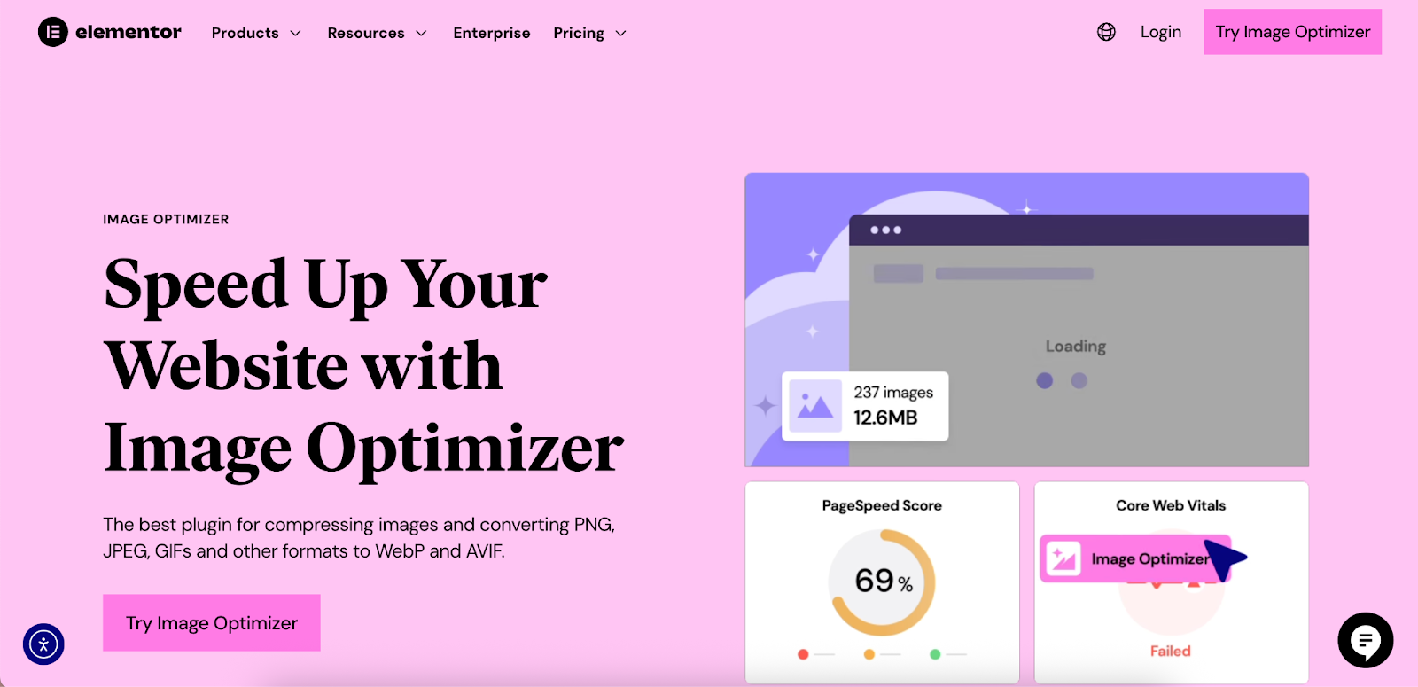
To improve your website’s performance, optimize your images, minify your CSS and JavaScript files, and leverage browser caching. Choose a hosting solution that is optimized for performance. Website building platforms that offer features like built-in image optimization and performance-enhancing capabilities can significantly improve your site’s loading speed. For instance, Elementor’s Image Optimizer plugin can help reduce image file sizes without sacrificing quality.
16. Accessibility (A11y)
Web accessibility is the practice of designing and developing websites that can be used by everyone, including people with disabilities. An accessible website ensures that all users have equal access to information and functionality. This includes providing alternative text for images, ensuring sufficient color contrast, and making your website navigable with a keyboard.
Following the Web Content Accessibility Guidelines (WCAG) is the best way to ensure your website is accessible. Many website builders are including accessibility features to help creators build more inclusive websites. For example, some platforms offer tools to check for accessibility issues and provide guidance on how to fix them.
VI. Principles of Conversion and Engagement
17. Persuasive Design and Clear Calls-to-Action (CTAs)
Persuasive design involves using psychological principles to influence user behavior and guide them toward a specific action. This can include using social proof (e.g., testimonials and reviews), creating a sense of urgency (e.g., limited-time offers), and highlighting the benefits of your products or services.
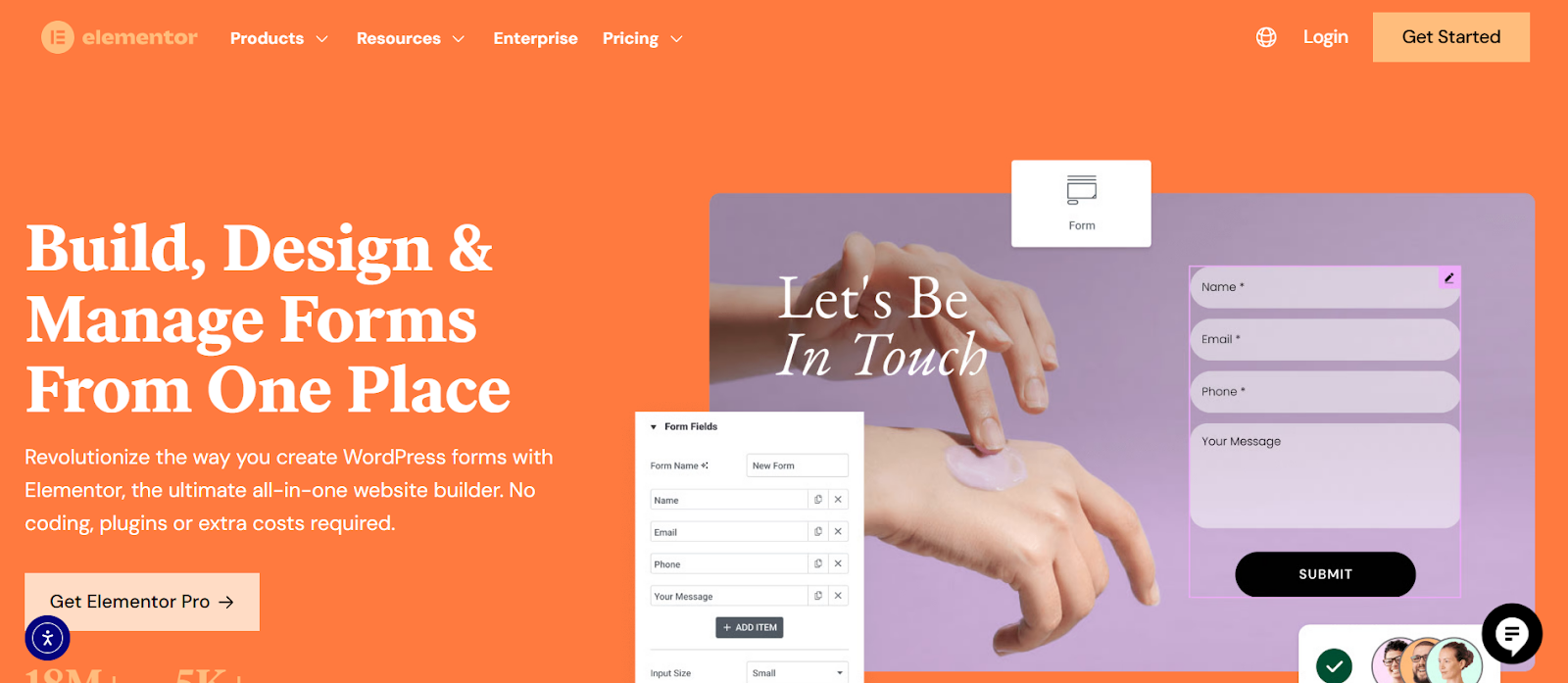
A clear and compelling call-to-action (CTA) is a crucial element of persuasive design. Your CTAs should be prominently displayed, use action-oriented language, and stand out visually from the rest of the page. The Elementor Form Builder and Popup Builder are examples of tools that can be used to create effective CTAs and lead-capture forms.
By applying these 17 web design principles, you can create a website that is not only beautiful but also highly effective. A user-friendly website enhances the user experience, builds trust with your audience, and ultimately helps you achieve your business goals. With a powerful website builder like Elementor, you have the tools and flexibility to implement these principles and create a truly exceptional online presence.


